

- Messages
- 1,695
- Name
- jason
- Edit My Images
- Yes
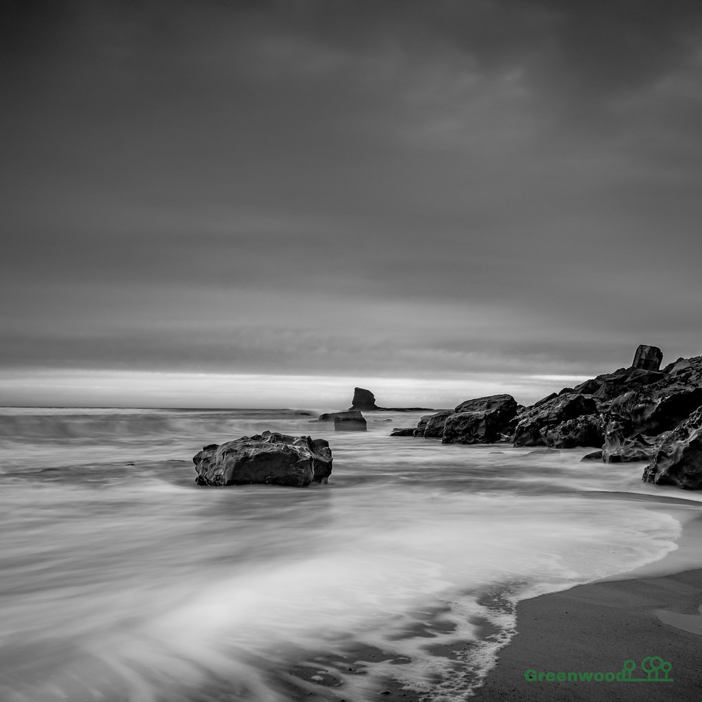
Very difficult to get to due to high-ish tide, big waves and slippery rocks. Eventually made it but we'd missed some of the water around the wreck. Skies were bland so though I'd go dark and moody for the PP.
There was a guy there who had come up from London and left his camera and tripod unattended as he went into his bag for something. It was very windy and...…..
One smashed Gitzo tripod, Nikon D850 and snapped off lens. Probably 4k worth of damage.
Poor bloke had travelled up and slept in has car all night for the sunrise shot that didn't happen. He was then booked onto an expensive one day workshop locally with a pro. Felt gutted for the guy.
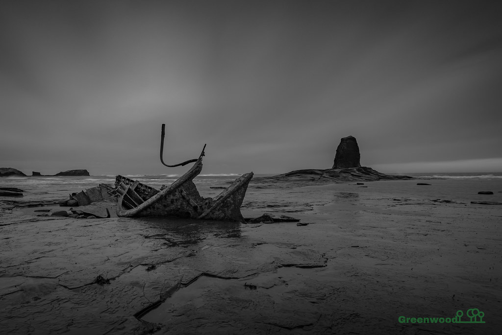 DSC_2643 by jason greenwood, on Flickr
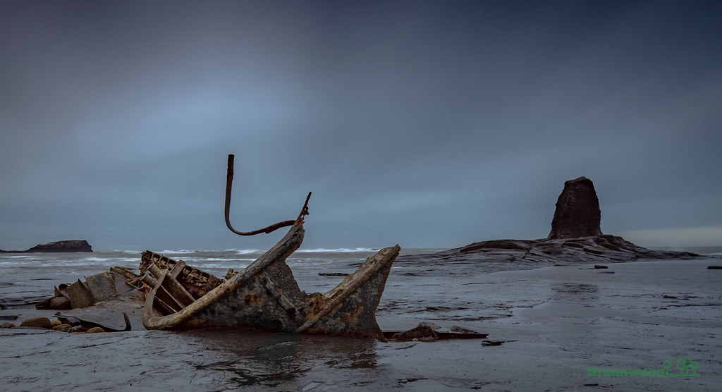 DSC_2643-2 by jason greenwood, on Flickr
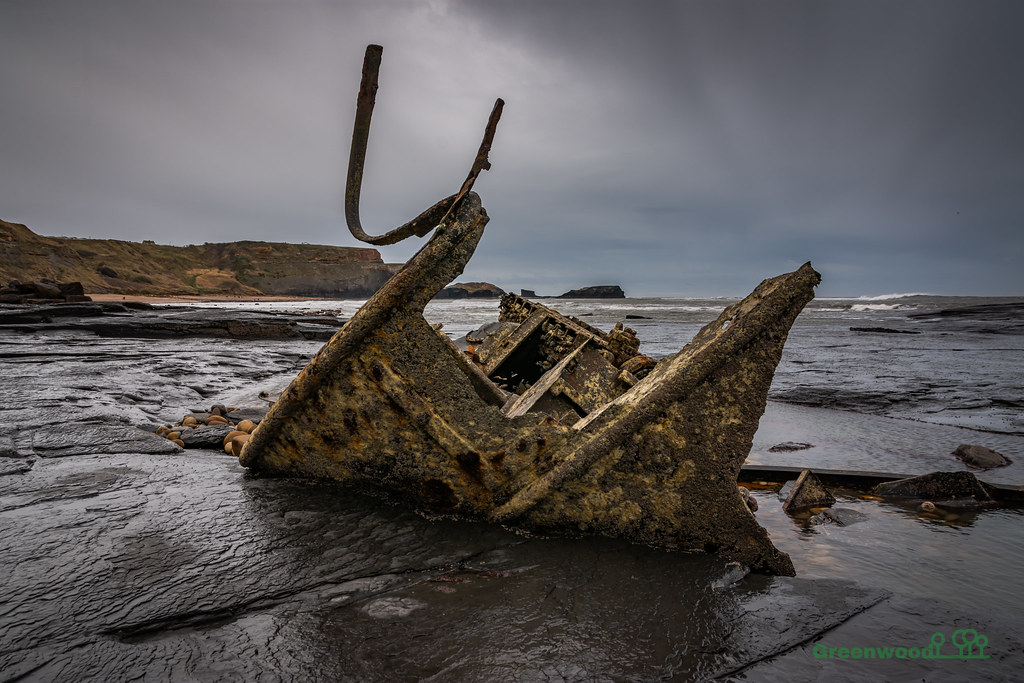 DSC_2658 by jason greenwood, on Flickr
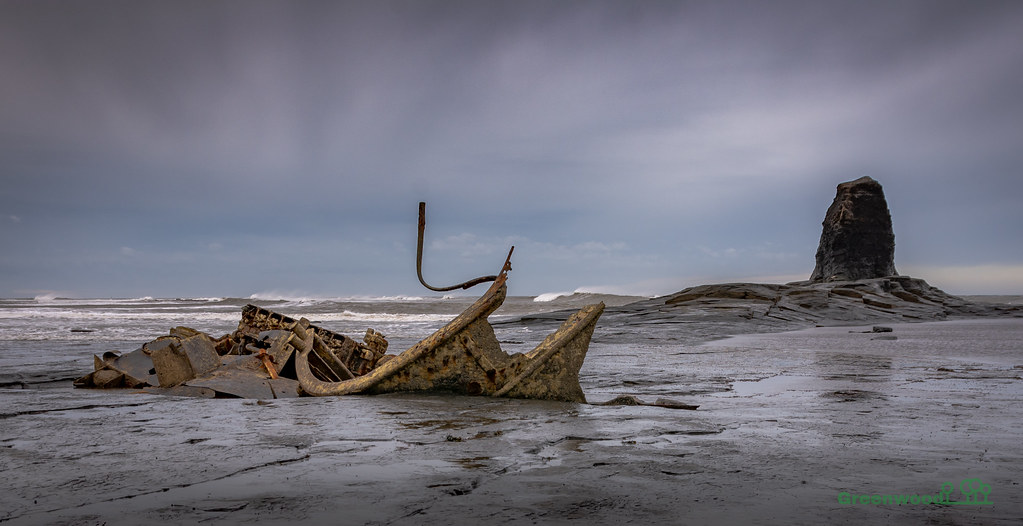 DSC_2651 by jason greenwood, on Flickr
DSC_2643-2 by jason greenwood, on Flickr
 DSC_2629 by jason greenwood, on Flickr
 DSC_2623 by jason greenwood, on Flickr
There was a guy there who had come up from London and left his camera and tripod unattended as he went into his bag for something. It was very windy and...…..
One smashed Gitzo tripod, Nikon D850 and snapped off lens. Probably 4k worth of damage.
Poor bloke had travelled up and slept in has car all night for the sunrise shot that didn't happen. He was then booked onto an expensive one day workshop locally with a pro. Felt gutted for the guy.
DSC_2643 by jason greenwood, on FlickrDSC_2643-2 by jason greenwood, on FlickrDSC_2658 by jason greenwood, on FlickrDSC_2651 by jason greenwood, on FlickrDSC_2643-2 by jason greenwood, on FlickrDSC_2629 by jason greenwood, on FlickrDSC_2623 by jason greenwood, on Flickr")
 DSC_2643-ds