Shield Bug

Great series Nick, and that first is brilliant! I love that composition.

I know the plant in very yellow, so these colours are probably quite accurate, but I think the bug maybe picking up some of that colour from the reflected light. Have you try cooling it just a slight touch? It may bring out more of the greens in the bug.
 
Yes the first one is excellent perfect angle:)
Also agree with Tim I would alter the white balance a touch to bring out the green
 
Nick excellent set... 1st one is great but I like the action shots too.. #3 in particular is my fav.

As for colours I can't actually recall seeing one so can't comment, sure I have seen one before but not really been looking into the world of the small with intent until recently ;)
 
Thanks all.

I know the plant in very yellow, so these colours are probably quite accurate, but I think the bug maybe picking up some of that colour from the reflected light. Have you try cooling it just a slight touch? It may bring out more of the greens in the bug.
Also agree with Tim I would alter the white balance a touch to bring out the green

Ah, the Choisya - yes indeed, it throws a strong yellow cast. This leads into interesting territory I think, touching on some quite fundamental things about photography. :)

Perhaps I could start by asking a question: Would you want to bring out the greens in the bug because it would make the image look more pleasing to look at (obviously that's a matter of personal taste, but that's fine), or because it would make the bug look more like its real colours (or both, or some other reason)?
 
Super photos Nick, not seen any in my garden yet this year but normally get quite a few info these chaps on my shrubs.
 
The first mainly. The latter reason is also valid as the bug is the main subject, but then you are opening up a can of worms around what is the accurate colour and how this is interpreted under different lighting conditions....
 
Super photos Nick, not seen any in my garden yet this year but normally get quite a few info these chaps on my shrubs.

Thanks Alby. I hope yours turn up soon.

The first mainly.

That's seems reasonable to me. That bush really does throw a strong cast on subjects, but it doesn't offend my eye. As you suggested though, I did try cooling down one of the images - the second one - but it didn't make it more pleasing for me; the opposite in fact as it seemed to take some of the vibrance out of it. It's the opposite effect of something that's been puzzling me for a while now. I often warm my images up a bit, and it seems to not simply make them more yellow (well, perhaps orange would be more correct). It seems to have a similar affect to increasing the Exposure (in Lightroom talk, I imagine equivalent to Brightness in other editors); it brings up the colours, gives them more "depth" (I'm having trouble finding the right words for this stuff, and I suspect what I'm describing may only happen in certain colour/brightness/contrast ranges that I typically work in, or lift an image from). So I suppose I shouldn't be surprised that cooling that shield bug image down had the opposite effect.

Puzzling. Perhaps I'm imagining things. I'll happily make RAWs available if you want to play with them to see if any of this makes sense to you (it might also reveal some nasty secrets about what my bridge camera images look like "under the surface" - ugly).

The latter reason is also valid as the bug is the main subject, but then you are opening up a can of worms around what is the accurate colour and how this is interpreted under different lighting conditions....

He he, you knew where I was going. A can of worms; quite so. No need to grapple with the intricate details, but in respect of colour casts in particular my take FWIW is that (what I think of as) the "real" colour is the colour that is perceived in the illumination at the time and I'm content to leave environmentally induced colour casts alone; indeed, for me they add some variety that I find pleasing - a bit like the difference in the look of flowers at different times of day. (btw, I wouldn't want to "correct" a golden hour shot so it looked like it looks at some other time of day, and I don't suppose anyone would, so why would I want to do it for an environmentally induced colour cast?). So for me it is a case of "no change needed" on "reality" grounds - but I might well change things around for reasons of aesthetics, personal taste etc. So for example if a colour cast spoiled a picture for me then I might well try adjusting the colours. As I've probably said here before, I like my images to look somewhat credible, as in "it could really have looked like that", but not necessarily "accurate", as in "it did really look like that". And to be honest I can't remember what things looked like in fine detail, and in any case I generally only see these scenes through the camera LCD, and so arguably even if I could remember I would be remembering a derivative representation. And then .... oh, it's too convoluted and complicated.... enough! :)
 
He he, you knew where I was going.
Yeah, saw that one coming ;) In fact I was going to expand further and mention the "golden hour" shots as the prime example. I am in full agreement with you on this.
I also agree with your reasons for preferring these as they are, and as you say, that's more personal choice. Before I read your reply I was mulling over these images and deciding how I would treat them, As I've mentioned before, although I always try and minimise the post production process, it's something I enjoy and I tend to spend some time editing my images, even if the results are quite subtle.

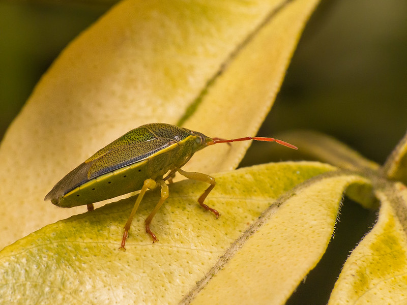
I was pretty sure you wouldn't mind, so I thought I would have a play with my favourite of this set and have a look how I would process it (if you do mind, of course I will remove them)...

Thinking about it further, and before I began I figured that just reducing the yellow channel across the image would likely have a negative effect on the background, and as a result, a large percentage of the image. I figured I might have to do something a bit more time consuming with the adjustment brush:


As you can see, I chose quite an extreme colour change, and then some slight changes to shadows/highlights and contrast (also a slight saturation boost).

The main changes were very slight, but here is a side by side comparision:


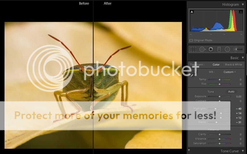
That was pretty much it. I suppose it didn't really need the adjustments to shadows and highlights. The starting image was nice as it was, and I assume you would have addressed any issues here as you felt fit. Sometimes I just can't stop messing with sliders!
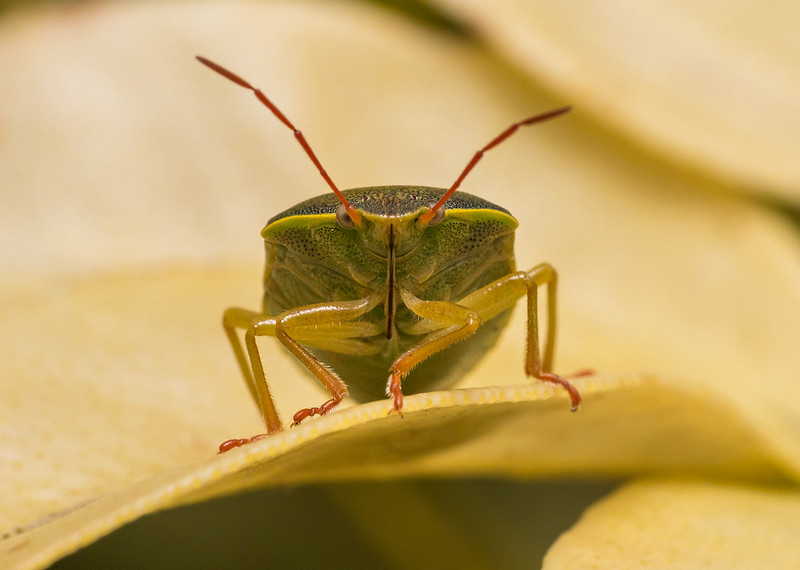
Anyway, I felt the final image was a very strong one (before I got my hands on it), and these changes are really typical of the type of thing I would do to my captures. Usually I would take it into PS for sharpening or any cloning.

Anyway this is what I ended up with:


I feel that the colour adjustments have separated the subject from the background a bit more, and the slight contrast changes have given it a bit more punch. They've also moved it away from the "realistic" approach, but I think this still stays true to the subject and as such is still credible.
 
Last edited:
Nice one Tim. I'm still playing with it and need to go to bed now because up early in morning to go to another of the reserves. I'll get back on this tomorrow or Saturday. Fascinating. Thanks.

I've been playing some more. You've done a great job increasing the clarity and visible detail. I'm not so sure about the colours though - they seem overly blue to me. What I can't work out is exactly what is having that clarifying effect. I've tried exactly replicating what you did but I don't get the same result. What version did you start from? And what were the changes associated with the second Adjustment Brush pin I can see in your version?

I've tried applying changes rather similar to what you did (apart from the colour changes) to the whole image as well as working with the selection (doing exactly what you did). In both cases it did make a lot of difference to the clarity, removing the flatness of the posted version, but not increasing the visible detail nearly as much as in yours.

You've clearly illustrated that the original processing could have been improved; thanks for that. I don't think I'll be getting into selections in that way though - it is too time consuming for the number of images I'm dealing with. It's very instructive though what you have been able to achieve by doing that. I don't want to spend too long on this one image just now, but I may well come back and re-study what you have done because I'm immensely curious as to the mechanism by which the extra detail was revealed, because I'm sure there must be a technique in there that I'd like to apply/have available for my standard workflow.
 
I don't think there is any "secret" technique I have used. If you have gone back to your RAW image it may be different as I started with your original JPG file (downloaded from this thread) so maybe the contrast/highlight/shadow settings are responding slightly differently. The only other thing I can think of that might impact sharpness (or perceived sharpness) is that I extracted the JPG using a preset for web (100% quality, 1000X1000 pixels, 72ppi). I stayed away from the clarity slider throughout, and didn't purposefully set out to add sharpness in any way.

The only other values I can think that may have impacted this are the shadows/highlights and contrast sliders. I didn't do any pixel peeping (I didn't even check it at 100%), just did the quick mask and played with the sliders. The second adjustment brush you can see was to add a bit more vibrancy to the background, and I think I reduced the highlights slightly. It seemed to me to be a bit washed out in places, but the changes weren't very noticeable and ultimately I didn't think it was worth mentioning.

As for the colour changes I did give myself a bit of a fright when I reopened Lightroom the following day. I was faced with a bright blue monstrosity and I couldn't figure out how I'd managed to come up with that result and find it appealing the night before. I eventually realised I'd overwritten the original downloaded jpg with my amended version, and Lightroom was reapplying everything I had amended over the top (doubling up all the changes to the original). I breathed a sigh of relief when I confirmed my uploaded version wasn't quite so extreme, although reviewing again I would probably tone it down just a touch. It's often recommended to go and do something else for a while when editing an image, then return to it with fresh eyes a while later. I think this is very good advice, but something I rarely follow in my excitement to share things. Maybe I should try and make more of an effort to do this in future :)
 
I don't think there is any "secret" technique I have used. If you have gone back to your RAW image it may be different as I started with your original JPG file (downloaded from this thread) so maybe the contrast/highlight/shadow settings are responding slightly differently. The only other thing I can think of that might impact sharpness (or perceived sharpness) is that I extracted the JPG using a preset for web (100% quality, 1000X1000 pixels, 72ppi). I stayed away from the clarity slider throughout, and didn't purposefully set out to add sharpness in any way.

The only other values I can think that may have impacted this are the shadows/highlights and contrast sliders. I didn't do any pixel peeping (I didn't even check it at 100%), just did the quick mask and played with the sliders. The second adjustment brush you can see was to add a bit more vibrancy to the background, and I think I reduced the highlights slightly. It seemed to me to be a bit washed out in places, but the changes weren't very noticeable and ultimately I didn't think it was worth mentioning.

As for the colour changes I did give myself a bit of a fright when I reopened Lightroom the following day. I was faced with a bright blue monstrosity and I couldn't figure out how I'd managed to come up with that result and find it appealing the night before. I eventually realised I'd overwritten the original downloaded jpg with my amended version, and Lightroom was reapplying everything I had amended over the top (doubling up all the changes to the original). I breathed a sigh of relief when I confirmed my uploaded version wasn't quite so extreme, although reviewing again I would probably tone it down just a touch.

Interesting details. Thanks Tim.

BTW, your idea about adjusting particular colour ranges stuck. For example, I am now happy taking down the luminance and/or saturation of the yellows for shots involving that choisya bush, and awake to the possibilities of using the same approach in other circumstances. Thanks for that.

It's often recommended to go and do something else for a while when editing an image, then return to it with fresh eyes a while later. I think this is very good advice, but something I rarely follow in my excitement to share things. Maybe I should try and make more of an effort to do this in future :)

I'm sure that is sound advice. Not advice that I have much success in following though. Having processed a set of images I just want to wrap it up, do the bureaucracy, maybe post some here, and move one.
 
Last edited:
Back
Top