

- Messages
- 876
- Name
- Simon
- Edit My Images
- No
Got a few of these so thought put them in their own thread, See which ones you lot prefer. ")
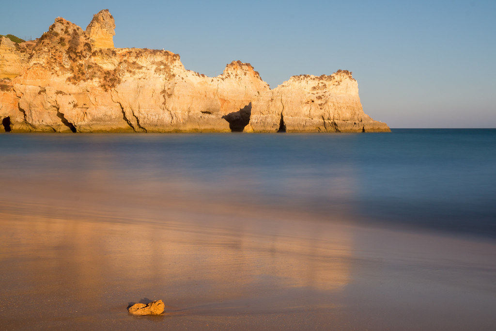
 IMG_2761.jpg by Simon Geary, on Flickr
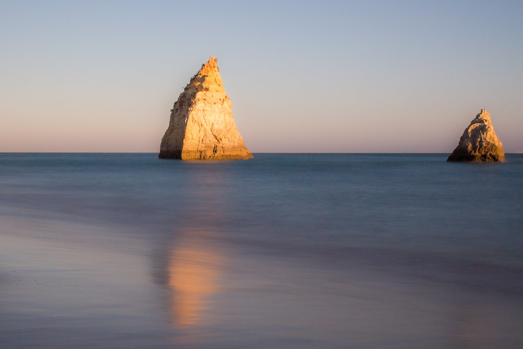
 IMG_2766.jpg by Simon Geary, on Flickr
 IMG_2780.jpg by Simon Geary, on Flickr
 IMG_2780.jpg by Simon Geary, on Flickr
IMG_2761.jpg by Simon Geary, on Flickr IMG_2766.jpg by Simon Geary, on Flickr IMG_2780.jpg by Simon Geary, on Flickr IMG_2780.jpg by Simon Geary, on Flickr
Last edited: