moomike

TPer Emeritus
Messages
5,783
Name
Mike
Edit My Images
Yes
Hi all,

Thought I'd share a few of my recent studio portraits as I've not shared anything for ages!

Cheers for looking,

Mike (y)

u6jguuu.jpg

WeviEcd.jpg

mh2LTE4.jpg

3jFpvHB.jpg
 
Nicely done!

I find the palette of the replacement background a bit odd in the last one, otherwise it'd be totally spectacular.

Thanks Simon, appreciate the feedback - I was on the fence about whether or not to post that one if I'm honest - it looks a bit too plain for me with just the red, but I think I may agree with you on the background as it is - I'll revisit it (y)
 
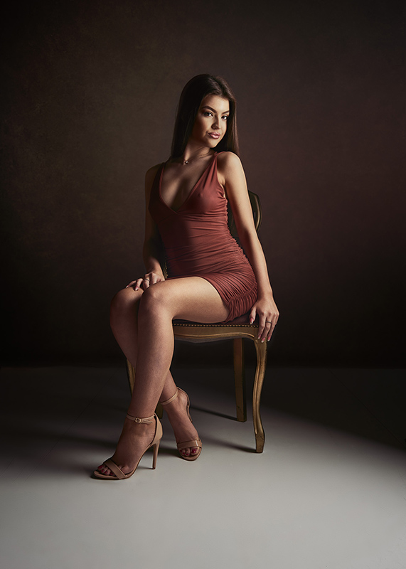
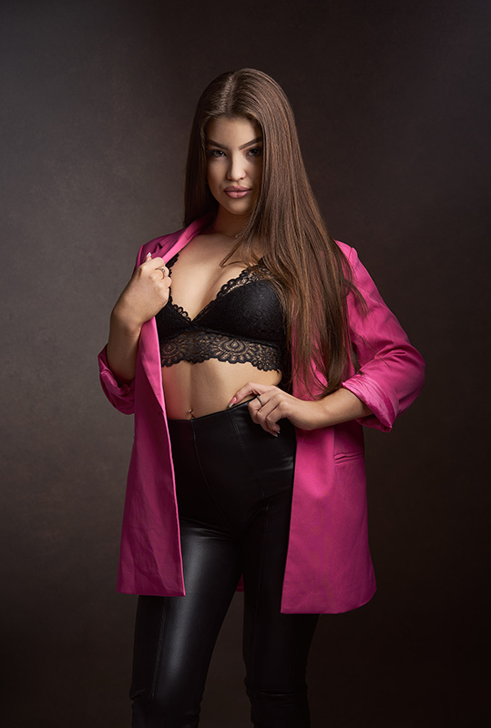
In the first one the lighting is great but I'm distracted by the proportion which looks odd to me. Her feet, legs and hands seem very emphasised and look larger than life and the hand position isn't helping. Not keen on the hand in the second either. I'm wondering if the focal length of the lens you chose was a factor?

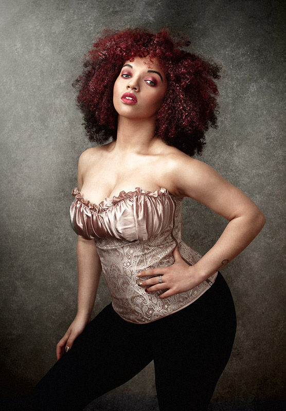
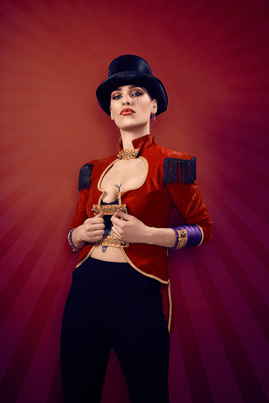
I'm going to be in a minority of one and say that I actually like the last one best of all. The background is good for me and I like all the red which I find very effective and it seems like a very striking shot. I also like the third one. Though the hands in the last two also seem a bit more prominent, they fit with the picture style more than in 1 and 2.

Maybe it's just me and I'm having a hand - fixated night
 
Hi all,

Thought I'd share a few of my recent studio portraits as I've not shared anything for ages!

Cheers for looking,

Mike (y)

u6jguuu.jpg

this one i like !...it expresses more emotion through the simplicity and suggestion
 
Last edited:
Tbh I couldnt fault any. On pure instinct when first veiwing the last one is fab followed by 3 1 and then 2.
Sorry I can't be more constructive but I don't think I will ever be able to see the minor points people whom do this for a living or seriously can see.

Gaz
 
Back
Top