Numbers 1 and 3 are nice.
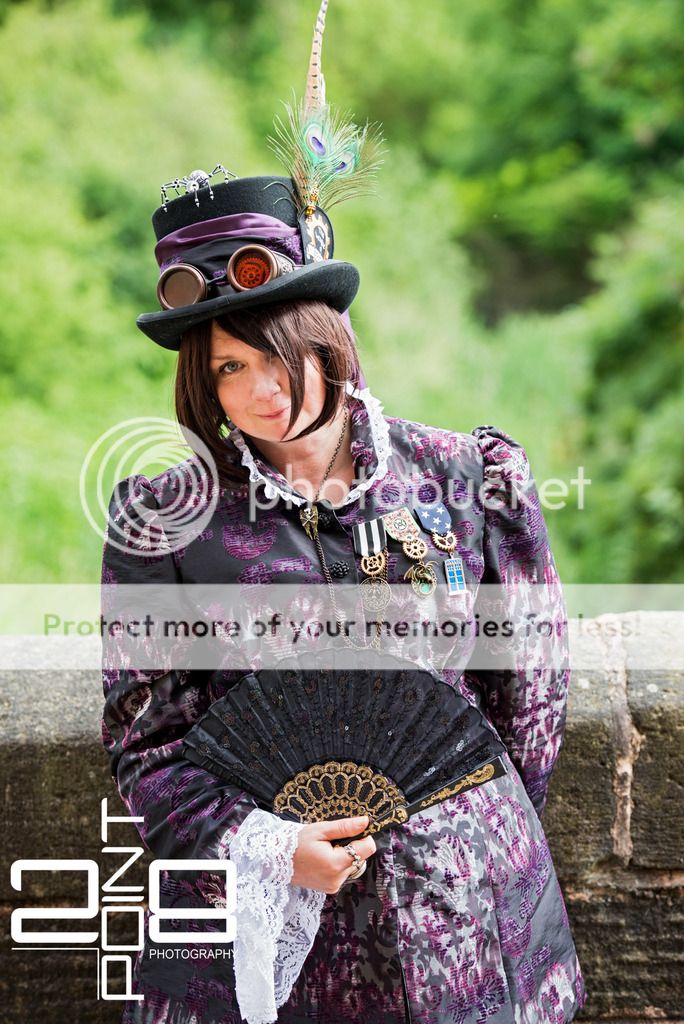
Number 2 is a bit of a chaos.There is to much to see on his chest what draws your eyes to it.
Like the hand under the ribbon ( i had to look twice to understand that it was'nt motion blurr )
Watermark ads more chaos.
The man is in a strange persective.I guess because he walked by it looks like he leaning to the left.
Photo 4..When you crop the coffeecups and the people on the background out its a nice shot.
I love to soup up my background with F/2.8 to,but you have to know that you cant do this with every background.Works great on neutral things like (blank) walls ,trees,landscapes etc.
The moment you see objects like people in it ,it disturb the soup.Your eyes are drawn to it,and you think: What's that on the background??
Your watermark is a bit to much.I would sugest something smaller


")
