

You are using an out of date browser. It may not display this or other websites correctly.
You should upgrade or use an alternative browser.
You should upgrade or use an alternative browser.
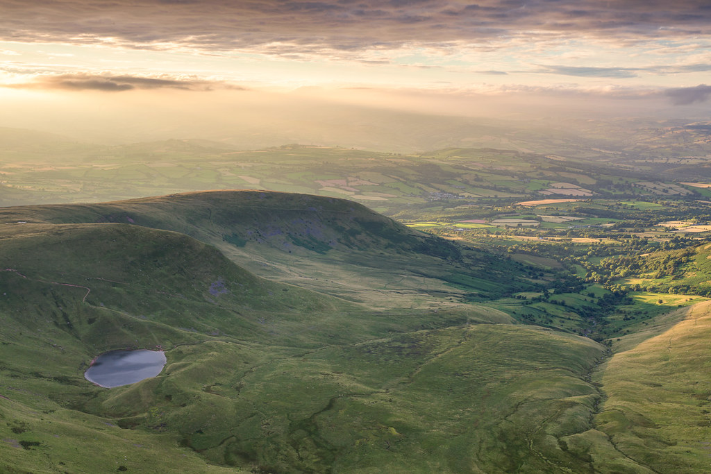
Critique Sunset from Corn Du (edit added)
- Thread starter Carl Hall
- Start date
Kodiak Qc
Suspended / Banned
- Messages
- 20,285
- Name
- French Canadian living in Europe since 1989!
- Edit My Images
- Yes
•
This, Carl, is a great take IMO.
And, IMO too, it is not properly developed.
The tonal qualities were left behind to the
goods of shadow details and this flattened
the rendition. There are other issues too but
you will see them as you go!
This, Carl, is a great take IMO.
And, IMO too, it is not properly developed.
The tonal qualities were left behind to the
goods of shadow details and this flattened
the rendition. There are other issues too but
you will see them as you go!
OP
- Messages
- 3,817
- Name
- Carl
- Edit My Images
- Yes
•
This, Carl, is a great take IMO.
And, IMO too, it is not properly developed.
The tonal qualities were left behind to the
goods of shadow details and this flattened
the rendition. There are other issues too but
you will see them as you go!
Thank you for the comments, it's greatly appreciated
") I must admit I was trying to keep some of the detail in the shadows on the side of the hill and now that you mention it the image does look a little flat. It's weird that you don't notice things until someone points them out, and then they're so obvious!
I must admit I was trying to keep some of the detail in the shadows on the side of the hill and now that you mention it the image does look a little flat. It's weird that you don't notice things until someone points them out, and then they're so obvious!When I get home I will have another look at it. Hopefully if I can give it a little more contrast it might darken the shadows on the side of the hill and make the nice light on the right hand side stand out a little more.
Kodiak Qc
Suspended / Banned
- Messages
- 20,285
- Name
- French Canadian living in Europe since 1989!
- Edit My Images
- Yes
Photography is a visual art and technique.now that you mention it the image does look a little flat. It's weird that you don't notice things until someone points them out, and then they're so obvious!
As music will develop one's ear, togging will
develop your eye, vision.
Warning:Hopefully if I can give it a little more contrast it might…
more contrast is not what this rendition needs!
OP
- Messages
- 3,817
- Name
- Carl
- Edit My Images
- Yes
more contrast is not what this rendition needs!
When I said more contrast, I just really meant that I'd darken the shadows on the side of the hill a little bit
Unless that's not what you meant either? Do you mean that by bumping the shadow detail up I've made the image look flat?I spent a bit of time looking at it last night but can't seem to get a result I'm really happy with. I think my processing skills are the weak link that I need to improve on!
Kodiak Qc
Suspended / Banned
- Messages
- 20,285
- Name
- French Canadian living in Europe since 1989!
- Edit My Images
- Yes
Exactly. You went too far, IMO. Sometimes, oneDo you mean that by bumping the shadow detail up I've made the image look flat?
has no other choice but then to compensate, a
mid tone tweak should go.
… send me the untouched original and Ican't seem to get a result I'm really happy with
could see what I can do…
OP
- Messages
- 3,817
- Name
- Carl
- Edit My Images
- Yes
Exactly. You went too far, IMO. Sometimes, one
has no other choice but then to compensate, a
mid tone tweak should go.
… send me the untouched original and I
could see what I can do…
Looking at the raw file the mid tones aren't really that much better (not sure if I used an ND grad. I don't think I did for this one, but I may have done looking at how there is detail in the shadows without a blown out sky!). I'll try and add the raw file to my dropbox and then send you a link. Thank you
If anyone else is curious what the raw file looked like before I got my grubby mitts all over the sliders, here's a quick copy, with the only adjustment being a resize.


Kodiak Qc
Suspended / Banned
- Messages
- 20,285
- Name
- French Canadian living in Europe since 1989!
- Edit My Images
- Yes
•could you tell me what adjustments you made to get it like this?
Sure, if you have Skype… it's free!
OP
- Messages
- 3,817
- Name
- Carl
- Edit My Images
- Yes
Ok I've had a little play and I've got something I'm much happier with now
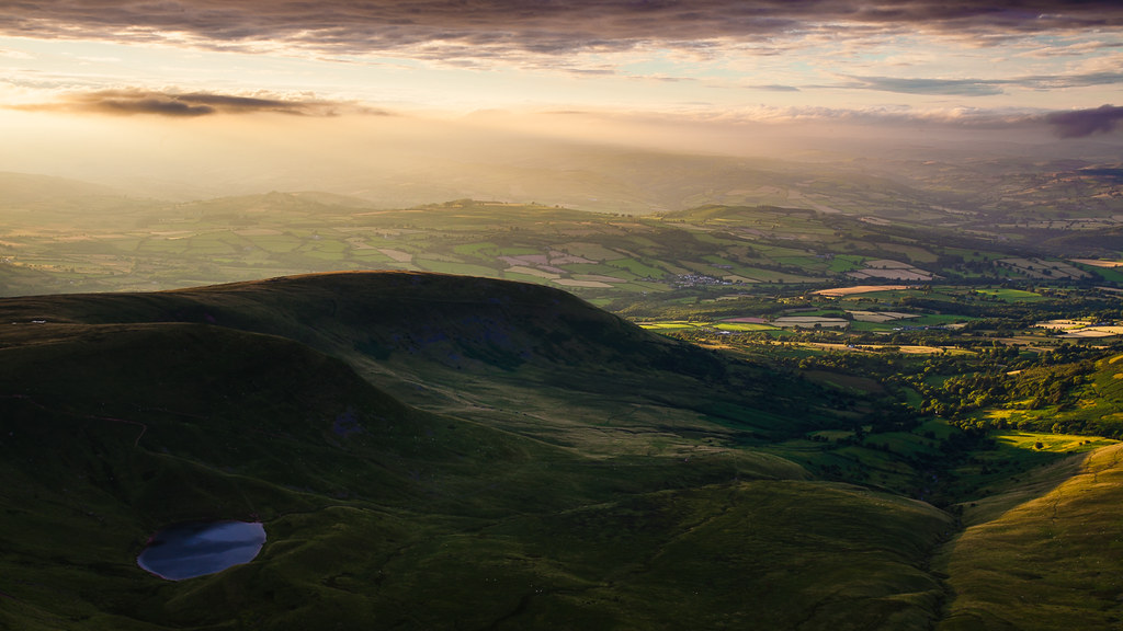
Corn Du Sunset by Carl Hall, on Flickr
Corn Du Sunset by Carl Hall, on Flickr
Kodiak Qc
Suspended / Banned
- Messages
- 20,285
- Name
- French Canadian living in Europe since 1989!
- Edit My Images
- Yes
•I've got something I'm much happier with now
Well, that's the reward for the extra work!
A lot more lively than your first two attempts
and I know you're not through yet…
Take the time to discover, to mature and make
sure you have a good time at it!
- Messages
- 272
- Name
- Will
- Edit My Images
- Yes
Nice shot and interesting to see you guys discuss the variable ways to render the image. In my humble opinion I feel your last posting Carl is nearly there, I reckon the way the light is falling on the trees, fields etc on the mid right hand side section is perfect to my eye whereas the area with the lake and shadowed hillside need bringing up a bit. In this respect i like Kodiaks rendition but maybe a little less pop, if thats what it is. I dunno, it just looks a little over cooked to me. The top right side i'd go more with the likes of what Kodiak has achieved in bringing out the warmth of the rays of light. But yeah nice. As you were.
Kodiak Qc
Suspended / Banned
- Messages
- 20,285
- Name
- French Canadian living in Europe since 1989!
- Edit My Images
- Yes
That's one of the great things about a forum… talking photointeresting to see you guys discuss the variable ways to render the image.
with people I would never have the chance to meet!
My suggestion isi like Kodiaks rendition but maybe a little less pop
— purely technical given the recorded data in the RAW file
— strictly based on my experience of light and sceneries and
possibly not "real" as I didn't see the scene as Carl did
— in such cases, I would never dare an artistic intent as this
the privilege of the author
— the "pop" is proportional to the distance/depth in the scene
and is determined by taming the mid-tones, this has an impact
on the reflected light by dust particles in the air, fog etc
Mine may be a pleasing rendition in that regard but may notbringing out the warmth of the rays
reflect the real situation as I haven't seen it… but Carl.
Cool comment, Will!
- Messages
- 20,926
- Name
- Steve
- Edit My Images
- Yes
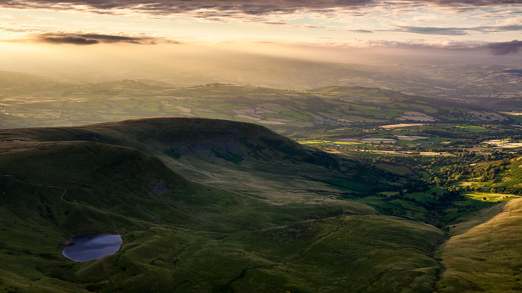
I think the edits make the image too dark and artificually contrasty. The etheral feel has been lost and IMHO the darkness just makes it dark and depressing. QC's edit is better than the op's as it doesn't raise the black point quite as far.
- Messages
- 272
- Name
- Will
- Edit My Images
- Yes
Thanks Kodiak.
Indeed that is the great thing about forums. I'm a bit of a noob when it comes to getting involved with forum discussion. Always tended to be a bit more of a lurker. Silly really but it comes from a tendency to be a bit socially unsure. On this forum maybe a bit from lacking confidence in my photography/ editing knowledge. I'm starting to grow in this regard and get a bit more confidence to share an opinion. In this regard i have a propensity to function from quite a intuitive direction as opposed to technical. Always have but trying to get more objective in life generally to become a more balanced individual.
Anyhow i digress somewhat, excuse me. What i was trying to get at when i said "the pop was a bit overcooked" i think it was maybe a bit too much saturation or something. Reminded me of some hdr work when its a bit too hyper real. Just needed a bit more subtlety imho.
Yep, having not seen it either, like i say above it was just my take on how i'd go to get the image to tickle my aesthetic yearnings tis all.
Cheers guys keep up the good work.
Indeed that is the great thing about forums. I'm a bit of a noob when it comes to getting involved with forum discussion. Always tended to be a bit more of a lurker. Silly really but it comes from a tendency to be a bit socially unsure. On this forum maybe a bit from lacking confidence in my photography/ editing knowledge. I'm starting to grow in this regard and get a bit more confidence to share an opinion. In this regard i have a propensity to function from quite a intuitive direction as opposed to technical. Always have but trying to get more objective in life generally to become a more balanced individual.
Anyhow i digress somewhat, excuse me. What i was trying to get at when i said "the pop was a bit overcooked" i think it was maybe a bit too much saturation or something. Reminded me of some hdr work when its a bit too hyper real. Just needed a bit more subtlety imho.
Mine may be a pleasing rendition in that regard but may not
reflect the real situation as I haven't seen it… but Carl.
Yep, having not seen it either, like i say above it was just my take on how i'd go to get the image to tickle my aesthetic yearnings tis all.
Cheers guys keep up the good work.
- Messages
- 272
- Name
- Will
- Edit My Images
- Yes
I think the edits make the image too dark and artificually contrasty. The etheral feel has been lost and IMHO the darkness just makes it dark and depressing. QC's edit is better than the op's as it doesn't raise the black point quite as far.
Fair play. I wonder if doing as i tried above to express and then maybe bringing down the vibrance/ saturation on the image as a whole would have the effect of balancing and then calming the pic to reclaim the ethereal feel you describe.
OP
- Messages
- 3,817
- Name
- Carl
- Edit My Images
- Yes
Nice shot and interesting to see you guys discuss the variable ways to render the image. In my humble opinion I feel your last posting Carl is nearly there, I reckon the way the light is falling on the trees, fields etc on the mid right hand side section is perfect to my eye whereas the area with the lake and shadowed hillside need bringing up a bit. In this respect i like Kodiaks rendition but maybe a little less pop, if thats what it is. I dunno, it just looks a little over cooked to me. The top right side i'd go more with the likes of what Kodiak has achieved in bringing out the warmth of the rays of light. But yeah nice. As you were.
Thanks Will. It's great to be able to post a photo and then get useful feedback from other members. I definitely think post processing is my weak point so getting comments and suggestions from everyone really helps me to improve. Thanks for the input
I think the edits make the image too dark and artificually contrasty. The etheral feel has been lost and IMHO the darkness just makes it dark and depressing. QC's edit is better than the op's as it doesn't raise the black point quite as far.
Cheers Steve, I'll have another look at it later after work. Expect edit number three to be posted this evening
I'm a bit of a noob when it comes to getting involved with forum discussion. Always tended to be a bit more of a lurker. Silly really but it comes from a tendency to be a bit socially unsure. On this forum maybe a bit from lacking confidence in my photography/ editing knowledge. I'm starting to grow in this regard and get a bit more confidence to share an opinion.
Personally, I think that photography is such a subjective subject that everyone's opinions are equally valid. Some people might be better placed to offer technical advice about editing etc, but it's impossible to be wrong if you're saying why you like/dislike a photo. In fact, if only the best photographers commented on photos and offered opinions, the forum would be a very quiet place indeed.
OP
- Messages
- 3,817
- Name
- Carl
- Edit My Images
- Yes
Corn Du Sunset by Carl Hall, on Flickr
- Messages
- 20,926
- Name
- Steve
- Edit My Images
- Yes
Better but needs a little more contrast removed and a few shadows lifted further. 98% there