You are using an out of date browser. It may not display this or other websites correctly.
You should upgrade or use an alternative browser.
You should upgrade or use an alternative browser.
Sunshine and Puddles
- Thread starter CC92713
- Start date
sunnyside_up
<span class="poty">POTY (Joint) 2016</span>
- Messages
- 3,622
- Name
- Bethy
- Edit My Images
- No
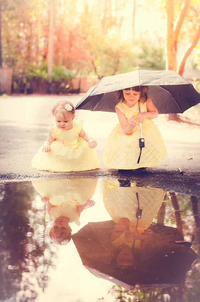
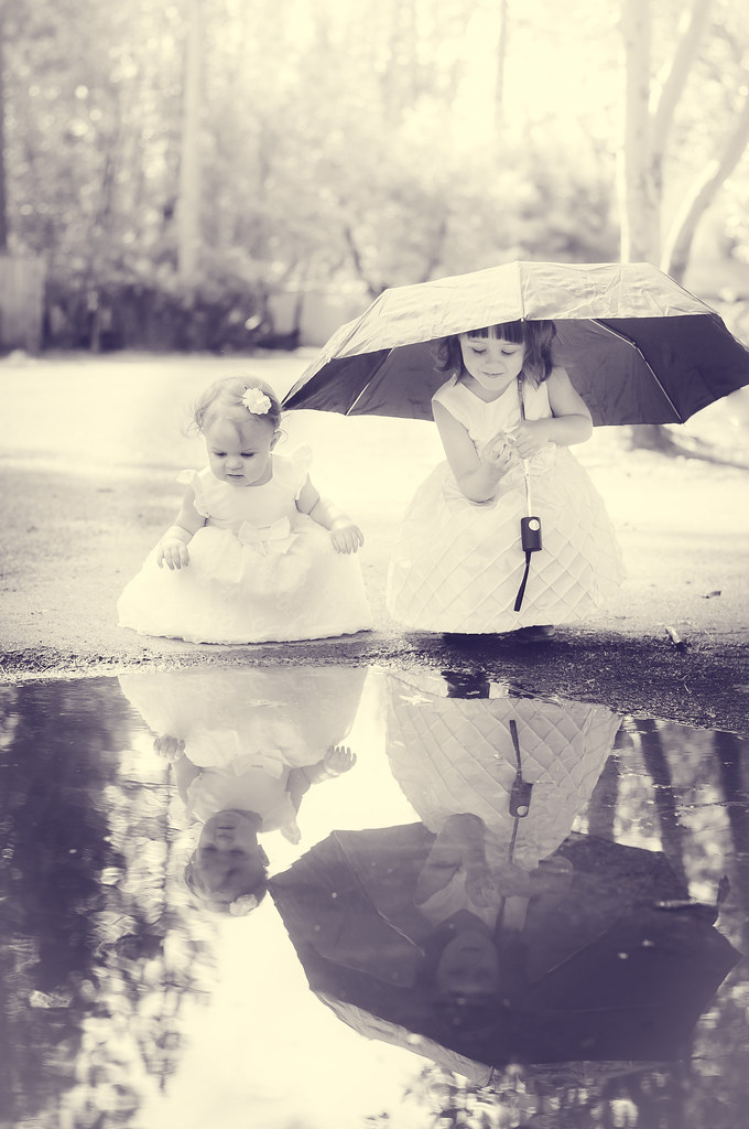
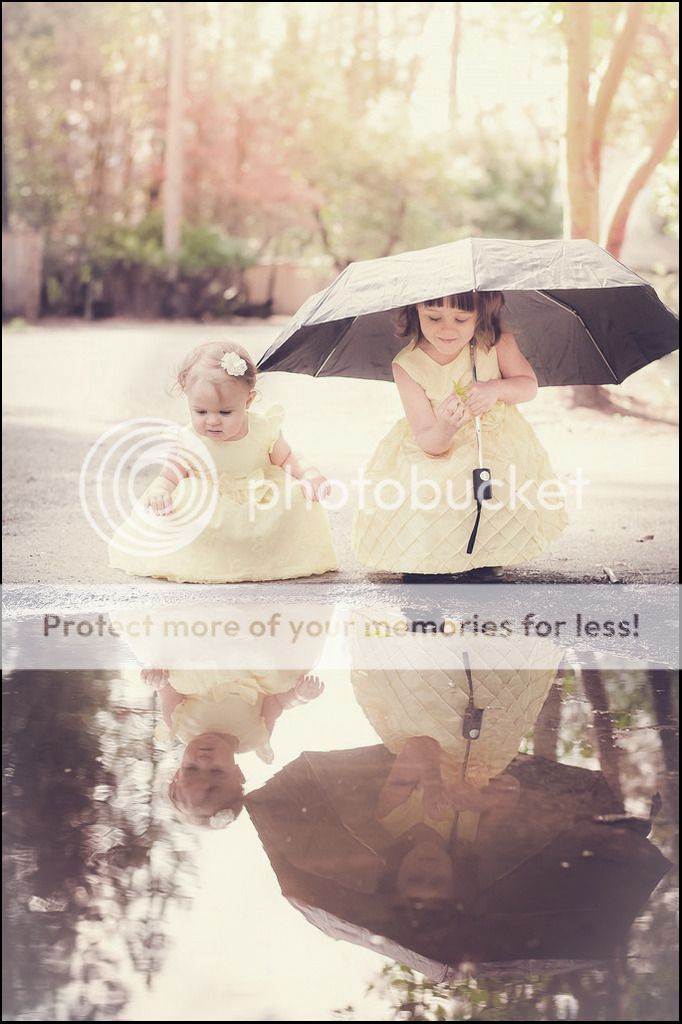
lovely shot! Keep the colour though, the black and white loses it's effectiveness... maybe lose a bit of the processing too on the colour image. Not sure if you could bring out some clarity to the reflection...?
I'd be happy with that shot though... lovely.
I'd be happy with that shot though... lovely.
D
Deleted member 34016
Guest
D
Deleted member 34016
Guest
Lovely shot. Only thing i noticed was the slightly clipped umbrella. No biggy though.
Les, what's usm?
Un-Sharp Mask or you could use any sharpening filter
- Messages
- 1,288
- Name
- Ian
- Edit My Images
- Yes
Christian, I hope you don't mind but I've edited Les' version to add in the clipped umbrella. Method as above, and also added canvas to the bottom of the pic to keep the 6x4 ratio.
 not my photo_edit for TP by Ian J Bradshaw, on Flickr
 not my photo_edit for TP by Ian J Bradshaw, on Flickr
- Messages
- 23,501
- Name
- Toni
- Edit My Images
- No
Seems I'm the only one to like the mono version, but I do like Les's tweak and the recreated side that Ian added too.
- Messages
- 1,338
- Edit My Images
- Yes
Lovely shot. Disregarding the colour/mono debate, my only crit would be that although the light at the top of the frame is very nice, it does draw my eye upwards such that it distracts from the reflection... cropping about half of the empty space at the top (ie the brightest bit) improves the comp for me.
- Messages
- 695
- Name
- Alan
- Edit My Images
- Yes
Lovely pic I actually prefer your colour one
- Messages
- 1,288
- Name
- Ian
- Edit My Images
- Yes
I thought your daughters looked a little washed out, so I've reduce exposure and increased saturation on their dresses.
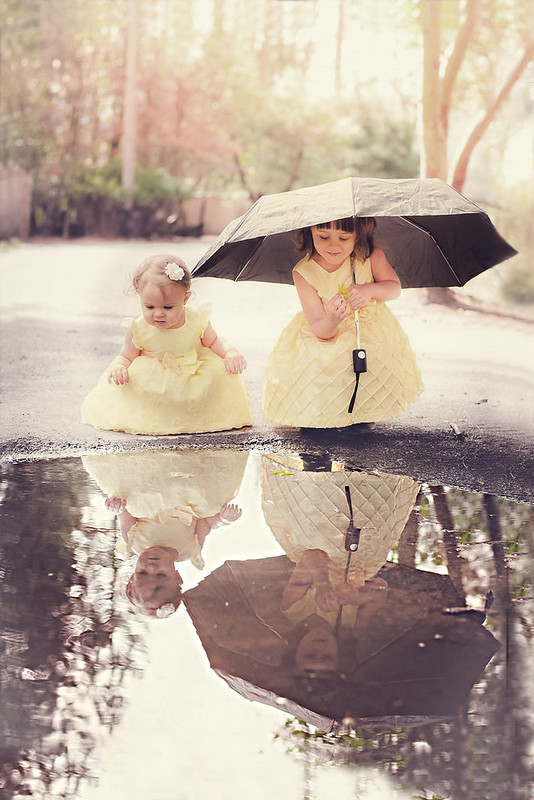 not my photo_edit for TP v2 by Ian J Bradshaw, on Flickr
 not my photo_edit for TP v2 by Ian J Bradshaw, on Flickr
- Messages
- 298
- Name
- Christian Elizabeth
- Edit My Images
- Yes
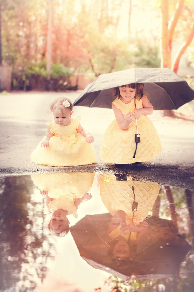
Thank you for the ideas! i toned it down a little but i do like the warmer feel. I added a some blurring (not sure if its too much??)... I am still working on getting the clipped umbrella fixed. I use GIMP and I am still learning but it looks so much better with the entire thing in the picture!

- Messages
- 1,288
- Name
- Ian
- Edit My Images
- Yes
It's been said already, by Tom, that the light/warm tones in the background draw the eye away from the subjects. Personal opinion but I would either cool them down a bit or desaturate them a little. This would make the subjects the thing that the eye is drawn towards.
- Messages
- 1,288
- Name
- Ian
- Edit My Images
- Yes
Morbid - how did you put the umbrella back into the shot?! You've blown my mind!!
It's not difficult, just extend the canvas to give you an empty area to fill in and then use the clone stamp in PS to fill in the gaps. The umbrella was extended using the clone stamp too. I guess it's a bit like painting, using other areas of the image to provide the paint/pattern - if that makes sense? Once finished crop to get it back to 6 x 4 ratio.


