

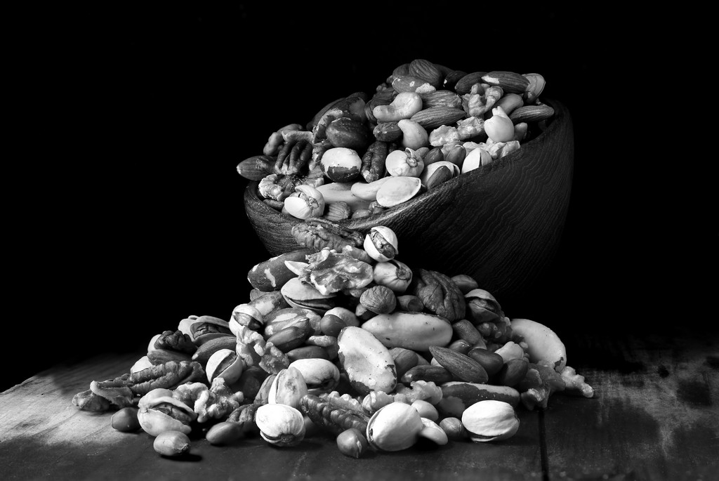
The few times I have tried some tabletop photograghy I have been pretty pleased with my results. I thought I would give it another go.
Things didnt turn out as expected. The main thing being colour. I never shoot in B&W but as the window I shoot in front of backs onto our garden, a mass of greenery at the moment, my subjects were looking VERY green/yellow.
So I switched to mono.Shame as I love colour. That aside I think I used to many differing textures.
I just don't do mono so I can't help but want to see the colours.
Posting for feedback on any aspect. Subject, colour, post, composition, anything at all, is more than welcomed.
I lifted the blacks on the second as I was thinking the original looked a bit harsh but again maybe niether work.
Thanks
Gaz
1
2
Last edited: