Critique Take a Break

Messages
337
Name
Mike
Edit My Images
Yes
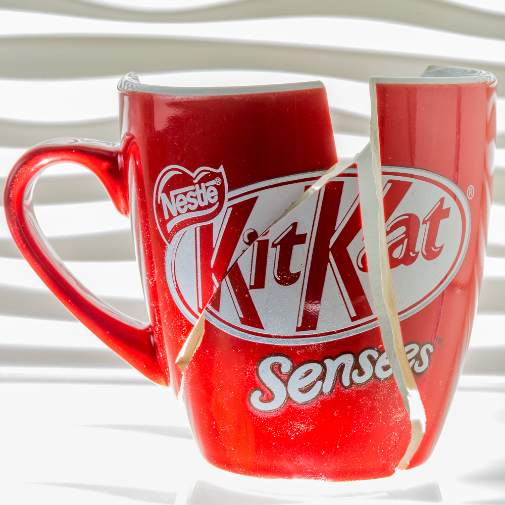
Me v the wife's favourite mug. Thought it was worth immortalising, not sure if this the the best way to shoot it...

8N2A5496-1-2 by Mr Seahorse, on Flickr
 
Like the bright colours and subdued background.

For me - compositionally it could be improved by having the handle at an angle rather than horizontal to the camera.
 
It's on a glass shelf, with a speed light below and a second one with soft-box to the left.

Not sure I understand your comment about the handle? I still have the bits, so I can have another go :)
 
Ooops !!!
Is somebody in trouble for breaking that?

I quite like the lighting on this actually, especially the light from below and the concept of rearranging the broken pieces works well.
Too closely cropped in the frame for me though. I'd really like to see some more space around it.
 
[QUOTE="Seahorse, post: 6713283, member: 74636]

Not sure I understand your comment about the handle? I still have the bits, so I can have another go :)[/QUOTE]

I mean that - for me - it would be more interesting and give a better impression of 3D if the handle were at an angle ie turned to or away from the camera.
 
Subject revisited taking in the comments regarding crop and handle. Switched from macro lens to zoom, and pushed the light closer to the background.

8N2A6044-1-2 by Mr Seahorse, on Flickr
 
Back
Top