

- Messages
- 1,288
- Name
- Ian
- Edit My Images
- Yes
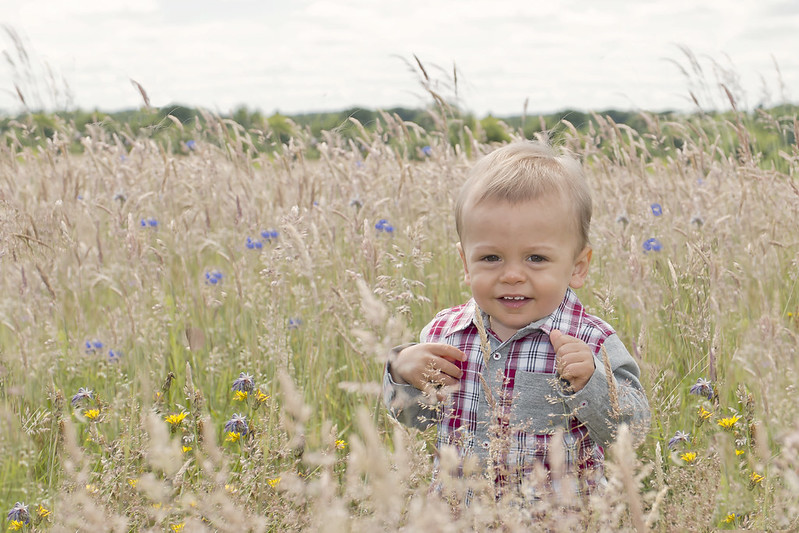
Took this a couple of weekends ago, at a local spot which normally has more flowers. Maybe I went later in the summer previously, I can't recall. More grass than flowers, but quite pleased with how this one came out.
Flash used for fill, shot in raw and processed in ACR, PS and DxO Optics Pro 8 (just wanted to try this really, as a free download was available).
 IMG_4365_DxOe3 by Ian J Bradshaw, on Flickr
Would be interested to hear/read what people think.
Thanks for looking!
Flash used for fill, shot in raw and processed in ACR, PS and DxO Optics Pro 8 (just wanted to try this really, as a free download was available).
IMG_4365_DxOe3 by Ian J Bradshaw, on FlickrWould be interested to hear/read what people think.
Thanks for looking!
 IMG_4365_DxOe4
 IMG_4373
 IMG_4338
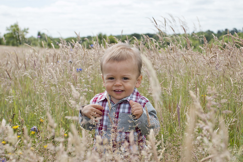 IMG_4365
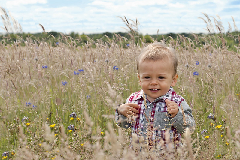 IMG_4365_DxOe5
 IMG_4365_DxOe6