Tate Modern and the Millennium Footbridge

For me the processing has over-cooked the image and both exagerated the noise and introduced some halos ... personally I would have another look at it and reduce the processing (just my opinion :) )
 
For me the processing has over-cooked the image and both exagerated the noise and introduced some halos ... personally I would have another look at it and reduce the processing (just my opinion :) )

My opinion too - you're not alone.
 
Yes, you're right, although the original has quite a low noise it does display some edge effects which seem to have been emphasized during the upload - either by Flickr or by the link to TP.
I've seen people complain about Flickr affecting their images in the past.
I have a different version of the same shot, so give this a try.
There is a highlight under the RH side of the nearest bridge support which looks like a halo, but is just a reflection of the floodlight.

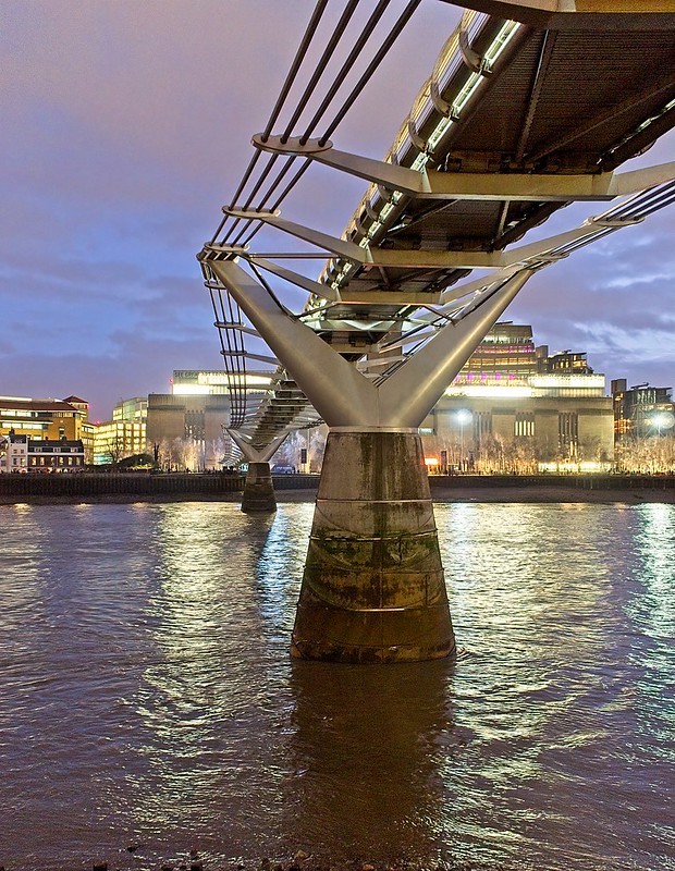
Tate Modern & Millenium Bridge by Brian Gibson, on Flickr
 
That looks much better. I'd probably up the contrast or drop the exposure a touch to add a little more density, but otherwise works for me.
 
I like it its a good composition. Drop the shadows and that should hide most of the noise and you'll just be about there (y)
 
Back
Top