
- Messages
- 695
- Name
- Alan
- Edit My Images
- Yes

Nailed it")
Very good.
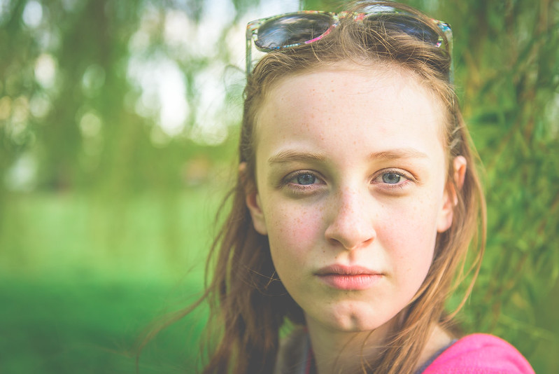
Love it. Great connection, nice catch lights, like the composition, can still see the detail in the freckles, good DOF choice for the background. [emoji106][emoji106][emoji106]
I guessing by the way you've cropped this so tightly that you already know this - her eyes are quite low in the frame. A real shame as it's quite nice otherwise.
 Girl in the park re-edit by Alan Cook, on Flickr
I prefer the first edit. I think the glasses add more than the height of the eyes in the frame takes away.There isn't much room to move as I wanted her glasses in the shot however I do agree now you've pointed it out. The only way I can move her up is to crop her head, something to think about for next time.
Thanks for commenting
I prefer the first edit.

The rule of thirds are a guideline for a reason. This image woukd benefit from following those guidelines, as Alan's second edit demonstrates.

As Alan stated though he wished to have the glasses in the shot though.
It's all down to artistic choice though Ryan, rule of thirds is a starting point.
For me it's not so much about the rule of thirds as about balance. She needs some space below her chin to balance.
Thanks for all the comments, I tried to fill the viewfinder when I was taking the shot ...

Never the best idea with anything other than a bog-standard composition unless the limitations of your camera preclude much cropping later
However, FWIW I reckon the first one's a very decent snap indeed, but if it was mine and I wanted to go for effect, I'd keep the aspect ratio and go even tighter than your second crop, thus ...
Be that as it may, I guess it's just me who doesn't rate the processing ... ?
Really liking that crop!

 The look