

You are using an out of date browser. It may not display this or other websites correctly.
You should upgrade or use an alternative browser.
You should upgrade or use an alternative browser.
Critique The Plasterer
- Thread starter cargo
- Start date
- Messages
- 8,309
- Name
- Ian
- Edit My Images
- No
Why do you think it didn't work out?
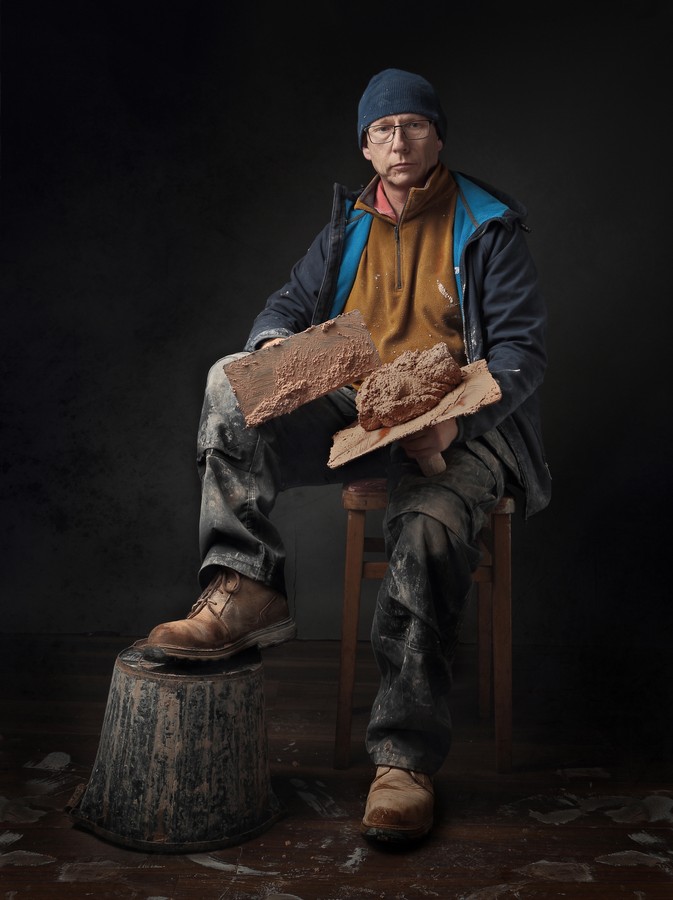
The only incongruity for me is the contrast between the mucky plasterer and your ultra clean background. I'm guessing you tried to "dirty" up the floor, but you missed a patch behind the subject?
I think this would have worked much better a) with the existing background, but without the bucket and plastering props, or b) leaving it all in, but taking the pic in an environment more suited to your subject. It feels like it's trying to bridge two worlds and doesn't feel at home in either (to me!)
I love the lighting, composition and pose. As a formal portrait it works really well but personally I like to see expression on a subject's face. That's very much a personal thing though and I don't think it detracts from your shot at all. I also love the colours in there too. A portrait that benefits from being in colour I think.
Nice work.
Last edited:
Mr Badger
Didymus
- Messages
- 7,457
- Edit My Images
- No
Not keen on the 'old master meets new plaster' type look. Unless producing a set of manual workers in an out of context formal portrait background as an 'art project', I think a single shot of one doesn't really work; as a single shot I'd much rather have seen that chap posed like that against a contextual background of a newly or partially plastered wall on a building site. I think Martin Parr is particularly good at contextual portraits like that, when he's not doing his more quirky stuff.
Last edited:
- Messages
- 104,470
- Name
- The other Chris
- Edit My Images
- Yes
The thing that strikes me is that he is sitting down, I bet he never sits down with the float in his hand. So either sat down with a brew or stood with the float/hawk. Overall though it is a well executed photo and a good portrait in your style.
- Messages
- 3,099
- Edit My Images
- Yes
I'm afraid it doesn't work for me as I've never seen a plasterer dressed as an outside builder. If there had been a pile of bricks and a trowel instead of the stool and float, then it would have been different. Plus that bucket would probably be upright seeing's he has plaster on the go.
Hi IanWhy do you think it didn't work out?
The only incongruity for me is the contrast between the mucky plasterer and your ultra clean background. I'm guessing you tried to "dirty" up the floor, but you missed a patch behind the subject?
I think this would have worked much better a) with the existing background, but without the bucket and plastering props, or b) leaving it all in, but taking the pic in an environment more suited to your subject. It feels like it's trying to bridge two worlds and doesn't feel at home in either (to me!)
I love the lighting, composition and pose. As a formal portrait it works really well but personally I like to see expression on a subject's face. That's very much a personal thing though and I don't think it detracts from your shot at all. I also love the colours in there too. A portrait that benefits from being in colour I think.
Nice work.
Thanks for your detailed reply it really does make it worthwhile uploading an image for critique.
I was thinking it had not worked out as I was going for an old sort of painterly look " not just lifted blacks" in post as seems to be what folk do. Just didnt feel the light was giving me that. I'm no expert at lighting but enjoy trying.
I left out the minor detail that it is me in the photo, yes I am a Plasterer so I guess it's a selfie, unfortunatly the messy floor was made in error, turns out it's not that easy to dash over on a 10 second timer "many times" whilst holding the hand board/hawk and try to pose.
That said it don't matter if it were me or not your points are all valid.
Am I reading point "a" as the image would have been better with me in the frame and no hint of plastering other than my workwear ?
I agree the image would look great taken in the usual enviroment I'm found working in.
Thanks Dan.I like it, but I suppose I would love to see it with a newly plastered wall as a background, a corner perhaps.
I get ya. The corner thing would be great I would not have thought of that.
Hiya.Not keen on the 'old master meets new plaster' type look. Unless producing a set of manual workers in an out of context formal portrait background as an 'art project', I think a single shot of one doesn't really work; as a single shot I'd much rather have seen that chap posed like that against a contextual background of a newly or partially plastered wall on a building site. I think Martin Parr is particularly good at contextual portraits like that, when he's not doing his more quirky stuff.
Thanks for your feedback. Really appreciate it.
Thanks Chris.The thing that strikes me is that he is sitting down, I bet he never sits down with the float in his hand. So either sat down with a brew or stood with the float/hawk. Overall though it is a well executed photo and a good portrait in your style.
Your quite correct it's pretty much none stop the day is over quick. The plaster dictates brew times which often differs from the other trades.
Hiya.I'm afraid it doesn't work for me as I've never seen a plasterer dressed as an outside builder. If there had been a pile of bricks and a trowel instead of the stool and float, then it would have been different. Plus that bucket would probably be upright seeing's he has plaster on the go.
No problem it's not working for you.
That said the clothing is standard clobber for all trades these days especially this time of year working on empty properties/ extensions etc.
There once was a time Plasterers whore whites even ties...... them days have long since gone.
Yes I agree this bucket would be the other way up, containing my troweling up water and brush if in an eviromental setting.
Thanks for your feedback it is appreciated
Gaz
Last edited:
- Messages
- 8,309
- Name
- Ian
- Edit My Images
- No
turns out it's not that easy to dash over on a 10 second timer "many times" whilst holding the hand board/hawk and try to pose.
I lol'd when I read this. I can barely do selfies with a timer when I have nothing to mess about with! Considering it's a selfie, I think you have done exceptionally well with the lighting. I think the "look" you have decided on works really well. I think it's quite natural and doesn't have an "effect" to it. I think it would probably look really nice as a print.
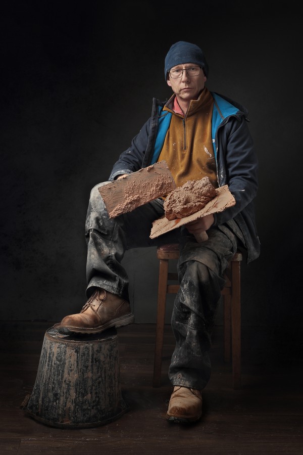
I'm not sure now how it would look with a clean floor. It's the contrast between floor and background that doesn't work. I'm thinking with a clean floor perhaps it would be ok...
I'm not sure now how it would look with a clean floor. It's the contrast between floor and background that doesn't work. I'm thinking with a clean floor perhaps it would be ok...
I agree I see what you mean. The first ones I took will have a clean floor. It got messy the more times I ran to press the shutter.
Encouraging that the feel/look seems to work ok.
Gaz
@Harlequin565
Hiya.
I have time on my hands.
Thought I would see what your suggestion looks like I blended the floor in from one of the earlier shots not cleaned it up fully.
What do you think better or worse ?
Gaz
Hiya.
I have time on my hands.
Thought I would see what your suggestion looks like I blended the floor in from one of the earlier shots not cleaned it up fully.
What do you think better or worse ?
Gaz
Last edited:
- Messages
- 8,309
- Name
- Ian
- Edit My Images
- No
I think it's better. Would still prefer it in the environment, but I quite like this. I do like the soft lighting which would probably be lost in a bare plastered wall & concrete floor scenario. I just think it would be a totally different photo. So taking this on its own merit, I think it works well, and as I said before, would probably look really nice as a print on a high quality cotton rag. A nice present for the (grand)kids perhaps? ")
Hiya. Thanks for coming back to me on this. I know it's only for fun but I need the feedback to learnI think it's better. Would still prefer it in the environment, but I quite like this. I do like the soft lighting which would probably be lost in a bare plastered wall & concrete floor scenario. I just think it would be a totally different photo. So taking this on its own merit, I think it works well, and as I said before, would probably look really nice as a print on a high quality cotton rag. A nice present for the (grand)kids perhaps?
I agree an Insitu photo would look great but I'm not that confident to be doing this on any of my jobs.
In my own little shed I'm fine with.
I'll take your word for it print wise it's not something I would have thought to do.
Cotton rag ? I only use dscl on the odd occasion I get anything printed. Normally there lustre paper.
Gaz
- Messages
- 8,309
- Name
- Ian
- Edit My Images
- No
Cotton rag ? I only use dscl on the odd occasion I get anything printed. Normally there lustre paper.
If you want to mail me a link to a high rez version I'll do you an A4 and send it in the post. My printer needs working out once a week anyway. If not, get it done on the Photo Rag. (https://dscolourlabs.co.uk/category/150-professional-hahnemhle-fine-art-gicle-prints)
Don't mind me, I just think that the print should be the final output of any piece of work.
sk66
Advertiser
- Messages
- 8,674
- Name
- Steven
- Edit My Images
- Yes
There's a lot to like about this image; I would certainly put it well above average. The incongruities aside, there are a couple things technique wise I think could probably be a little better.
In terms of lighting, I think it's a bit too soft for what you were going for. If it was a bit higher/farther the Rembrandt lighting would be more defined, the light would have lifted the BG a bit more, and the near knee/foot would be a bit less hot comparatively.
The camera position being at/below mid, looking up, and pretty close, is causing a foreground emphasis (feet/shins/hawk) that seems a bit off. An upward angle is used to impart a sense of size/dominance/masculinity; but it doesn't work the same if the pose/perspective is causing the upper body/head to recede.
Hi Steven.There's a lot to like about this image; I would certainly put it well above average. The incongruities aside, there are a couple things technique wise I think could probably be a little better.
In terms of lighting, I think it's a bit too soft for what you were going for. If it was a bit higher/farther the Rembrandt lighting would be more defined, the light would have lifted the BG a bit more, and the near knee/foot would be a bit less hot comparatively.
The camera position being at/below mid, looking up, and pretty close, is causing a foreground emphasis (feet/shins/hawk) that seems a bit off. An upward angle is used to impart a sense of size/dominance/masculinity; but it doesn't work the same if the pose/perspective is causing the upper body/head to recede.
Thanks for taking the time to critique this for me.
I must admit I do struggle with the finer details of lighting. I am not sure nor can I often tell the differance between harder/softer lighting. Obviously really hard small light sources I can tell but minor stuff very much harder.
Plus I guess you tend to light things in a similiar fashion most times, especialy when you have had descent results before.
That said I have looked back at the images from that day and I did take the front diffusion panel from the box at some point and the image above was chosen from those.
I can see those are a little more contrasty but not much. Higher would be better I suspect.
Camera Position.
I can see exactly what you mean, you have explained it really well. Something else to consider for the next time.
Thanks again.
Gaz
Thanks IanIf you want to mail me a link to a high rez version I'll do you an A4 and send it in the post. My printer needs working out once a week anyway. If not, get it done on the Photo Rag. (https://dscolourlabs.co.uk/category/150-professional-hahnemhle-fine-art-gicle-prints)
Don't mind me, I just think that the print should be the final output of any piece of work.
Thats very kind of you.
You helped me out once before when I enquired in the printing section.
I can't let you print images for nothing.
Although it was never intended to be printed, it would feel vain and I am as far away from that as could be possible......
That said you have made me wonder what it would look like printed, you seem to print quite frequently and must have an experianced eye as to what prints pretty well.
I would be more than happy to send you a link if you would allow me to bacs you some money as payment.
Thanks
Gaz
- Messages
- 8,309
- Name
- Ian
- Edit My Images
- No
That said you have made me wonder what it would look like printed, you seem to print quite frequently and must have an experianced eye as to what prints pretty well.
Not at all. I enjoy printing, and my own work just isn't that good.
sk66
Advertiser
- Messages
- 8,674
- Name
- Steven
- Edit My Images
- Yes
It's much easier for me to see/evaluate/critique after the fact... I have my share of issues when it comes to getting it right at the timeI must admit I do struggle with the finer details of lighting. I am not sure nor can I often tell the differance between harder/softer lighting. Obviously really hard small light sources I can tell but minor stuff very much harder
. FWIW, shooting tethered really helps (big screen), especially if doing a self portrait.I had a quick go at editing it more towards what I was thinking/describing. I think removing some of the relative brightness from the leg/foot has helped decrease the emphasis there due to camera position/angle. Just looking at the image here it might look basically the same; but if you put the images side by side the difference is significant IMO.
FWIW, I prefer the character of the dirty floor, just needs some character/texture to the wall as well.

Last edited:
Hi NeilI would be more than pleased to have taken it. If there's an issue - and I'm not sure if it's me missing a point - it's in the emphasis on the lower legs and boots. Why are those key to a plasterer?
Thanks for your feedback. I had not realised that the lower view point would put more emphasis on the lower regions of the image or I should say the nearest thing to the lens.
Oh yes I see the differance straight away. Thanks for the edit and description it helps no end.It's much easier for me to see/evaluate/critique after the fact... I have my share of issues when it comes to getting it right at the time
I had a quick go at editing it more towards what I was thinking/describing. I think removing some of the relative brightness from the leg/foot has helped decrease the emphasis there due to camera position/angle. Just looking at the image here it might look basically the same; but if you put the images side by side the difference is significant IMO.
FWIW, I prefer the character of the dirty floor, just needs some character/texture to the wall as well.
Gaz