

- Messages
- 671
- Name
- Nigel
- Edit My Images
- Yes
And so it begins playing catch up again ") ....
....
Week 0 Song title or lyrics
Hammer time
 w-Week-0-Hammer-time by Nigel Proctor, on Flickr
Week 1 Ordered spices
 w-Week-1-ordered by Nigel Proctor, on Flickr
....Week 0 Song title or lyrics
Hammer time
w-Week-0-Hammer-time by Nigel Proctor, on FlickrWeek 1 Ordered spices
w-Week-1-ordered by Nigel Proctor, on Flickr w-week-2-comfort
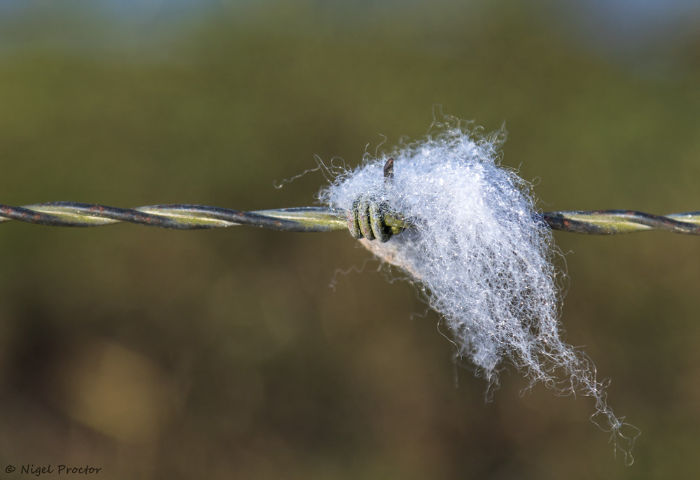 W-Week-3-Hairy
 w-week-4-smooth