

OP
- Messages
- 671
- Name
- Nigel
- Edit My Images
- Yes
Week 19 Architecture - Two for me on this theme, a church and something a bit abstract which is probably a bit of a shoehorn ") .
.
Church
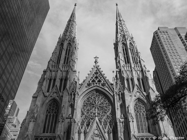 w-church by Nigel Proctor, on Flickr
Iron works
 w-blue-wall by Nigel Proctor, on Flickr
.Church
w-church by Nigel Proctor, on FlickrIron works
w-blue-wall by Nigel Proctor, on Flickr w-broken
 w-super-street
 w-Minimalistic
 w-progress
 w-fly
w-fly w-black-fly
 w-tiny
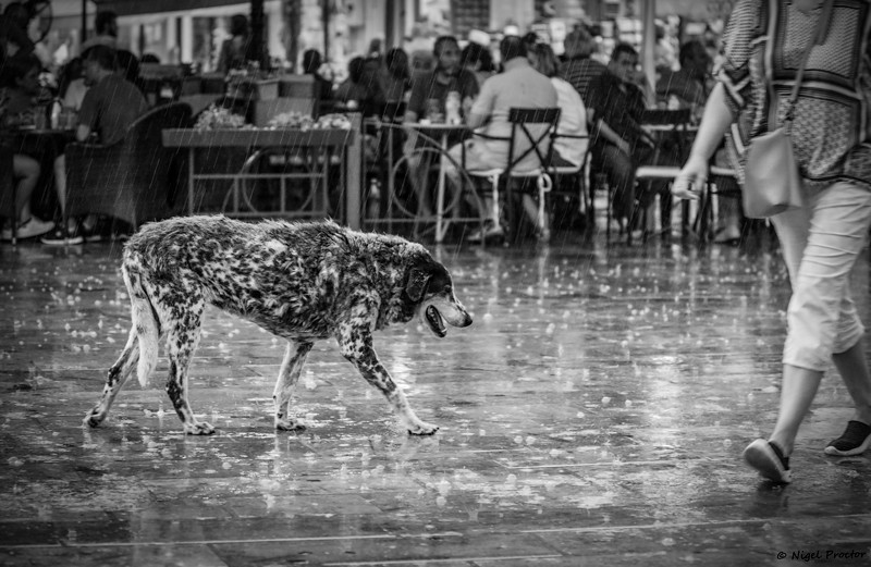 w-wet-dog
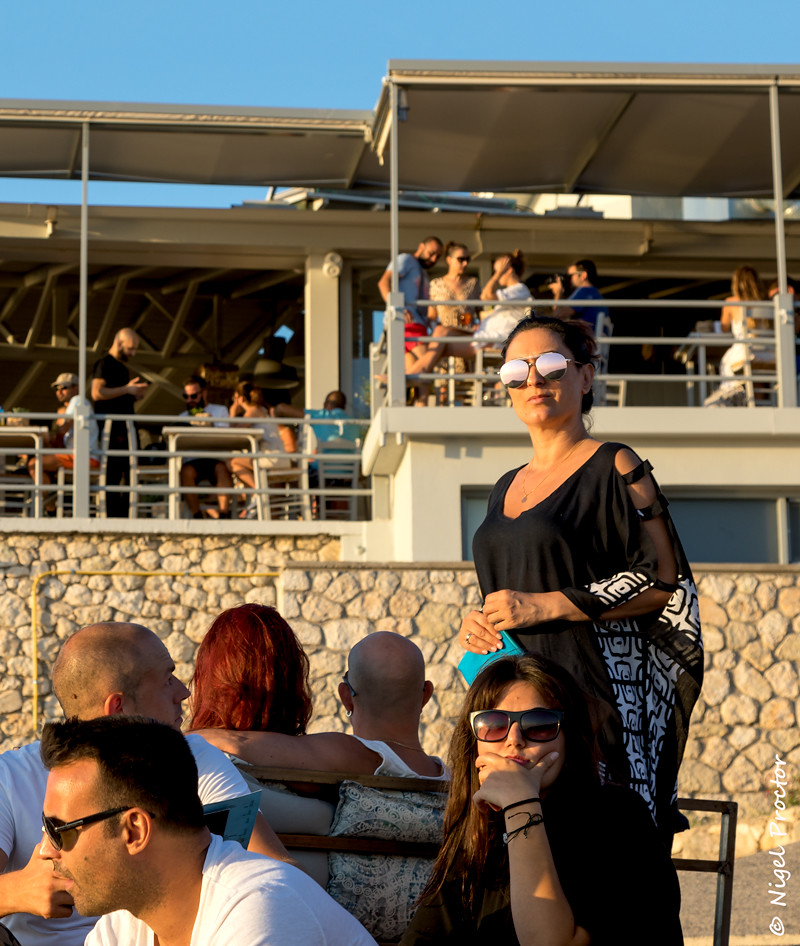 w-faces
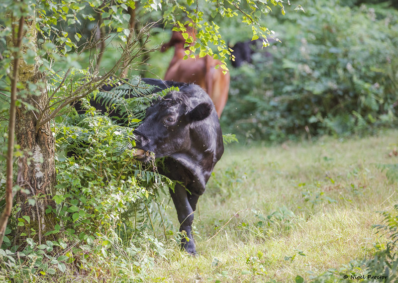 w-Bull
 w-flying-bee
 w--fruit-cocktails