weekly Tillys 52 for 2018 Week 29 Round

Looks like quite a bright day, I'm pleased you used a high enough shutter speed to retain the energy of the water, rather than going for the smoothed out look.
No problem with the tree here, it's part of the scene and doesn't distract, it's just hiding part of the dry part of the waterway, so we're not missing anything much.
 
Don’t mind the tree just not sure it’s the best viewpoint, of course I have no idea never having been there, although saying that it is on theme
 
Straight - works well for the theme, as you say shame about the handrail.
Unattractive - thats a different take on the theme and I like it, swindon town centre has something similar and they are an eyesore.
Shadow - interesting sculpture, image is bang on for the theme.
Beautiful - can't really fault a nice shot of some tree blossom with a nice bright blue sky to make the blossom pop from the BG.
Low - good take on the theme.
 
Sorry, I can see what you were going for with low but it's really not conveying the message for me.
 
Week 19 Match
I had an idea in my head that I'm still trying to get right for this one. I wanted it to look old fashioned in colour but I haven't got it right yet so here's the shot in normal colour.
Match by Craig Tillotson, on Flickr
 
Thanks for the advice Tim, I'll check it out over the weekend
 
Thanks Chris
 
+1 for the edit, great colours and vintage feel!
 
Nice to see the olde box and rustic wood, but more matches detail would be good. :)
 
Week 20 Music
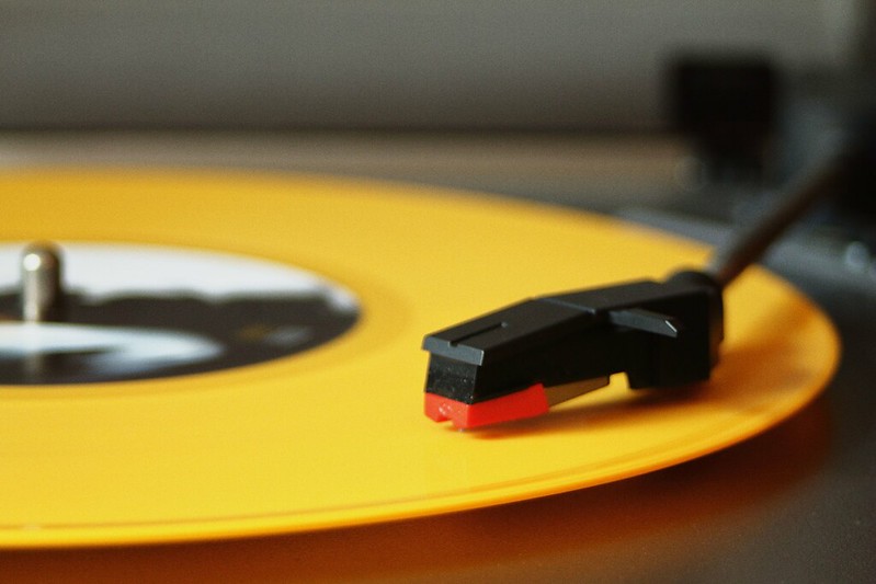
Tried a few different shots of my stereo and deck this week and this was the angle I liked most. I added a film effect filter using the Nik Collection as I liked how it brought out the colour and I like the bit of grain it adds too.
Music by Craig Tillotson, on Flickr
 
I quite like the colours in your music shot, but I would like to see more texture! The record looks completely smooth in this picture... But great light, great colours and great composition!
 
Maybe the record was spinning?

Nice shot either way :)
 
The record was spinning when I took the shot. I never considered it might look better if it wasn't as I was focusing on the needle holder
 
Week 21 Hard & Week 22 Creatures
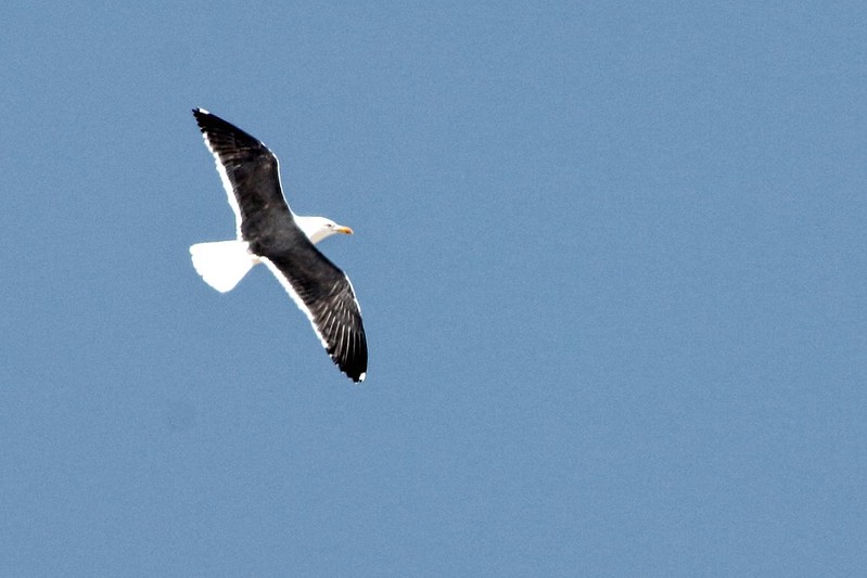
On the catch-up at the moment I've had a busy few weeks. Took these 2 at the beach while on holiday last week and while hard wasn't too hard to do :) I've never really tried to photograph birds in flight so it was quite a challenge so any advice would be welcome
Hard by Craig Tillotson, on Flickr
Creature by Craig Tillotson, on Flickr
 
Liking the rock on the beach, though it is a little too central for me.

The gull, it's a little oof, but I do like the overall composition of it. Your exposure was 640th at f11, I would have gone for a wider aperture, no more than f8 and had a faster shutter speed. It's not easy, but I would say it's a good first try. Exposure is quite good, sometimes if light is awkward add around of 1stop extra to help keep detail in the birds plumage. Gulls are great for practising on. Keep trying!
 
For the rock on the beach might work better with a more contrasting coloured rock but we have to work with what we've got.

Not that I'm any kind of expert but from my attempts I think birds in flight are just plain hard and are helped by a lot of very expensive gear and getting close, stick at it, like most things I'm sure practice makes a big difference
 
I like the idea and the bold colours in Music, Tilly; the colours and the crop work really well. Another good idea for Hard and you've made perfect use of shallow DOF to draw the eye straight to the subject, and I agree that birds in flight are difficult so this is a good first try and the high contrast, grainy look suits it well.
 
Hi Tilly,

Hard - almost has a feel about it that you can't judge the size. I'm afraid to say that the background is what draws my eye though. it has an almost starburst look at about 10 O'Clock from the stone (at lest to me).

Creature - I don't do BIF, but other than that they are smaller, I guess it's similar to aircraft. There is something not quite right with the exposure, the sky has that typical 7Dmk1 look to it, where it's noisy even though by rights it shouldn't be. I mean, ISO 200, that noise shouldn't be there :/ I always got that effect with my 7D, other sensors are more forgiving. Blue is apparently a sod like that.
 
Hi Craig

Beautiful, Nice detail in the flowers against the blue sky. I would like to think that you could have taken it from another angle so the OOF leaves are not in the Image. As another blossom against the blue sky I can't help but like it.

Low, Interesting picture, I have not seen anything like that on such a scale, there are some much smaller ones on the local canal. Tree is okay with me, perhap I would have gone wider if possible to make it more impressive. I checked google for other Images.

Match, 2nd processed image does not improve it for me. It's a box of matches so on theme.

Music, I like the colours and layout but most of the detail we know is there is missing.

Hard, rather uninspiring stone in the wrong place. Detail before and on stone, but none behind it. I like the colours but that is it.

Creatures. A better Image, but a lot of noise in the sky, looks like a heavy crop due to the size of the dust spot just underneath the seagull.


Pete
 
Thanks for the comments guys
 
Week 23 and 24
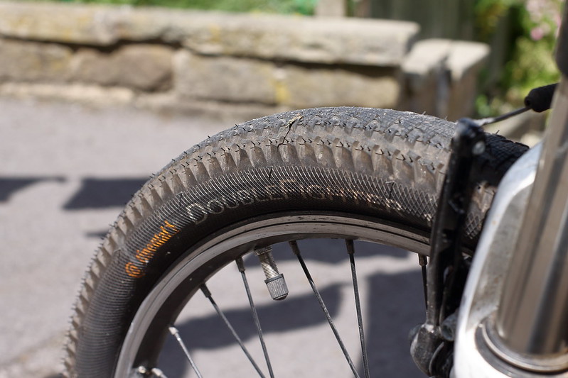
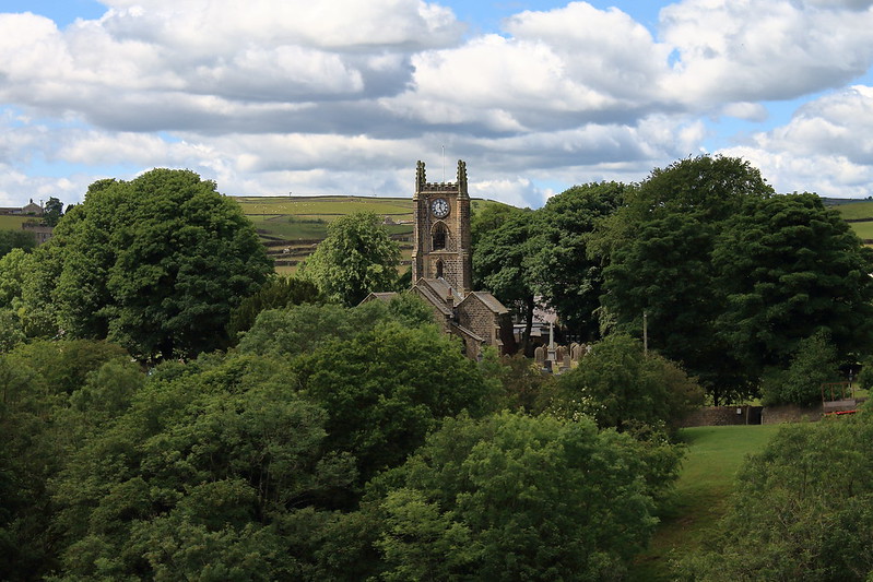
On a bit of a catch-up here. I found synthetic a hard one to find so ended up with some synthetic rubber but had more fun trying to find a rural shot as living in the countryside gave me lots of options.
Synthetic by Craig Tillotson, on Flickr
Rural by Craig Tillotson, on Flickr
 
Liking both those Tilly

Super bike tyre detail. And the church tower peeking out from all the greenness. (y)
 
agree with David both good for the themes the church nestled in the trees is nice
 
Good tire but I might have gone in closer to crop out the forks.
Rural with he church in the trees is really well seen and one of the best takes on that theme so far I think.
 
Synthetic
That looks good to me.

Rural
Well exposed and an interesting sky. I think the church is a little bit central.
 
Synthetic - Good image, the way you've used the DoF leaves the viewer in no doubt what the subject of the shot is.
Rural - The stronger of the two imo, loving the blues, greens, clouds and the church.
Shame the clock face says 5.01 ;) :exit:
 
Thanks for the comments guys I appreciate them as always. It's always useful to know how a shot could have been done differently. I've never really done anything like the rural shot before and I like how it's come out, might have to try some more like it :)
 
Week 25 Bright
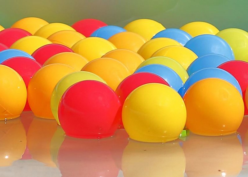
I was having trouble thinking of something for this theme until I walked through my yard and saw the kids paddling pool now had plastic balls in as well as the water. Nice work kids :)
Bright by Craig Tillotson, on Flickr
 
Week 26 Elegant
Headed out into the garden with my new extension tubes looking for the most elegant flower I could find for this weeks theme. Having never used extension tubes this week was a challenge within a challenge :). Here's what I came up with, comments are welcome as always, as I said this was my first go at this sort of photography.
Elegant by Craig Tillotson, on Flickr
 
Back
Top