

- Messages
- 656
- Name
- Jon
- Edit My Images
- Yes
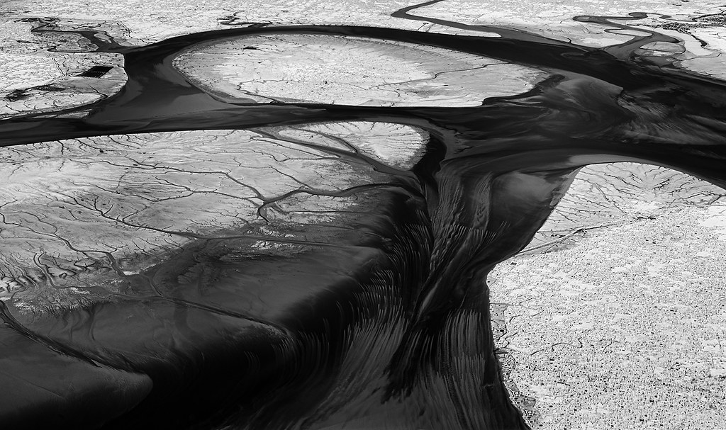
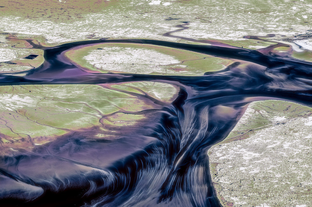
I've been reprocessing a lot of old aerial images recently, and would welcome an opinion on this one. It's a panorama from 4 shots taken on a K20D that was converted to IR at 830nm. As such, the original is mono. It is one of my favourite images, not due to any artistic reasons, but because it is the only IR image I have taken (or seen) that shows the bottom of a body of water in detail. It shows part of the Bay of Bengal, near Chittagong in Bangladesh. I decided to try tinting the image, which I did in Lightroom and Photoshop, by blending 3 copies set at different white balances and playing with the individual colour channels. The green areas show plant life, the darker areas are the seabed.
I would very much appreciate opinions on whether the tinted version works, before I perhaps waste time messing around with other 830nm images.
Here's the original image I posted on Flickr when I took the image
 Urirchar Island by Jon, on Flickr
And here's the tinted version
 Urirchar Island, Bay of Bengal (IR)by Jon, on Flickr
") But prefer the mono
But prefer the mono