

Hello everyone, new here but thought I'd throw some photos up for your opinions.
Two ICM shots from a rare and brief visit to the coast last month, it was originally a set of three but one was a bit 'filler'.
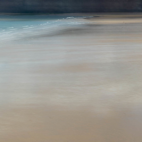
Coastal Colour III by Chris Dale, on Flickr
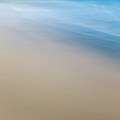
Coastal Colour I by Chris Dale, on Flickr
Two ICM shots from a rare and brief visit to the coast last month, it was originally a set of three but one was a bit 'filler'.
Coastal Colour III by Chris Dale, on Flickr
Coastal Colour I by Chris Dale, on Flickr
")