For me, the first KF is a good solid perch shot - nice colours, good detail, nicely framed.
The heron shot, I'm not as keen on, the overall look of the frame is too dark, the bird is too central in the frame, and cropping the bright strip away from the top of the frame would help.
The last king has real potential. If you have some more negative space to the right of the bird I would add that, cropping away the distracting stalks on the left, but keeping the framing really loose as you've done here. The head angle is beautifully angled slightly towards us. On a technical note, it looks like you've added a little bit too much noise reduction to the bird, leaving it a little 'smeared'.
I had a little play and had to bodge the background so its not as neat as if you did it, but maybe something along these lines?
View attachment 251586
Mike


")
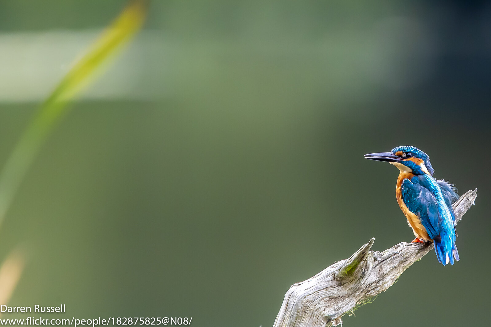 _G0I3343 2 by Darren Russell, on Flickr
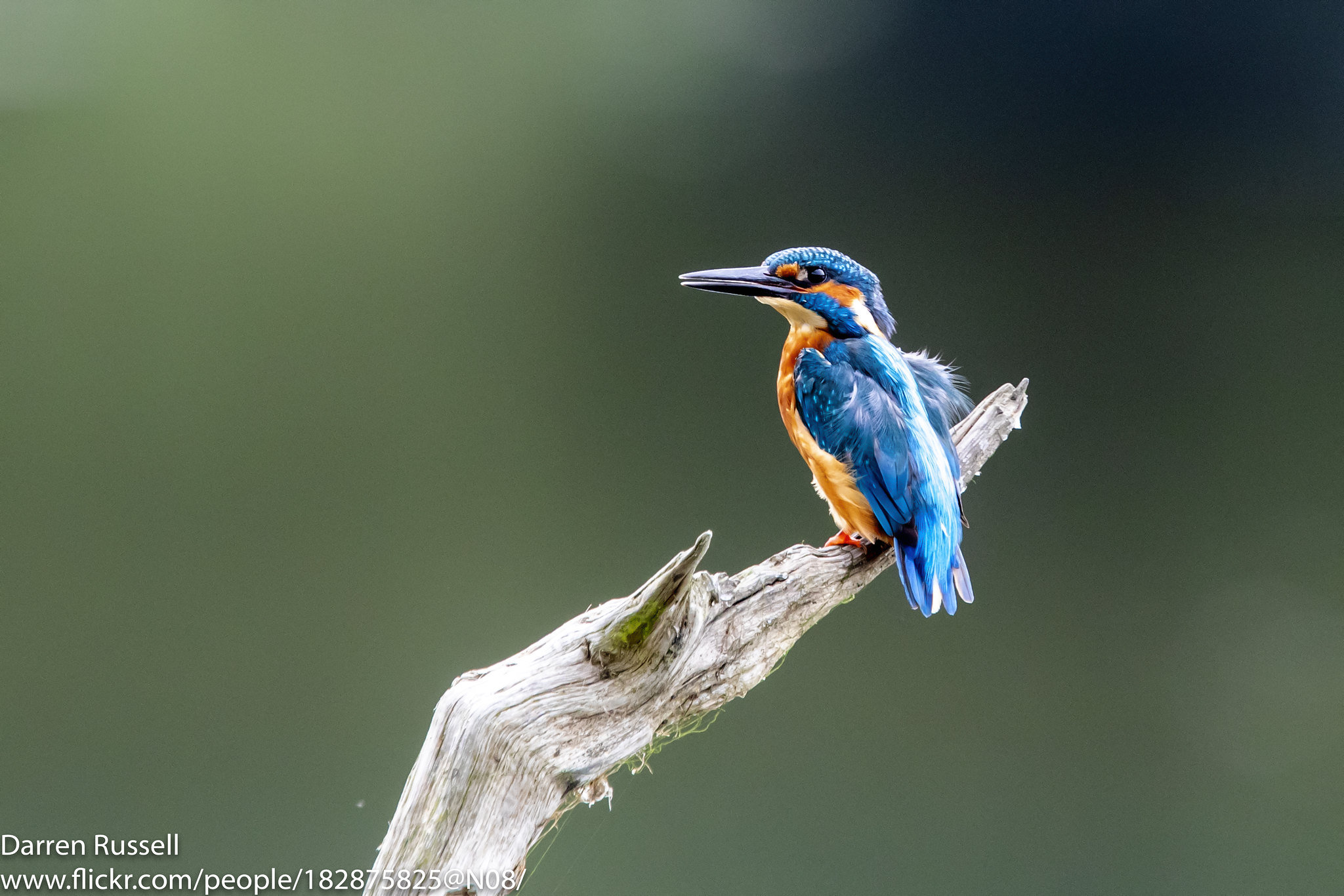 1 by Darren Russell, on Flickr