

You are using an out of date browser. It may not display this or other websites correctly.
You should upgrade or use an alternative browser.
You should upgrade or use an alternative browser.
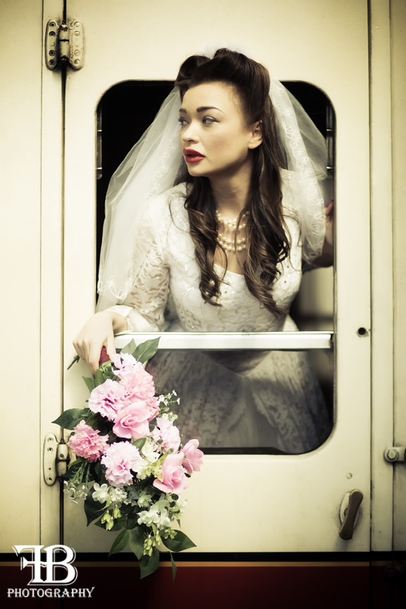
Vintage Bride
- Thread starter Fionab
- Start date
D
Deleted member 34016
Guest
I love them all - the PP is rather good in my humble opinion
Les
Les
OP
- Messages
- 1,602
- Name
- Fiona
- Edit My Images
- Yes
pp is meant to be different in all of them but all the PP imho has a vintage feel. i hate images all processed the same way it IMO makes them boring.
as in the OP we were meant to have a male model but he didint turn up so on the spot thinking got us to abandoned.... before or after is up to the viewer i dont believe in spoon feeding a story - i like to allow the imagination to kick it..
thanks everyone comments appreciated.
as in the OP we were meant to have a male model but he didint turn up so on the spot thinking got us to abandoned.... before or after is up to the viewer i dont believe in spoon feeding a story - i like to allow the imagination to kick it..
thanks everyone comments appreciated.
OP
- Messages
- 1,602
- Name
- Fiona
- Edit My Images
- Yes
should clarify that none of few of my images are meant to go together as a set in any real terms if this was the case the images would indeed have simlar processing to gel them, but i usually only use in seriousness one at a time of any given shoot so they dont and are not meant to sit together in a set other than just being taken on the same shoot. ( hope that makes sense)
shreds
Slushy
- Messages
- 1,575
- Name
- Ian
- Edit My Images
- No
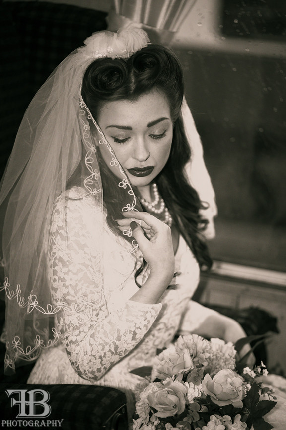
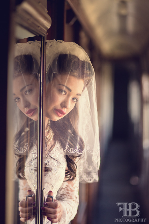
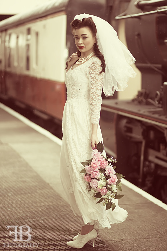
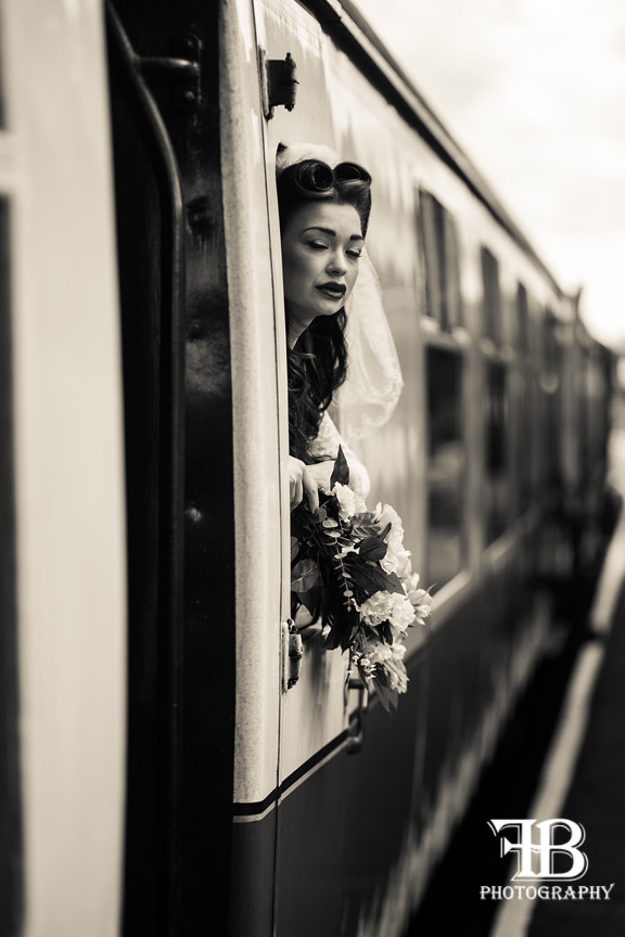
2, 3 & 5 for me. Really rather like the differing effects, especially as they are not 'a set'.
Probably No 4 is the weakest, too much background distraction.
Not sure she looks abandoned, more 'going away' though, she doesn't look distraught enough to be 'abandoned'.
Probably No 4 is the weakest, too much background distraction.
Not sure she looks abandoned, more 'going away' though, she doesn't look distraught enough to be 'abandoned'.
- Messages
- 9,818
- Edit My Images
- No
Very nice processing, but I can't decide if you're going for a '40s or '50s theme. The style suggests '40s, the location says '50s, the model's posture and expression says modern day (not that there really seems to be much animation/emotion in her expressions).
I think the fifth is the most interesting, do you have a version without the flowers?
I think the fifth is the most interesting, do you have a version without the flowers?
shreds
Slushy
- Messages
- 1,575
- Name
- Ian
- Edit My Images
- No
Very nice processing, but I can't decide if you're going for a '40s or '50s theme. The style suggests '40s, the location says '50s, the model's posture and expression says modern day (not that there really seems to be much animation/emotion in her expressions).
I think the fifth is the most interesting, do you have a version without the flowers?
The carriages are 1950s+, the models' look to me is late 1940s, but the ankle boots are definitely 2015! [pedant mode off]
")
Last edited:
- Messages
- 25,287
- Name
- Phil
- Edit My Images
- No
They're gorgeous (*except no2) but I'd prefer consistent processing, if they're a 'set' they should look like one IMO. No 5 is my favourite though, the light is superb (although her hand is a little 'hot' if I'm being really picky).
*the harsh flash shadow completely spoils it for me.
*the harsh flash shadow completely spoils it for me.
OP
- Messages
- 1,602
- Name
- Fiona
- Edit My Images
- Yes
not sure how an expression can be modern day, looking sad and "down" was the theme we went for given that we had to change things due to unprofessional male model... anyway... no sorry i dont have a version without the flowers .Very nice processing, but I can't decide if you're going for a '40s or '50s theme. The style suggests '40s, the location says '50s, the model's posture and expression says modern day (not that there really seems to be much animation/emotion in her expressions).
I think the fifth is the most interesting, do you have a version without the flowers?
OP
- Messages
- 1,602
- Name
- Fiona
- Edit My Images
- Yes
lol did the best i could given that i wasnt going to spend in the region of £100 for 40s style bootsThe carriages are 1950s+, the models' look to me is late 1940s, but the ankle boots are definitely 2015! [pedant mode off]
OP
- Messages
- 1,602
- Name
- Fiona
- Edit My Images
- Yes
They're gorgeous (*except no2) but I'd prefer consistent processing, if they're a 'set' they should look like one IMO. No 5 is my favourite though, the light is superb (although her hand is a little 'hot' if I'm being really picky).
*the harsh flash shadow completely spoils it for me.
as i already explained they are NOTa set they just all happen to be from the same shoot. which is why the processing is different.
OP
- Messages
- 1,602
- Name
- Fiona
- Edit My Images
- Yes
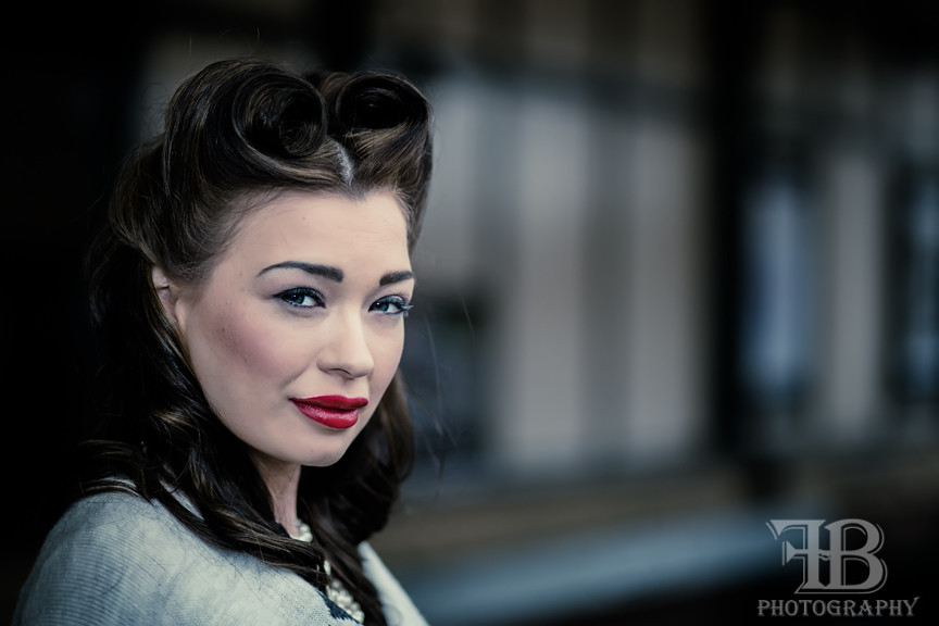
the only one i lit was #2 the rest are all natural lghtThese look very cool to me. Really like number 1 so this would be my fave just really like the cold tones along with thst warm red lippy and pale face.
All great to view though.
If you don't mind telling. Did you light them all ?
Gaz
Thanks Fthe only one i lit was #2 the rest are all natural lght
Gaz
- Messages
- 9,818
- Edit My Images
- No
storyline was meant to have a male model but he let us down so we went with the abandoned bride one.....
should clarify that none of few of my images are meant to go together as a set in any real terms
looking sad and "down" was the theme we went for given that we had to change things due to unprofessional male model...
I know you're experimenting with different processing across the images, but a themes shoot presented as a group will always be taken as a set by viewers and the opening post suggested a storyline which would indicate a themed set of images to be taken together.as i already explained they are NOTa set they just all happen to be from the same shoot. which is why the processing is different.
I'm afraid the model has got the modern "pouty" look down to a tee, and I'm not seeing "sad" or "lonely" in any of her expressions. Which may be a good thing, no woman I know would look sad or lonely at being stood up on the platform - I'm pretty sure my partner would be alternating between worried/concerned and seriously pi$$ed off*not sure how an expression can be modern day, looking sad and "down" was the theme we went for given that we had to change things due to unprofessional male model... anyway... no sorry i dont have a version without the flowers .
I think that's why the fifth one works the best, there's a hint of concern and at the same time an impression of whether he comes or not, she's taking that train and going.
The processing is good (although like Phil I'm not keen on the lighting in #2), it's the posing and expressions that let things down.
* with an emphasis on the p'd off.
OP
- Messages
- 1,602
- Name
- Fiona
- Edit My Images
- Yes
I know you're experimenting with different processing across the images, but a themes shoot presented as a group will always be taken as a set by viewers and the opening post suggested a storyline which would indicate a themed set of images to be taken together.
I'm afraid the model has got the modern "pouty" look down to a tee, and I'm not seeing "sad" or "lonely" in any of her expressions. Which may be a good thing, no woman I know would look sad or lonely at being stood up on the platform - I'm pretty sure my partner would be alternating between worried/concerned and seriously pi$$ed off*
I think that's why the fifth one works the best, there's a hint of concern and at the same time an impression of whether he comes or not, she's taking that train and going.
The processing is good (although like Phil I'm not keen on the lighting in #2), it's the posing and expressions that let things down.
* with an emphasis on the p'd off.
actually she isnt pouting that is her lips. i never ever shoot models that trout pout Kirstie has lips that are naturally like that accentuated by unfortunately the red lip stick which is what would have been worn.
I actaully disagree i think her expression and poses are fab. its the old subjectivity in photography thing. im happy for folk to disagree but if i shot it again tomorrow i wouldnt pose her any other way.
it works for me and when i see them i feel her pain. and no a bride ditched would only be angry later when she had time to think . at the moment of her being ditched i think pain and unhappiness would be the foremost feeling. then of course she would kill him once she had got passed that........... that may be the next shoot actually cos as he really just didint turn up i may join her- Messages
- 5,275
- Name
- Ryan
- Edit My Images
- Yes
I like number 3 a lot. That's a cracking portrait (although were it me I'd have turned her head slightly so we see less whites of her eyes).
The weakest of the set is number 2. The lighting isn't good at all I'm afraid. It's very flat and very harsh.
I do understand you're reasoning that as individual pictures it's not necessary to have a consistent approach to the PP. But you also say that the set is supposed to tell a story of a jilted bride. So if there's a story to the set of pictures (and therefore they are to be viewed as a set) then I think consistent PP would have been the better route to take.