Waiting on the shore

Messages
23,520
Name
Toni
Edit My Images
No
We saw this woman wander down to the beach while we were walking along. Her clothes fit the colours of the environment, and she looked like a model from a 1960s catalogue. Apparently completely absorbed in her thoughts, we did our best not to disturb her or to get close and obviously point cameras in her direction, and in any case the greater environment was an important part of the image.

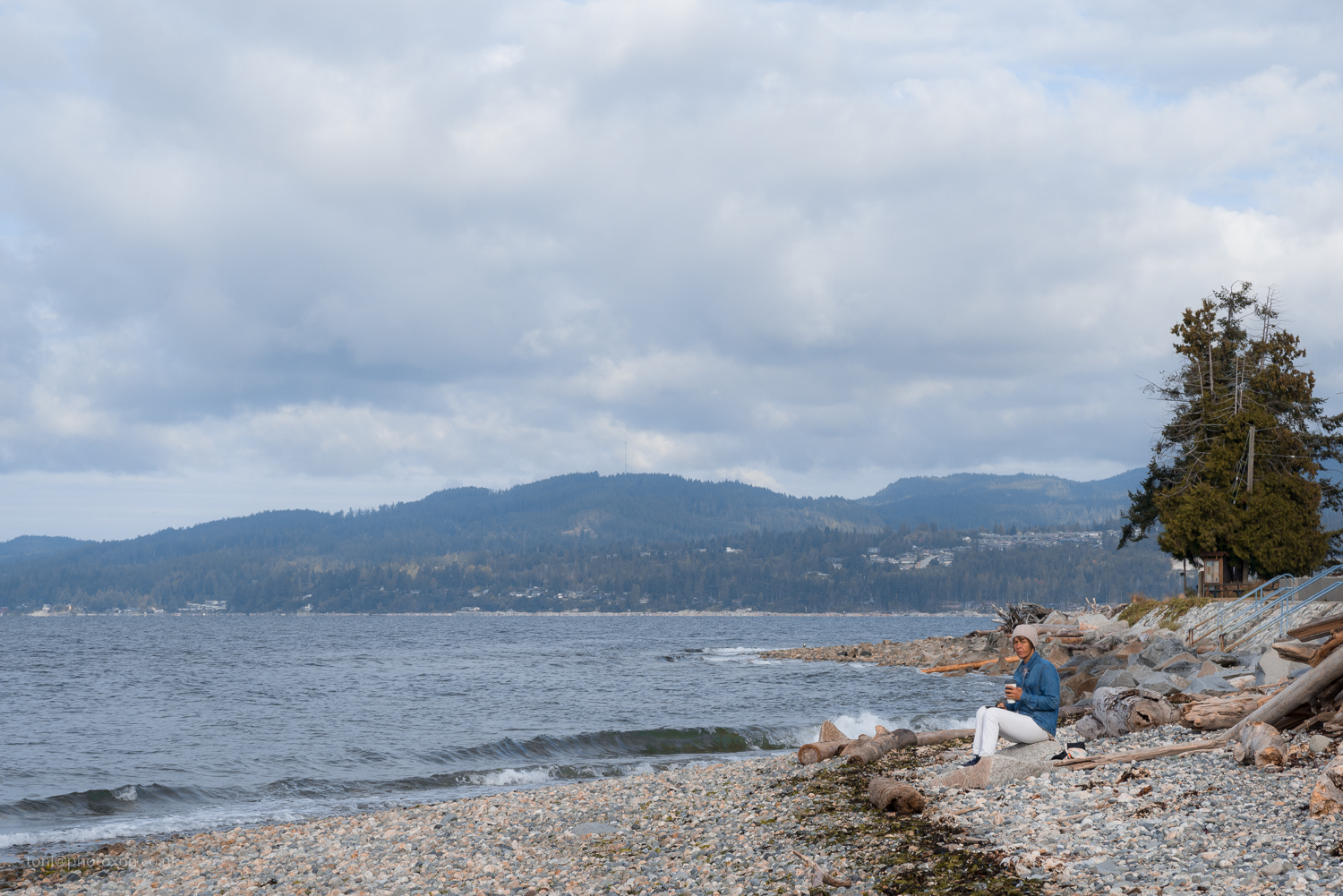
Waiting-4242 by Toni Ertl, on Flickr

Waiting-4245 by Toni Ertl, on Flickr

I've worked to keep the processing in sympathy with the 1960s/70s vibe, tweaking hues to effect an old colour film and rolling back the clarity. C&C welcome.
 
Last edited:
The subject feels a bit lost in the first one Toni. Really like the blue/white synergy going on, but it just doesn't quite manage it for me. Perhaps if you'd pulled round to the left and had her isolated from the water? And got in a bit closer? There's way too much sky in the image.

The second one is better (for me) compositionally, but the big dead tree & detritus on the right detracts from the overall serenity to the image. It obscures the water and limits the space and just looks untidy...

I think the idea is a great one - the vision is there - but it's not quite achieved in the final image(s), for me. Most of my comments are subjective though so as usual with me - take what you like & leave the rest.
 
Thanks Ian, comments very much appreciated. You're right that she's rather small in the images and they are cluttered as portraits go. I somewhat wish I'd had the cheek to go and ask if I could take a few shots.
 
I think that it's lacking a little punch and there's a slight magenta cast in the highlights. The log in the top one off her head is distracting but she is also scowling. I'd crop the first a little more so that she's in the bottom third. I did a quick rehash out of curiosity so there's a bit more punch in there.
 
I think that it's lacking a little punch and there's a slight magenta cast in the highlights. The log in the top one off her head is distracting but she is also scowling. I'd crop the first a little more so that she's in the bottom third. I did a quick rehash out of curiosity so there's a bit more punch in there.

Thanks for taking the time to both comment and experiement Kris, I really appreciate it. May well go back & do some re-cropping. Yep, she's scowling, possibley because of the irritating tourists walking up the beach taking pictures. ;)

There's a lot more punch that could be generated, but I was trying for a film-era look using greens pushed towards yellow and slightly crushed blacks as one might have seen in some magazines and even knitting patterns. :)

My take was a little filmic to my eye with some red added to the midtones. I'll send it to you if you like Toni as you have your no to editing thing ticked. I've used PS so not sure what you use, can send you the file if you do use that?
 
My take was a little filmic to my eye with some red added to the midtones. I'll send it to you if you like Toni as you have your no to editing thing ticked. I've used PS so not sure what you use, can send you the file if you do use that?

Hi Kris - you're welcome to post the image here if you like. I'm not precious about images, but just didn't want them always open to being changed. Thanks.
 
Here you go then. You might not like the contrast so much but I find it a bit like Portra pushed which I seem to be into at the moment.

img
 
Last edited:
Thanks Kris, I like the crop better. I'd probably not push the contrast that hard although I agree you kept the film-like feel, but it seems more Kodachrome than C41. Thanks for taking the time. :)
 
Thanks Kris, I like the crop better. I'd probably not push the contrast that hard although I agree you kept the film-like feel, but it seems more Kodachrome than C41. Thanks for taking the time. :)

Tried to keep the colour mostly as is, just played a little with a colour balance layer and tweaked slightly. I did remove that telegraph pole too in the tree as thought that detracted too. All subjective as always.
 
Back
Top