

- Messages
- 6,029
- Name
- Graham
- Edit My Images
- Yes
As the title says a image of probably the most photographed boat house.
A nice misty morning waiting for the sunrise.
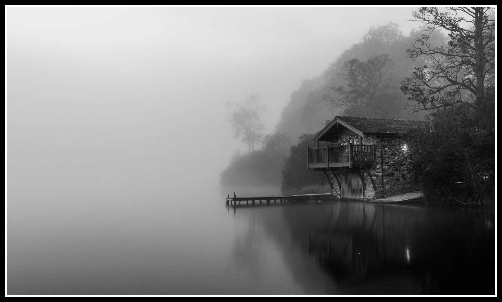 Boat House in the Mist by littlenorty, on Flickr
Thanks for looking.
A nice misty morning waiting for the sunrise.
Boat House in the Mist by littlenorty, on FlickrThanks for looking.
Last edited:
")
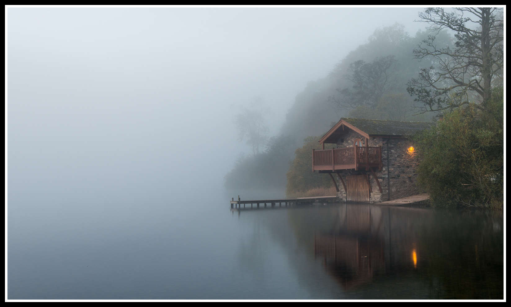 Boat House in the Mist - Colour
