- Messages
- 18,233
- Name
- David
- Edit My Images
- Yes
I'm looking to up my game a bit this year, trying to make my work stand out somehow. Looking to get a little more creative with the camera and my PP style. I fully appreciate that these have the potential to go down like a lead balloon but I have a little corner that i can go and cry into (and often do!) so give me both barrels 
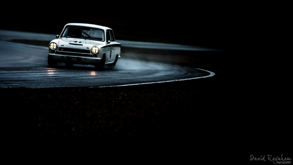
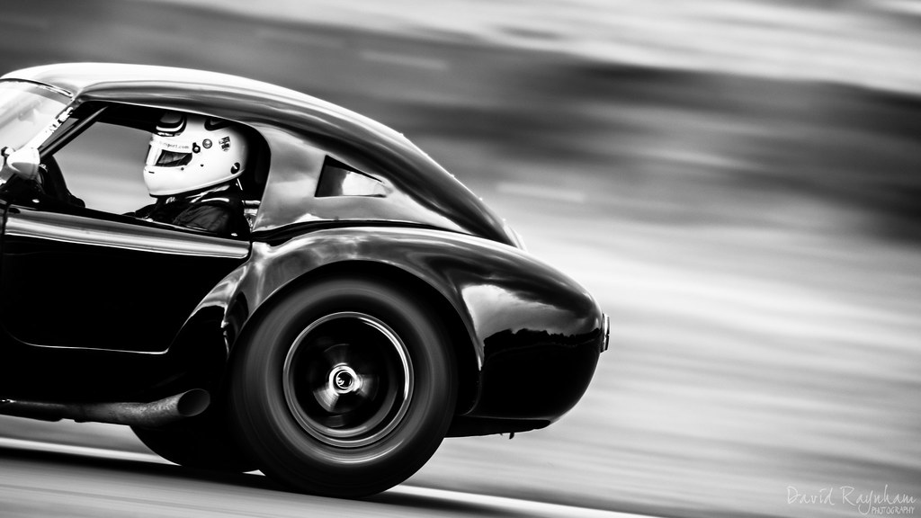
#1
Donington Historic Festival 2016 by David Raynham, on Flickr
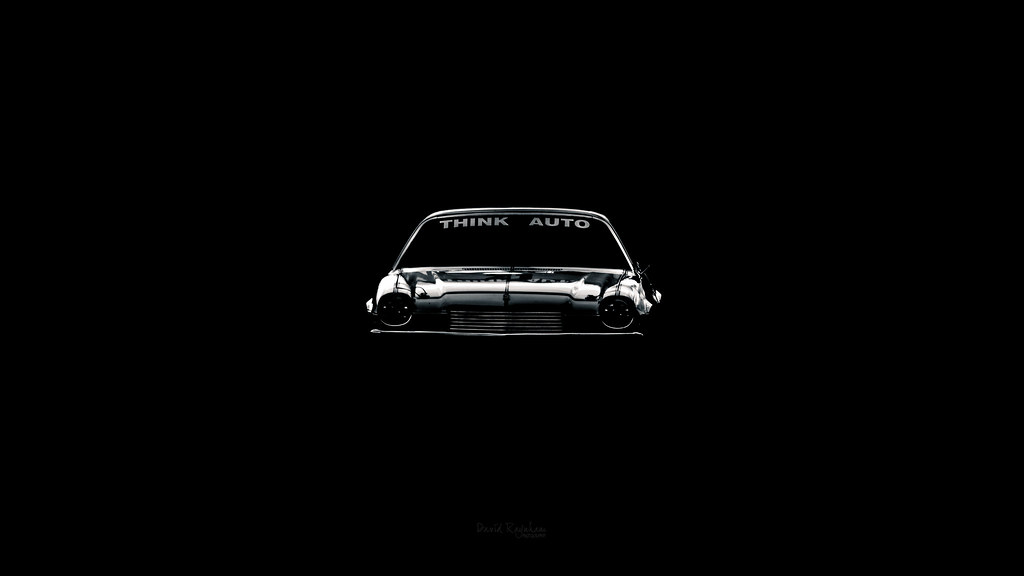
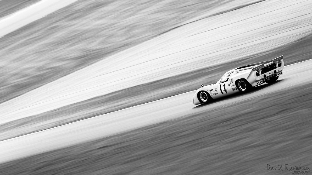
#2

Donington Historic Festival 2016 by David Raynham, on Flickr
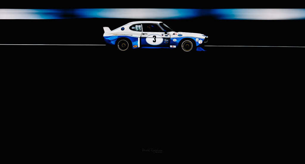
#3
Donington Historic Festival 2016 by David Raynham, on Flickr
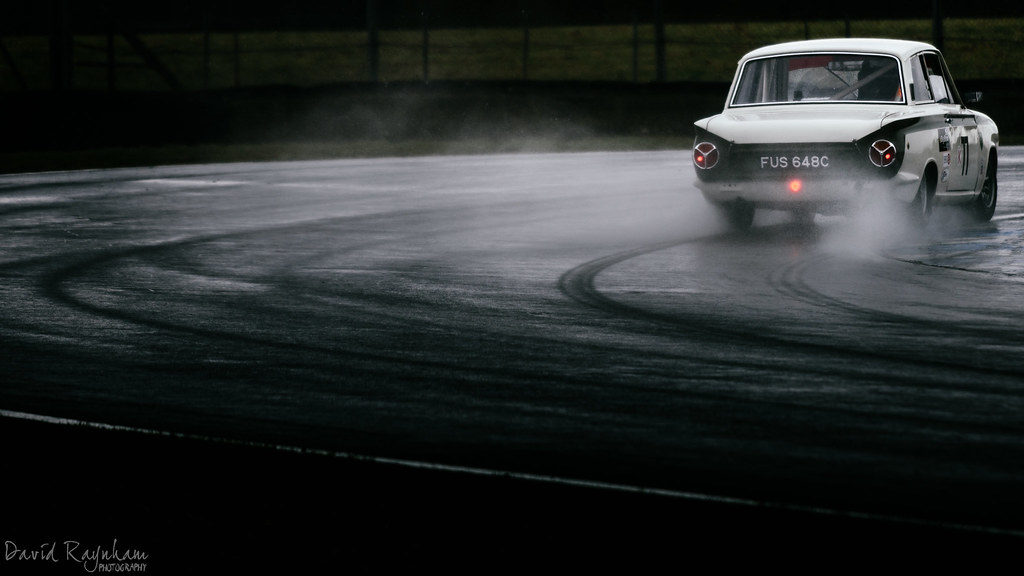
#4
Donington Historic Festival 2016 by David Raynham, on Flickr
#5 - Nothing really marmitey about this one. It was originally colour but @T_J_G suggested i try it in mono and i must admit, it does seem to work rather well.
Donington Historic Festival 2016 by David Raynham, on Flickr
Anyway, I'll get me coat...
#1
Donington Historic Festival 2016 by David Raynham, on Flickr
#2
Donington Historic Festival 2016 by David Raynham, on Flickr
#3
Donington Historic Festival 2016 by David Raynham, on Flickr
#4
Donington Historic Festival 2016 by David Raynham, on Flickr
#5 - Nothing really marmitey about this one. It was originally colour but @T_J_G suggested i try it in mono and i must admit, it does seem to work rather well.
Donington Historic Festival 2016 by David Raynham, on Flickr
Anyway, I'll get me coat...
 I love negative space and as you say it's good for advertising... Although i wouldn't have the first clue how to market my stuff.