

- Messages
- 5,007
- Name
- Tim
- Edit My Images
- Yes
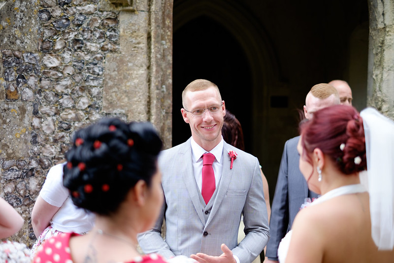
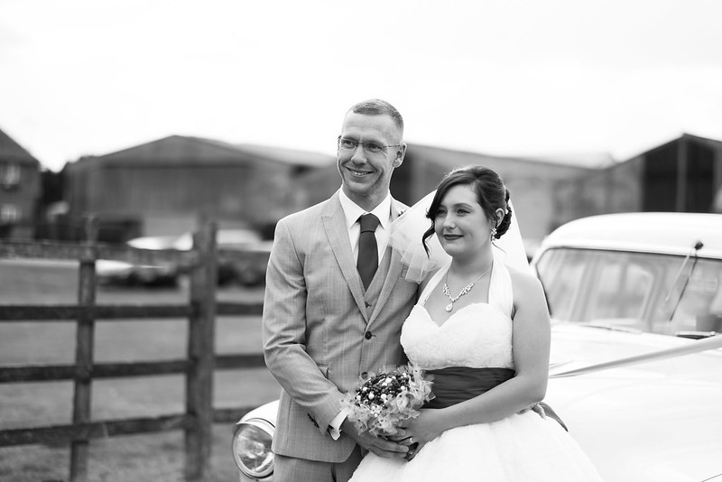
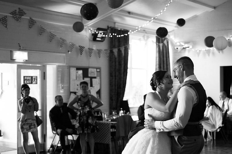
I was not the official photographer for this wedding, however the bride and groom who are good friends of ours were very keen on me getting some nice pictures. So, there was no pressure, and I tried to get the feeling of the day rather than the group shots.
I would like some honest feedback on where I can improve both capturing and editing as I am planning on the possibility of taking this a bit further...
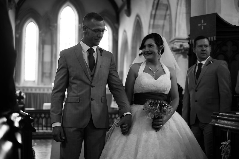 Lucy & Mark by Tim G, on Flickr
 Lucy & Mark by Tim G, on Flickr
 Lucy & Mark 4 by Tim G, on Flickr
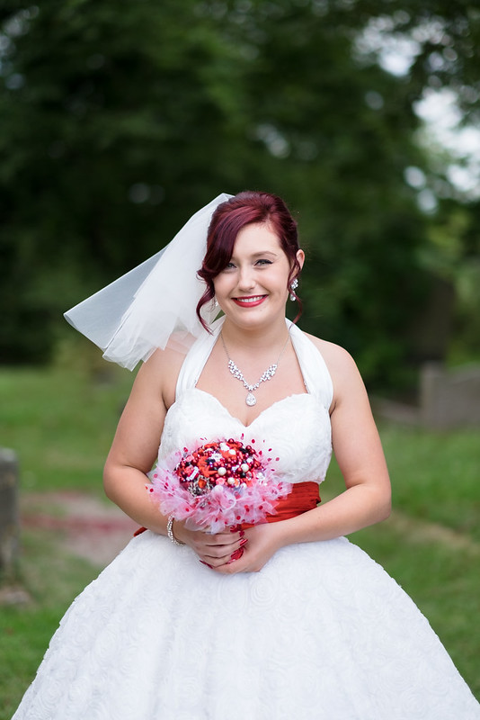 Lucy & Mark 3 by Tim G, on Flickr
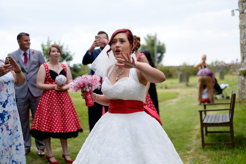 Lucy & Mark 5 by Tim G, on Flickr
 Lucy & Mark by Tim G, on Flickr
 Lucy & Mark 1 by Tim G, on Flickr
Thanks for taking the time to comment")
I would like some honest feedback on where I can improve both capturing and editing as I am planning on the possibility of taking this a bit further...
Lucy & Mark by Tim G, on FlickrLucy & Mark by Tim G, on FlickrLucy & Mark 4 by Tim G, on FlickrLucy & Mark 3 by Tim G, on FlickrLucy & Mark 5 by Tim G, on FlickrLucy & Mark by Tim G, on FlickrLucy & Mark 1 by Tim G, on FlickrThanks for taking the time to comment
Last edited:
