

- Messages
- 244
- Name
- Mark
- Edit My Images
- Yes
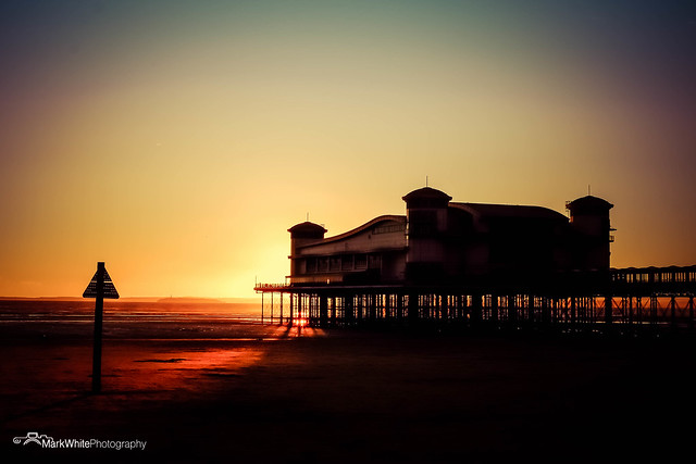
I'm working down this way and couldn't come without bringing the fuji with me!
Love to know your comments...
1.
 MarkWhitePhotography-1664.jpg by Mark White, on Flickr
2.
 MarkWhitePhotography-1606.jpg by Mark White, on Flickr
3.
 MarkWhitePhotography-1566.jpg by Mark White, on Flickr
4.
 MarkWhitePhotography-1608.jpg by Mark White, on Flickr
5.
 MarkWhitePhotography-1649.jpg by Mark White, on Flickr
6.
 MarkWhitePhotography-1697.jpg by Mark White, on Flickr
Love to know your comments...
1.
MarkWhitePhotography-1664.jpg by Mark White, on Flickr2.
MarkWhitePhotography-1606.jpg by Mark White, on Flickr3.
MarkWhitePhotography-1566.jpg by Mark White, on Flickr4.
MarkWhitePhotography-1608.jpg by Mark White, on Flickr5.
MarkWhitePhotography-1649.jpg by Mark White, on Flickr6.
MarkWhitePhotography-1697.jpg by Mark White, on Flickr")