My opinion.
You don't necessarily have to agree with it ")
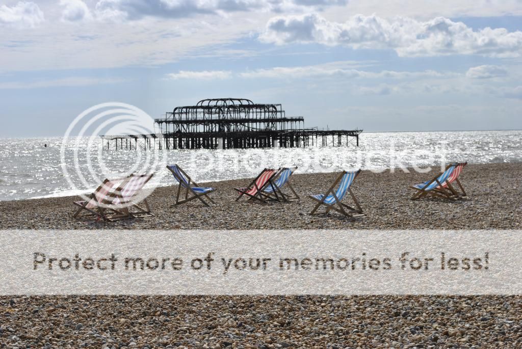
For me, your crop made it sterile and too organised. That may be what the OP wants for all I know. It's nice to have a balanced view though isn't it?
I rarely agree with your posts
I understand the point of space and emptiness and I think that goes well with the decay of the structure in the sea. I get it and I do a lot of this but there's a but
and it's my personal but which can be considered and rejected or accepted, whatever. It's all opinion and food for thought.
My own issue with the original shot is that it's very square on and central. The chairs, the structure the central framing. It's all lined up and central and that might well be the point and if it is, job done.
An alternative when going for space and emptiness (with the same camera/lens/focal length) could be to go for more of it and that could well come from including more of the foreground and perhaps thinking also about changing the square on relationship between the chairs and the structure to maybe create some lines and something to lead the eye a bit more rather than the up front smack in the face that the square on middle of the shot approach goes for.
There isn't enough room in foreground in the original shot to include more foreground in a crop but there could have been the option of changing the composition at the time of shooting.
The following are things I'd probably have considered. I might have rejected them and gone for exactly the same as the original shot but at least these things may well have crossed my mind...
- include more foreground to convey the emptiness, tilt the camera down and move the chars and structure further up the frame.
- include more sky, for the same reason but achieving a different emptiness, chairs and structure further down in the frame.
- move to the left or right to change the relationship of the chairs, structure and shoreline to create something to draw eyes in and around the frame rather than going for a straight on approach.
All are options, not necessarily right or wrong and not rules.
Many artists past and present painted different versions of the same picture and there's nothing wrong with taking the same shot from different angles and positions and seeing which tells the story best or which simply looks best. As I said in an earlier post what I sometimes do is produce two images, one for me and one that's a bit more... mainstream. In ten years time I might even change which one I like best.


 Home Time: Brighton Old Pier by Jason Palmer Photography, on Flickr