Critique Wintery Gorge

Messages
137
Name
Michael
Edit My Images
Yes
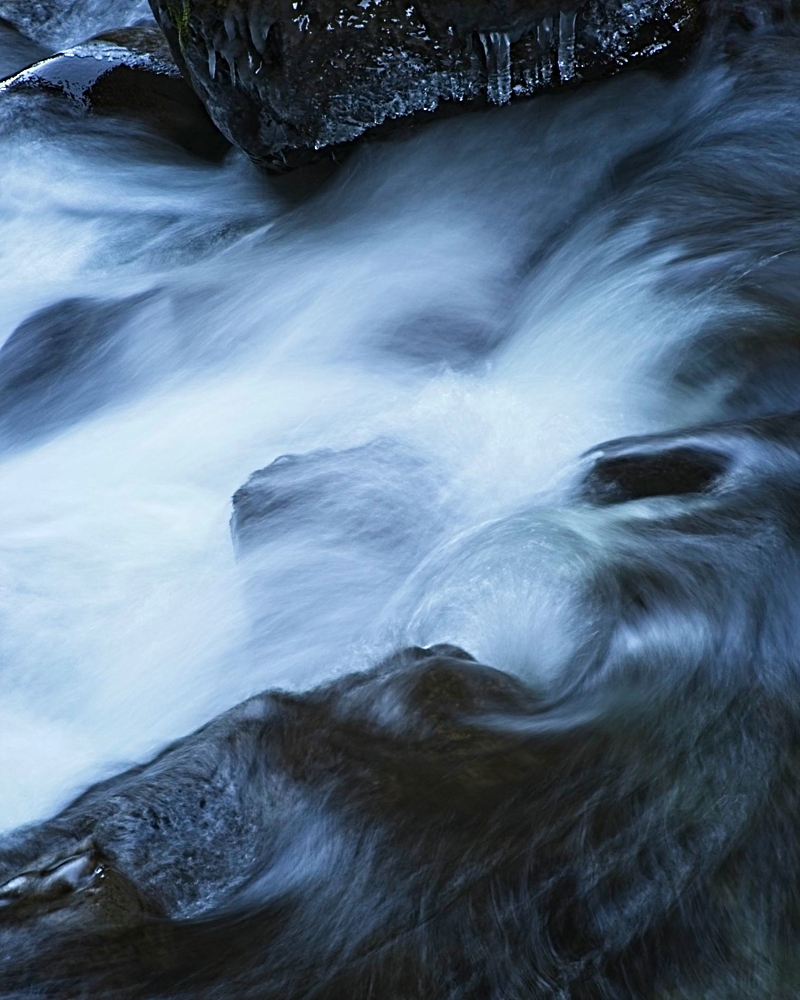
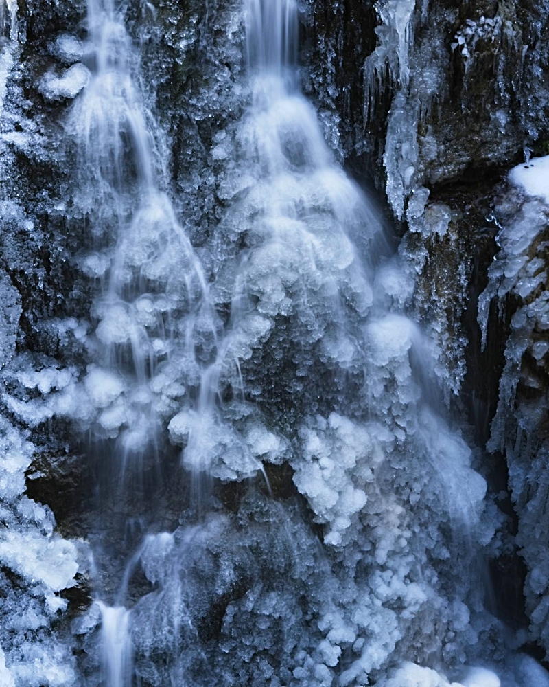
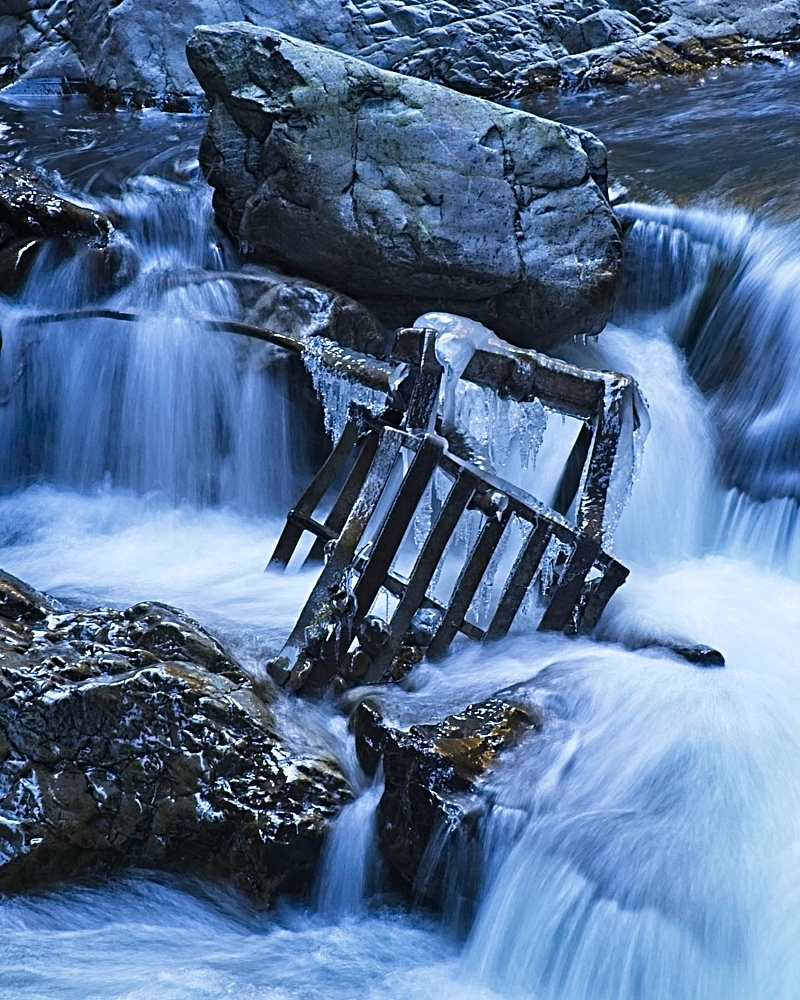
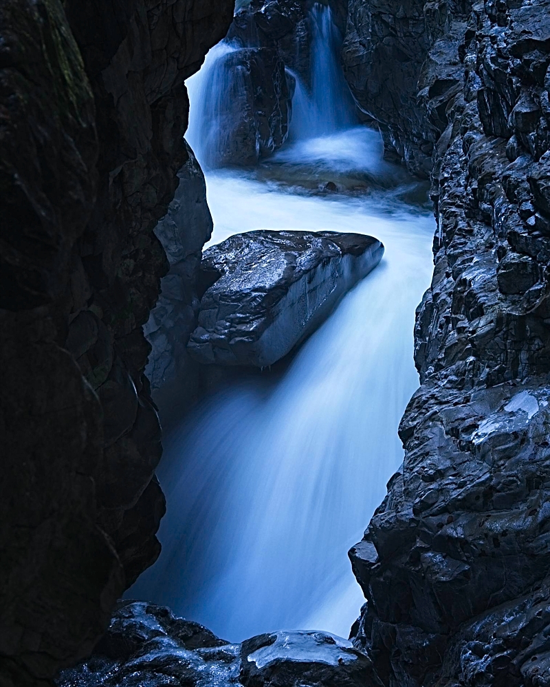
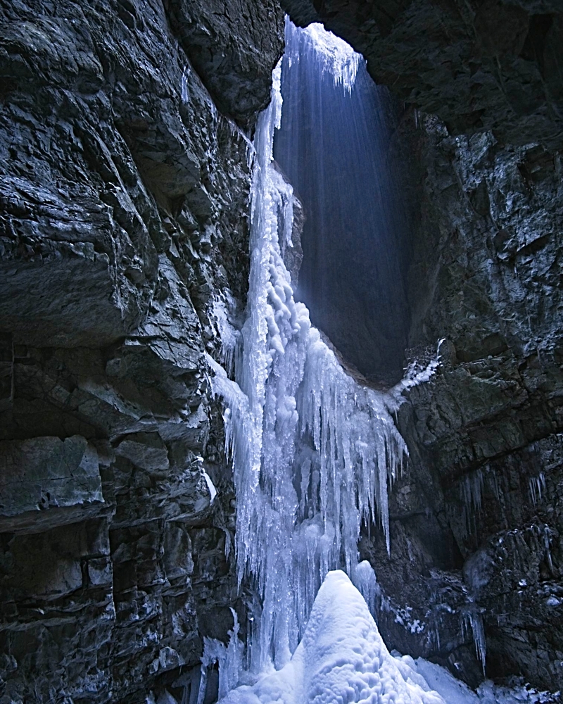
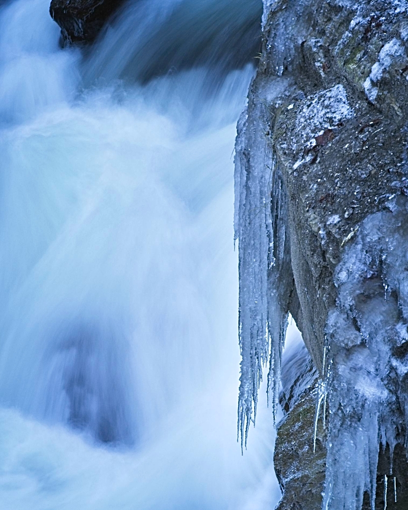
Hi chaps and chapesses. C&C sought for these images I took at the beginning of the week in a local gorge. I'm really looking to up my game in 2020 as I'm thinking about transitioning out of the day job and into photo workshops and hospitality in the Austrian Alps to supplement my early pension. I've given myself a generous time frame - 4-5 years and I want to use that time to really hone my skills and establish myself as a bone fide landscape photographer whom people feel like they could learn something from. Any tips regarding the photos themselves or the idea in general welcomly received. I've been following Chris Sale's video channel on a similar subject with interest.

Why the Austrian Alps? I live just over the border in Bavaria at the moment and know both the area and the language well. I've identified an area that gives good access to the Alps as well as being a stone's throw from the Dolomites. I'd feel a lot more confident and comfortable settling down in Austria than Italy - more stable and predictable for a start. Plus my wife and I are qualified to run mountain tours there - not mountain guides, but a level or two under that.

I'm not 100% happy with the compression here - is it best to submit via the gallery or to upload the photos to the post individually?


Last edited:
1 ,2, 4 and 6 I like, though for my tastes 1, 4 and 6 could be less blue. Composition of 1 and 4 especially good. The remnants of human activity in 3 - doesn't work for me as it's not clear if the picture is about lovely water flow or a bit of junk. Again, to my tastes the composition of 5 doesn't work as well as the others. Hope this helps - am all too aware how personal these things are.
 
First impression - they're all very, very blue, and possibly suffering from compression issues as you suggest.

I'm not 100% happy with the compression here - is it best to submit via the gallery or to upload the photos to the post individually?

Personally I'd prefer you to upload them large-ish (1920px or larger) to Flickr, they can be viewed with fewer artifacts.

1) - Has a good abstract shape. The bright reflections on the top rock are a distraction and the water seems a bit too silky, losing a sense of shape and solidity.
2) - These look like tiny icy Christmas trees. I'd probably crop the white blob on the RHS and a bit off the bottom to balance it up.
3) - As presented it's just a bit of junk in a very blue river. It's not interesting enough of itself and needs some context. IMO the water either needs more texture or less, and also looks blown in places.
4) - The black rock on the LHS dominates the image, rather than providing negative space that lets the eye follow the water flow. Cropping it somewhat makes it better balanced, but the image is then a bit tall & narrow. I feel like more texture & sparkle in the water would make it more attractive.
5) - In this image the subject (the hole fringed with ice) is in shadow and uninteresting while the rocks framing it sparkle & draw the eye away creating an almost negative sense of interest. I'd probably reprocess to make the central hole exciting and dull the rocks - or go back later when the sun is shining into the hole (better).
6) - Good idea! However the water is a bit too blurred to give a sense of movement against the icicles, and they don't carry enough sense of sharpness *in the image as presented here* (possibly due to compression and small size).

FWIW if presenting a set like this, it's probably good to try to colour match if possible. Several (possibly all) would benefit from using mono & a blue toner, where one can be a bit more brutal with tonality to shape an image.

Hope that's useful - this is just IMO and you don't have to agree.
 
Last edited:
I like blue toning for winter scenes but some of these are a little strong for my tastes. In terms of the compositions I think 1 works pretty well as a minimal type image but maybe rotating could have brought a more engaging flow by going from top to bottom corner. 4 looks decent but probably wants the shadows or blacks lifting a bit.

I’d be interested in seeing how Chris Sale gets on, seems a nice bloke but I think he turned pro a bit too early. I think your approach on building a quality portfolio first is the way to go
 
Personally I'd pick no 2 and the last one. They are the most graphic examples of the ice structures and an allegory to the cold alpine environment. My choice of processing would be either black and white or at least a fairly desaturated approximation. I think the shapes and details do their own talking, so colour is perhaps not exactly necessary.
 
I've tried to take on some of the suggestions - tricky when some say they prefer 1 and 4, others 2 and 6. Just goes to show that tastes are really different. And thank you particularly to Toni for sitting down and giving concrete feedback. Others from by FB friends found the blue cast added to the photos, I know it's not everyone's cup of tea, but for me it communicated the cold of the gorge, and it was out of camera rather than added.
Thanks too for the compliments. Here's my second take:

20200106_1069626v3v1.jpg
Different crop, de-blued and a few other tricks

20200106_1069470v3.jpg
Darkened the framing rocks and brightened the hole

20200106_1069484v3.jpg
Brightened the left edge - I still wanted to keep it for balance purposes, water de-saturated (but not sparkled - wasn't sure how to do that)

20200106_1069570v1.jpg
De-blued a touch and re-cropped

20200106_1069516v1.jpg
To replace the iron grid shot. I've tried to use some of Robin Whalley's processing tips to bring this one to life.
 
I think you've done a great job with these Mike - hope YOU like them too. :)
I do, thanks. I wouldn't have edited them to something I wasn't happy with. I think at least 50% of the difference is the lack of compression artefacts, but the crops definitely helped.
 
Way too much HDR like look with these now. Basically if you have to push shadow recovery slider past 50% expect some unnatural results. It's like some higlights are looking darker than brighter shadows and vice versa.
 
Back
Top