

kennysarmy
Yeah but can your army do this?
- Messages
- 7,312
- Name
- Jeff
- Edit My Images
- No
1. three shot mono hdr
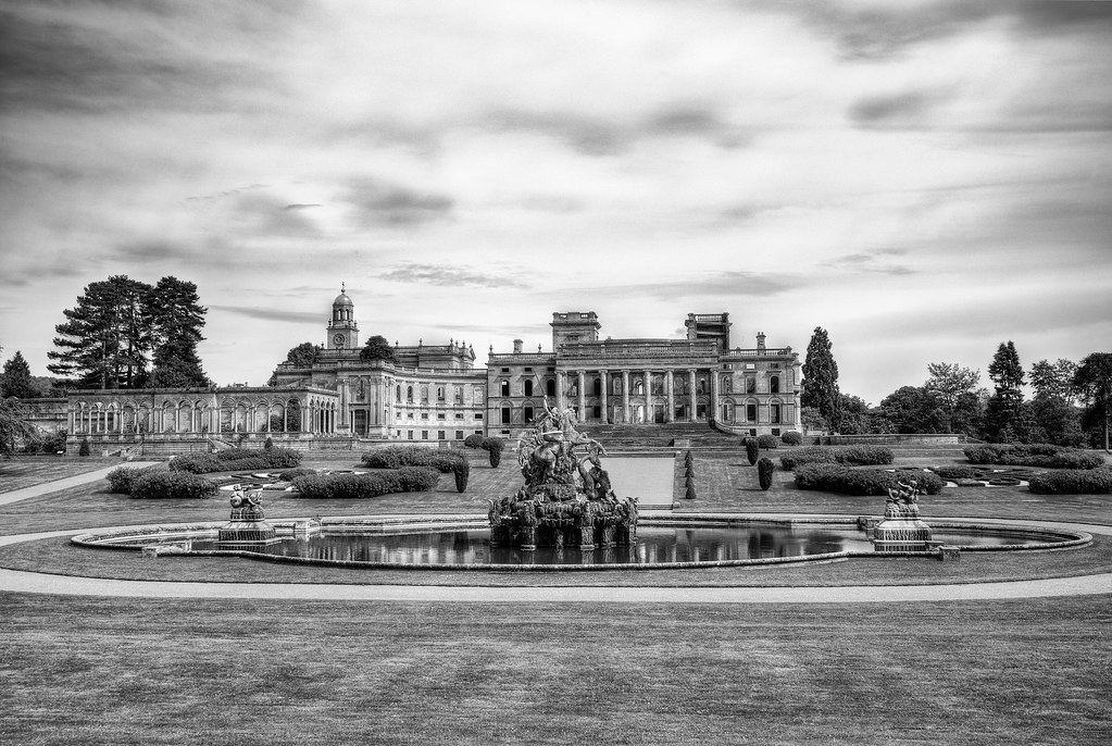 Witley Court HDR Mono by Jeff, on Flickr
2. three shot colour hdr 16:9 format
 Witley Court HDR Colour by Jeff, on Flickr
3. single shot processed in Photo Ninja colour in 16:9 format
 Witley Court Colour by Jeff, on Flickr
Witley Court HDR Mono by Jeff, on Flickr2. three shot colour hdr 16:9 format
Witley Court HDR Colour by Jeff, on Flickr3. single shot processed in Photo Ninja colour in 16:9 format
Witley Court Colour by Jeff, on Flickr")