Mike, again proper cheers for the time ok double time
")
, and efforts,real kind mate. The colour and how we see it, appraise, is really interesting for me! Your last rendition is the closest on keeping some of the warmth and separating the bird just slightly,I really hadn't considered this at all,and to be frank am arguing with my self as I write,but I like that mate. We are all different you guys have made me ponder something I probably wouldn't have,it's cool.
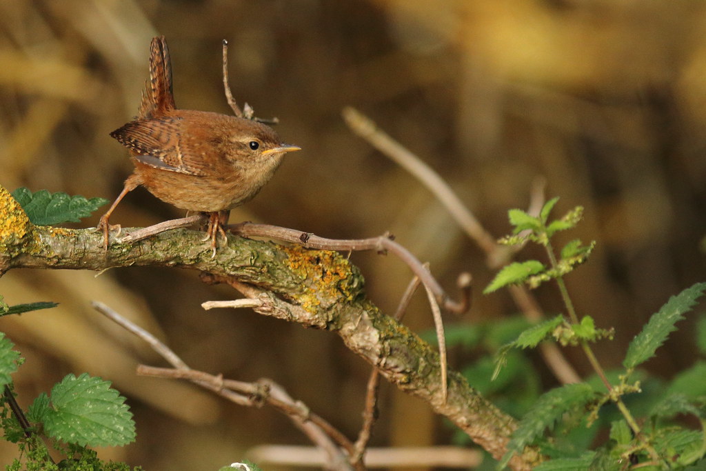
Ha let it be know I had blinding chances on this evening at this tricky little trog and didn't measure up,this is one of few that should be many!! some of you horrible lot would have sorted this one properly..... But that's me at the moment
Actually we prefer your first branch removal but,overall like the 2nd rendition better,I've got to lean this stamp tool's capabilities! Mike this was what I saw coming,the branch sticking out of the head and referred to in my initial post,the colour I didn't at all.
I guess this bird's habits lend it's self to being in places where colour of bird and background are at one,it is a very small brown bird whom scrubbles about making a living in the undergrowth essentially also brown(mind green browns huh!!,I think this also is making me unsure here about colour.
Mike thanks buddy,it's so cool hearing others ideas and seeing them,I think this is very good for me,my work is NOT YET done yet done inside the camera,the raw should be sharp,this is a lovely bonus though
many thasks
Stu


 F70F8374 by Stuart Philpott, on Flickr

