- Messages
- 6,964
- Name
- Phil
- Edit My Images
- Yes
An interesting idea, but it doesn't quite do it for me - looking forward to plan a!
Phil
Phil


 tbh, I'm not sure what else you could have done with it, so having offered no useful advice at all, I'll shut up! After all, I passed a clean dog off as a ditry one for my feeble attempt this week!
 Project Part 1 - Fantastic lighting and a nice air of mystery surrounding the figure. I like the area directly beneath the sun and clouds.
Project Part 2 - Nice lighting, a good crop, as Darren said it is like she is indecisive about the smile but it looks more natural.
It is evident that you spent time composing these shots as they work very well.
Film - Great image, I particularly like how you have the smoke... you can't have got that right first time! The head tilt just enough to hide the eyes adds to the atmosphere and the half undone tie. It makes me think private eye.
Dirty - Some of the takes on this theme I wouldn't have thought of, but when I seen them it was an 'of course' moment. This is truly a unique take on the theme and something I definitely wouldn't have though off. Well composed, I never thought I would say this line... but your soil looks great, its two takes on one theme that are entirely different and I like it. I am also interested to know what plan A was?
 I was thinking exactly the same about my soil and how wholesome rich and organic it looks.
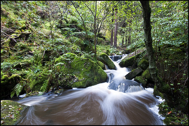
bottom of the image looks like liquid chocolate mmm. Not sure if the water looks too smooth to be raging but love the colours.
Thats a beautiful photograph. the greens are lovely and the slow shutter speed has created a lovely effect. A different take on the theme.Well done
Nice one, Chris. I think the motion blur does give it a bit of a raging feel. Nice colours and composition. Good take on the theme
Jenny
It's missing a little something for me Chris. I think the water is a little overpowered by the intense green of the surrounding foliage and detracts a little from the power of the raging torrent. I want to see water in my face.
That being said it's a good take on the theme
I like the composition and the swirl of the water, even though it is perhaps not quite fierce enough for 'rage'. So much green does make it seem a bit serene, though - maybe a mono conversion might be worth trying?
Dirty - Doesn't really hit the mark with me I'm afraid. You have captured the glass and the drink exceptionally well. Not an easy subject to light. I think the whole image looks too bright to be described as dirty though. I can see what you wanted to do but I don't think it's turned out as you'd hoped.
Rage - a god interpretation of the theme. Doesn't really shout raging torrent though. I think it has too much green as others have said. A B&W with less exposure may work well. I also see this as a portrait crop rather than landscape. That would could out some of the greenery and concentrate more on the water.
Andy
I really like this landscape, but I don't think the top half is adding much - might be worth cropping to concentrate on the lower section which is really good.
Phil
. I couldnt find anyone to console or at least take a shot of that nature so it was a toss up between the Play Station or the mixing console, the mixer won. I tried a few different angles and compositions but this is the one i settled on. Nothing special here but another theme complete. 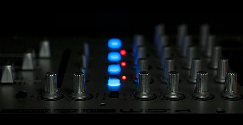 An unusual composition but kind of works in an abstract arty farty way.......... I trust a few trial runs of the mixture had to be tested to ensure perfect ratio's......
to be honest, i haven't been missing the 52 of the last few weeks........ console!
As mentioned above, looks like you picked the right choice between the PS whatever and this box of wires and knobs.
Dirty Martini - hmmmm, makes me want to try one of those sometime - though brine in a drink...
You chose the more interesting of the two consoles from your collection I feel. The blue and red lights lead the eye through the image nicely and the dials themselves are well lit and provide an interesting relief against the dark background.
A good photo. The lines are good and the colours stand out well.
I like it - simple and appealing composition. The blue lights draw the eye through the frame.
Phil
Glad you choose this console and not the play station. Simple but very effective the lights lead the eye nicely into the image
Nothing much wrong with console at all Chris.
I like it. Nicely composed, well lit and far more interesting than the PlayStation.
I can't add much more to what's been said on dirty and rage. Both great concepts, but the shots aren't quite there.
Here's hoping for a decent theme this week.
Hi Chris, I really like this one - you've got the lighting just right and the blue and red lights really make it. Excellent take on the theme
Jenny

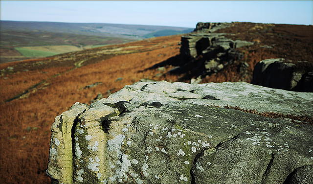
It certainly is a lovely view Sue, it was a clear crisp morning too, perfect for a stroll with the dog and camera.I prefer the first picture of Stanage Edge. Its a lovely view looking into the distance.The detail on the foreground rock is good with the lichen.
Like them both - shows how distant can vary in distance very well. Like the colours in the first one.
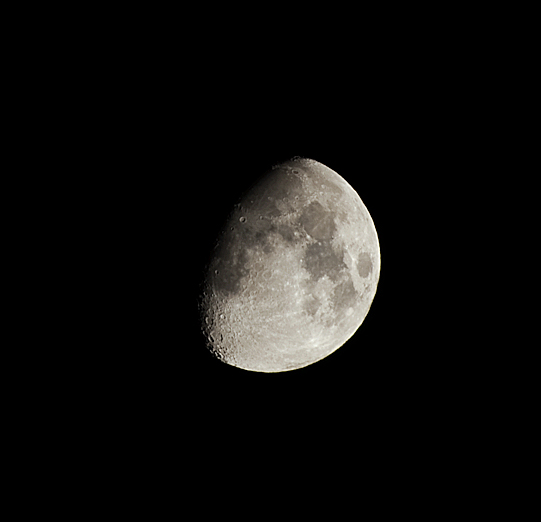
has come out very nicely indeed. Nice details, there's hints of the Clavius crater chain, Copernicus and Plato look great too. Even getting some colour delineation creeping in.