Clud17 52 Part 2 Week 44 Train

Messages
1,560
Name
Chris
Edit My Images
Yes
Week 1 to 27
Week 28 Relaxation
Week 29 Grace
Week 30 EndingsNSFW
Week 31 Electric
Week 32 Transform
Week 33 Mobile
Week 34 Surfaces
Week 35 Light
Week 36 Project
Week 37 Film
Week 38 Dirty
Week 39 Rage
Week 40 Console
Week 41 Distant
Week 42 Secret
Week 43 Urban
Week 44 Train
I think moving onto my second thread and the second part of my 52 deserves a :banana: Ive had fun for the first part which you can find here and im looking forward to the second, eagerly awaiting some good theme's and no doubt some bad ones. lately ive been lacking overall motivation and inspiration to carry on but this second thread is going to give me the fuel to continue.

Week 28 Relaxation
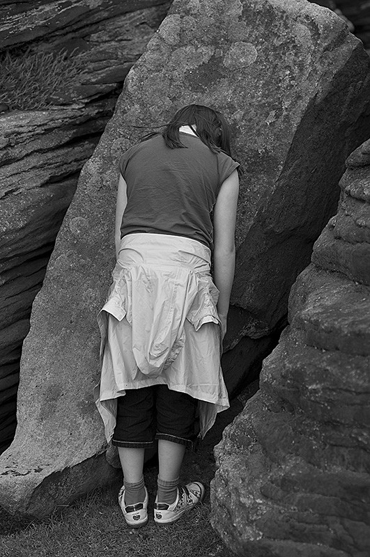
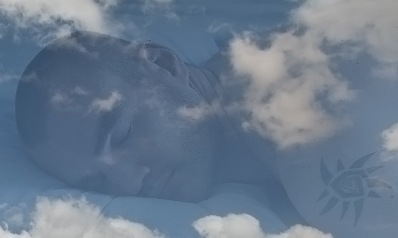
I've spent most of the week coming up with bad ideas and then i came up with a bizzare abstract plan which involved me dragging more furniture up into the Peaks as i did in Week 15unfortunatly the weather hasn't allowed me to do this. So i put this together this afternoon. Maybe im dreaming of the blue skies that have evaded me on my last few trips out or maybe my mind has just switched off from thoughts and all that is present is clean air.

Day Dreamer
4805115584_3982b22bb0_b.jpg
 
Last edited:
This one was obviously a good one for you Chris.

I had thought of the sleeping model (not a SP from me though) but not about adding a layer of clouds. Such a simple but really effective idea.

Absolutely screams relaxation (or should that be a whisper ;) )

Andy
 
This one was obviously a good one for you Chris.

I had thought of the sleeping model (not a SP from me though) but not about adding a layer of clouds. Such a simple but really effective idea.

Absolutely screams relaxation (or should that be a whisper ;) )

Andy

Thanks Andy, I often think that its difficult throwing a shot together when you live on your own, the only willing model i have is myself so SP are quite common in my 52 , i have a dog who's always pretty relaxed and willing but he's not allowed on the bed so was no good for this shot.:LOL:
 
Really effective use of Photoshop. Certainly bang on theme and a simple but very clever shot.
 
That is brilliant - so simple, and beautifully put together. I can almost hear the soft music...

:clap::clap:
 
That is brilliant - so simple, and beautifully put together. I can almost hear the soft music...

:clap::clap:

I agree absolutely :clap::clap::clap:

Would make a great relaxation CD cover (y)

Thanks guys, ive had a few people comment that it makes them want to go to sleep, i like that as it means ive hit the theme right. Christ knows what im going to do for Grace though.
 
That's fantastic Chris. Really, really like it and it's spot on for the theme.
Just the right amount of opacity in the layers and you've managed to position the clouds so that they don't obscure any of the main parts of the image. I also like the way that the tattoo on your shoulder almost makes an abstract sun in the sky.

I'd love to offer some constructive ideas for improvement, but I honestly don't think I'd change anything.

Christ knows what im going to do for Grace though.

:LOL: Don't you have a tutu and pair of ballet slippers that you could put on?
 
Thanks Sarah, it took a while and a bit of flipping and free transform to get the sky where i wanted it. I hadn't thought of the tattoo that way but you are right it does.

As for the Tutu, you may wish to see me in a ballet outfit and i'd probably be willing to try it but it would be so so far from graceful :D
 
What a great interpretation of the theme and fantastic use of PS. A simple, yet really impactful image. Just looking at this image makes me want to go to sleep!
 
Very clever, and very well done... Good work Chris
 
That really works Chris(y)
A very creative take on the theme. I agree with Sarah about your tattoo, it works well with the image and its positioning. Iain
 
Week 29 Grace

I found this one a little tricky, lots of ideas but none that i felt would be able to do credit or they just didn't satisfy me enough. The week passed quickly and that left me the weekend. This weekend was always going to be about family as my sister and the kids are is over from Ireland. I wasn't confident or too bothered that i was going to get a shot this weekend so this is a little bonus.

I cant remember who came up with the idea but Grace turned into Disgrace and while we were out taking a walk in the peaks Ciara found this wonderful crevice in one of the grit stone boulders. I told her to go to the corner in disgrace and hang her head in shame. ;)

Corner in Disgrace
4827637147_28b687ff35_b.jpg
 
Last edited:
Certainly a different approach! The pose works well and I like the textures in the stone - BW conversion really suits, too.
 
an excellent take on the theme Chris... it works very well, and the mono helps the mood.
 
Grace . . . disgrace :LOL: works for me.

The mono is perfect for this and adds to the mood. And I love the detail in the craggy rocks.

I'm not sure why because all the elements are there and it really is a good shot, but for me it seems to be lacking the spark that's in all of your other shots :thinking:
Perhaps a wider angle with more of the rocks in frame?
Or perhaps not that at all . . . I can't quite put my finger on it, but something isn't quite clicking for me.

I like it as it is, but can't help thinking that there's something a bit more special to be had from it :shrug:
 
it looks like she`s asleep, nice interpretation of this weeks theme, processed well.
nice family shot as well.
 
Week 30 Endings

First of all I'm Sorry if this image offends you or you have had experiences of this nature and it upsets you. I work as a Mental Health Nurse and i know this subject is both difficult to address and devastating to the victims and the friends and families of sufferers. It seemed an easy choice to me when the theme came out to do something based around self harm/suicide.

Anyway on a lighter side no best friends were harmed during this shoot. It took a fair bit of preparation to get the set up. last night i was down at B&Q buying some MDF and some tiles, as you can see from the results my tiling skills needs some improving . The image was shot in my friends kitchen with natural light and a spot light above which was defused through a reflector hoop. It was fun working with the fake blood but that stuff gets everywhere and its a bugger to clean!!! for reference the blood was made with glucose syrup, red and green food colouring.

I had a couple of ideas for the way i shot this but after looking at some other images around this subject i came up with this one. Thanks go to Gill for being patient and for sitting with her arm in a slightly unnatural position for a while. Believe it or not the band that looks like the skirting board is actually the top of the kitchen radiator.

My only gripe at myself was that i had reset the settigs on my camera and when i came home i realised i had shot this in normal JPEG, as a result of this i am unhappy with the quality of the image.

As no one cares..... I'll say adieu.
4846417063_a598041236.jpg
 
Last edited:
a very strong image chris and one that fits the theme well. my only question is how did she cut her wrist with the knife in the same hand.

Ian
 
a very strong image chris and one that fits the theme well. my only question is how did she cut her wrist with the knife in the same hand.

Ian
yeh good question Ian i did think about the effect of this, there are a few possible answers.
1) artistic licence :)
2) you assume she did it.... did she?
3) when someone cuts their wrist they don't die instantly, she may have cut the other wrist soon after.
 
Well that is a striking image, technically Its great, I wonder how they cut the wrist of the arm holding the knife?

If you wanted to make the image more striking, the arm is clearly alive, maybe you should have covered it with some sort of foundation to make it make it a pale green/white colour that un-perfused flesh is

Stuart
 
eeeeeyeuuuuuw
that it faaaaaaaaar too realistic :puke:

nicely on theme though, even if it was the last photo you ever took!!!!!

(not sure about the slightly greenish background?)
 
I also asked myself the question about the knife in the wrong hand and dismissed it immediately as artistic licence. Wouldn't be much of a picture if the knife was out of shot.

I think this is great. The colouring for me is spot on and gives a perfect gritty feel and the wide angle crop adds to the pulled from a movie look. Brilliant (y)
 
Thanks for the comments guys, i have gone for a cinematic look and i did tweak the green channel so that was intentional and i like the results. As in most films its always two wrists that are cut for effect so that could be why she has the knife in a cut hand. The reality of cutting this way will probably result in a slower end than if you cut just one wrist and cut it longways up the arm.

Mike, sorry if it looks all to realistic, i think i was aiming for that to makes the image stronger and with more impact.
 
no apology needed - take it as a compliment!
 
excellent and thought provoking

from a technical point ...
the blade needs to be turned 180deg to present a cutting edge
the cut needs to be lengthwise - the classic way to sever an artery in the wrist
 
Got to be one of the strongest pictures I've seen in a 52 so far.

The cinematic feel realy makes this shot stand out from the crowd.

Obviously a lot of thought and effort gone into this. Excellent (y)

Andy
 
Catch up time for me, Chris - and my first visit to your Part 2.

Relaxation: What a stunning shot. It fits the theme perfectly and looks so professional - you've done just enough to get a subtle, dream-like effect. A fantastic start to your Part 2. :clap::clap::clap:

Grace/Disgrace: This made me smile. A great idea and well posed by your willing model. Mono was a good choice, imo, as it brings out the texture in the rocks. (y) It sounds as though you had fun and enjoyed seeing your family. :)

Endings: :eek: A very dramatic ending! Well done for setting it up - it's quite realistic enough for me!!! Although I think the pool of 'blood' under her arm could be a litle messier. :)

I'm quite alarmed at the wealth of knowledge in other posters' comments. :eek:

But definitely a brilliant, if startling and sobering, take on the theme - it definitely deserves a (y) :clap::clap::clap:

Jean
 
excellent and thought provoking

from a technical point ...
the blade needs to be turned 180deg to present a cutting edge
the cut needs to be lengthwise - the classic way to sever an artery in the wrist

thanks John, from a technical point i chose to sever a vein as i can make darker blood better than i can bright red blood:D good point about the blades edge though.:)
 
Very realistic Chris, and I really like the way you've shot this, even if that seems rather ghoulish.. much better than my take on this.
 
Great idea and I love the way its worked out. Bang on theme and my favourite of the week.
 
That's got to be the image of the week Chris :clap:
Absolutely love it (if love is the right word for this sort of thing :puke:)

Obviously a huge amount of effort went into it (I can't believe that you bought the tiles specifically for it) but it's really paid off.
Lighting, blood, PP is all spot on. And the imperfect tiling actually works with it.

I can't see any issue with the image quality at this size - but if it's visible at full size I don't think it matters. IMO this is one of those shots where a bit of graininess and imperfection adds to the overall feel.

10/10 from me.

p.s. On a more cheerful note, the family shot from last week is great. You all look like you're really enjoying yourselves and I love the fact that you got the dog in there too.
Definitely one to keep for the album.
 
Back
Top