
OP
- Messages
- 737
- Name
- Martin
- Edit My Images
- Yes
Thanks dubcat for stopping by and the nice commentGreat idea. I prefer the first one as the colour says saffron. Nicely done.
Martin

Thanks dubcat for stopping by and the nice commentGreat idea. I prefer the first one as the colour says saffron. Nicely done.
Hiya Martin,
Well done on getting your week 7 posted so quickly. Both are fanastic photos.
Even though I like both, I prefer the first one because of the colour of background and the way the saffron are positioned makes it look like an abstract art. I t also looks neat and tidy and I like the title and font your have chosen in the top left. Oh yes and the border compliments the image well.
Like the second one too, but it would have been interesting to see that with a similar background to the first. It looks a lot busier and the very fine strands of saffron look more like hair. Not sure if it would have also benefited from a similar border to the first.
Considering how much saffron costs, and the amount you have displayed, I'd say you have quite a healthy supply of saffron - I take it you use it a lot in your cooking.
These would be great hanging on the wall in a dinning room or restaurant.
Well done
Cheers
Dawn")

Hi Martin
really like the 1st Saffron shot ,background color suits it ,the frame works really well , the writing fits perfectly & its set out in a pleasing shape ,great shot
The 2nd image seems a bit flat in comparison to the 1st ,sorry
Thanks Dawn, really nice comments. I was experimenting with an old halogen light I dug out of the garage during "clutter" week. I sat the Saffron in a dish directly on top of the light and immediately thought abstract. Here is #2 with the original background and same frame as #1
I got the frame from Picnick. You have got me hooked on it. Is it worth getting a premium account on there? Are the extras worth it ?
I wouldn't say we use a lot of saffron, but usually have some in for the occasional Paella. This shot didn't take much of it actually.
Looking forward to seeing your "Delicate" which no doubt will be a masterpiece
Martin
Now that is saying a lot. 
 Do you mean you put the bowl on top of a lamp? I'm just trying to picture your setup as it has been very effective.
Hiya Martin, what a tricky subject to photograph, i far prefer number 1 with regards to the layout, colours and lighting. Well done. Did you try anything like putting it on a white plate, outside being lit by the sun?
Hiya Martin,
Now that I see your version 2 with the right background I think these two images for this week are on parr with your Jeans
Halogen lights are very effective, but I really battled with them for my week 7 photo. So they do have their uses, but in some respects can be a bit harsh at times. Just something to think about for any future uses.
So with your setup, you mention you sat the bowl on top of the light?
BTW I am glad you are finding Picnik useful. I think some folk may under-rate it, but actually it is very much worth the upgrade. I have more fun with Picnik than any other pp I have.
I wasn't being obnoxious when I was stating that it must have cost you a pretty penny for the saffron, but at +£3.00 for a couple of strands in a local supermarket you have quite a healthy supply. If you have a secret supplier that you would like to share, I and a few others would be keen to hear of your contact for such a delicate flavour.
Oh and BTW my week 7 - Delicate is posted
Cheers
Dawn
(heading to your thread now)Hi martin,
Number 1 for me, i like the background colour and the lighting effect. Did also like your second version of number 2 as well
Barrysprout said:Must just be me, as I don't think anyone else has pointed it out. When I first looked at the images I instantly preferred the first. Both are good and fit the theme well but I was impressed that with the first one you had drawn a flower with the saffron, giving another layer to the theme.
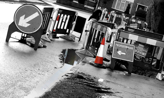 ). I like the way you have coloured the cones, but just think that the whole chaos theme would have been even more complicated by colouring all the signs, and leaving the rest mono (now there is a challenge for you )
I think you should be happy with yourself Martin, it's a good take on this week! I really like the duo tone, and the angle adds to the theme!
another good shot marts i like the b/w works well
Another good shot Martin, had to look several times as i thought it was where i lived in Outwood as the road works looked very familar. Like the B/W conversion with the selective colouring of the cones. Well done mate
Good work so far on your 52! I love your week 5 Hard. I think the sepia works brilliantly.
Liking Chaos as well
Hiya Martin,
... I like the way you have coloured the cones, but just think that the whole chaos theme would have been even more complicated by colouring all the signs, and leaving the rest mono (now there is a challenge for you
Great stuff though
Cheers
Dawn
Hi Dawn, Thanks for your nice comments. I really enjoyed doing the pp on this shot. Is this what you had in mind ...
Martin
Yep, but why did you exclude the orange cones????
And the chevrons?
Cheers
Dawn
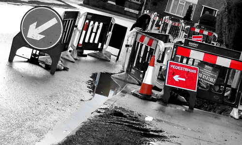
Hi, Martin, it's a bit frustrating when ideas done come along isn't it!
Good take on chaos and I really like the angle you took the photograph, really adds to the chaotic nature of the photograph.
I'd like to see a colour version.

oh, i thought you just meant the signs, I have this that I did earlier, its nearly there ...
Martin
Hiya Martin,
You are almost there ...loose all the colour except the signs, I'd even make the one behind the 'pedestrians' b&w.
Cheers
Dawn
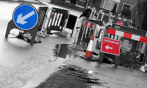
I rather like this and agree with Dawn about the colour, well done to have such an idea and execute it so well.
I also agree the tilt adds to the feeling and doesn't feel too odd as tilted images can.
I agree that the whole colour image lacks enough colour to work at all and using this selectively adds to the impact.
Hiya Martin!
Your representation of Chaos is great! Road works of any sort are the "parents" of a good chaos. I completely agree with some previous comments that the decision to go for selective colouring improves the photo. I am not sure if it will be better to have some signs of the chaos caused by the work - people or vehicle traffic.
Great job!
Rayna
not so sure this one works for me Martin as the arrows are pointing me out of the pic and the angle confuses my brain for some strange reason
however, I do like the first one of your selective colouring shots - gives your pic a focal point and kind of anchors my eye in the pic. Hope that makes sense!
I like the original black and White best. It makes it look gritty and conveys the disruption caused by all that much better.

