
You are using an out of date browser. It may not display this or other websites correctly.
You should upgrade or use an alternative browser.
You should upgrade or use an alternative browser.
Webby Photo52 - Week 52 - Glass added
- Thread starter Webby962
- Start date
- Messages
- 2,735
- Name
- Patrick
- Edit My Images
- Yes
Hi Adie, these are beautiful images and perfect for the theme of "chaos".
I've no idea how you did this, but I must give it a try sometime. I guess there are tutorials out there.
My preference is for the first image. Partly for the colours , but mainly because somehow it seems a more complete image.
Cheers, Patrick
I've no idea how you did this, but I must give it a try sometime. I guess there are tutorials out there.
My preference is for the first image. Partly for the colours , but mainly because somehow it seems a more complete image.
Cheers, Patrick
OP
- Messages
- 298
- Name
- Adie
- Edit My Images
- Yes
OK, here is week 9.
Had a busy week, so had to rush this one, all though hopefully the crossword is correct")
The idea is finishing a break, finishing a crossword and finishing a coffee. I tried to also treat the photo with a finish that brings out texture, so used a heavy contrast B&W finish.
Spent a bit of time arranging the shot, to take into account diagonals, and lead in lines.
Hopefully the shot works.
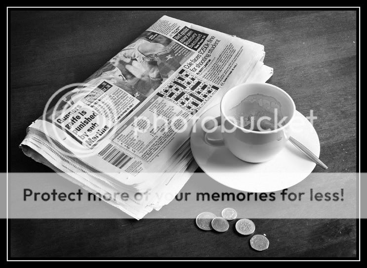
Rgds
Adie
Had a busy week, so had to rush this one, all though hopefully the crossword is correct
The idea is finishing a break, finishing a crossword and finishing a coffee. I tried to also treat the photo with a finish that brings out texture, so used a heavy contrast B&W finish.
Spent a bit of time arranging the shot, to take into account diagonals, and lead in lines.
Hopefully the shot works.
Rgds
Adie
- Messages
- 1,077
- Name
- Matt
- Edit My Images
- Yes
like it, the mono conversion definately does it justice
- Messages
- 737
- Name
- Martin
- Edit My Images
- Yes
Hi Adie,
Really good idea for this. The image says finished to me. That is because of the coffee cup and the coins. I am not sure that the crossword struck me obviously as finished, it was just that you stated it. That's probably not really a bad thing cos it doesn't really matter as the other elements say it all. I agree with hewhoknows about the mono conversion working well. Nice angle for this shot.
Well done on getting it done so soon too
Martin
- Messages
- 666
- Name
- Niall
- Edit My Images
- Yes
I like that. It suits my style that I often use
I was actually going to do something similar before when I finished my jalfrezi. There were lots of colours in the white bowl I didn't have time though
I was actually going to do something similar before when I finished my jalfrezi. There were lots of colours in the white bowl
I didn't have time though drodd
Also loves to mass debate
- Messages
- 5,519
- Name
- Dawn
- Edit My Images
- No
Hiya Adie,
I love your idea for week 9 and it 100% says finished to me.
Great composition with the finished crossword and empty cup, oh and the £1.40 tip (that must have been an expensive cuppa )
)
My only niggle is that something doesn't sit right with the position of the cup and spoon. I would have perhaps had the handle of the cup pointing to the right, rather than the left and then omitting the spoon or showing more of the spoon.
Otherwise I like the processing and think it fits the image well.
Well done
Cheers
Dawn
I love your idea for week 9 and it 100% says finished to me.
Great composition with the finished crossword and empty cup, oh and the £1.40 tip (that must have been an expensive cuppa
)My only niggle is that something doesn't sit right with the position of the cup and spoon. I would have perhaps had the handle of the cup pointing to the right, rather than the left and then omitting the spoon or showing more of the spoon.
Otherwise I like the processing and think it fits the image well.
Well done
Cheers
Dawn
OP
- Messages
- 298
- Name
- Adie
- Edit My Images
- Yes
Ok, been away for a while. Just moved house, so have been without the internet for a few weeks, and knee deep in boxes for the rest.
Well excuses over, and i'm trying to catch up, so these shots are a little rushed, but hay ho, needs must when the devil drives!
here is my take on Trio.. Couldn't find the chocolate bar from my youth, so had to settle for a a little humor instead.

.
.
.
.
.
.
.
.
In case your wondering how this is a trio......
Well a Pair means 2.
Therefore, half a pair is 1.
So a pair and half a pair is 3!!!!
Well excuses over, and i'm trying to catch up, so these shots are a little rushed, but hay ho, needs must when the devil drives!
here is my take on Trio.. Couldn't find the chocolate bar from my youth, so had to settle for a a little humor instead.
.
.
.
.
.
.
.
.
In case your wondering how this is a trio......
Well a Pair means 2.
Therefore, half a pair is 1.
So a pair and half a pair is 3!!!!
- Messages
- 19,461
- Name
- Andy
- Edit My Images
- Yes
Aide, did you forget to add the humour bit to your trio post???
I like the subtleness of this one. I'd like to see the half pear on the left with the stalk coming on from the lower left. Top section is quite dark.
"Teenagers know everything...!" Tell me about it!
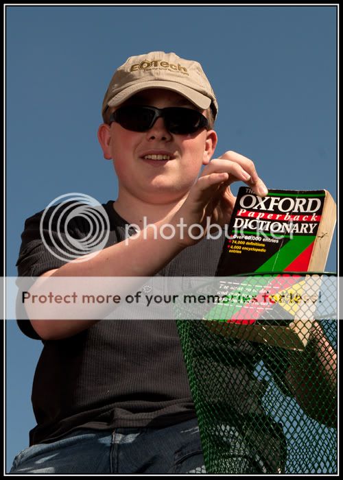
Not a bad photograph. I'd rather the book was bing thrown into a larger bin, if you know what I mean, but I guess with your move time is tight.
Cheers.
I like the subtleness of this one. I'd like to see the half pear on the left with the stalk coming on from the lower left. Top section is quite dark.
"Teenagers know everything...!" Tell me about it!
Not a bad photograph. I'd rather the book was bing thrown into a larger bin, if you know what I mean, but I guess with your move time is tight.
Cheers.
- Messages
- 6,704
- Name
- Colin
- Edit My Images
- No
Brilliant idea for trio, had to think for a bit to get it rather than read the explanation. The top of the whole pear is not as sharp, presumably due to the dof. Although I would have thought f9 was enough to get all of it sharp. Really like the lighting on this and the subtle colours.
Slightly awkward way your son is holding the book looks a bit strange to me but maybe he is further showing his distaste for such books. Again a good take on the theme.
Slightly awkward way your son is holding the book looks a bit strange to me but maybe he is further showing his distaste for such books. Again a good take on the theme.
OP
- Messages
- 298
- Name
- Adie
- Edit My Images
- Yes
Well, still trying to catch up.
This is a bit of a self indulgence, and I have tried to create an image based on a hero of mine... Mr Kiss kiss bang bang...
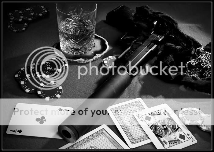
He drinks to excess,
He gambles to excess,
He womanises to excess,
But he practices moderation in his profession, picking his shots carefully, one round one kill.
And in keeping with my attempt to layer my shots with more than one element linking to the theme, the object on the end of the pistol, contrary to what Hollywood will have you believe, is in fact a MODERATOR and not a silencer!
Rgds
Adie
This is a bit of a self indulgence, and I have tried to create an image based on a hero of mine... Mr Kiss kiss bang bang...
He drinks to excess,
He gambles to excess,
He womanises to excess,
But he practices moderation in his profession, picking his shots carefully, one round one kill.
And in keeping with my attempt to layer my shots with more than one element linking to the theme, the object on the end of the pistol, contrary to what Hollywood will have you believe, is in fact a MODERATOR and not a silencer!
Rgds
Adie
- Messages
- 2,175
- Name
- Neil
- Edit My Images
- No
Hi Adie, I don't think I've commented on your 52 before.
After having a quick look there are a few I like - hard stands out for some reason; simple but it appeals to me.
I like your moderation, but I'm thinking the gun needs to be pointing up and leading you into the shot, pointing down doesn't seam to be right, or at least to me anyway. The props are good (I'm hoping the gun is a prop!) and the B&W works well for the image.
I never knew it was called a moderator, every day's a learning day!
- Messages
- 8,398
- Name
- Lynne
- Edit My Images
- Yes
Hi Adie , apologies for missing so many of your weeks...there always seems to be one I manage to miss !
I love your Moderation shot , B&W works really well as seems to add to darkness of his personna but would also love to see the color version ?
Your explanation for Tryo makes me chuckle...great thinking & choice for the theme but maybe a touch lighter or more color to the pairs would add a little more punch ?
Great shots though , well done
- Messages
- 6,704
- Name
- Colin
- Edit My Images
- No
Brilliant take on moderate Adie. Not sure if I would prefer the gun the other way around or not (maybe I'm just scared) So much going on in the picture and conjures up a lot more imagery.
drodd
Also loves to mass debate
- Messages
- 5,519
- Name
- Dawn
- Edit My Images
- No
Hiya Adie,
Oooh, I see I have some catching up to do here:
Trio: like your logic in the explanation. The processing looks good, but I think the focus is out or is that because you have applied some sort of soft effect in processing?
Knowledge: A clear photo, but I think that it looks a bit too staged for my liking. I think it would have looked better if you son casually walking past the bin and just dropped it in.
Moderation: I really like this photo, all the props work well together and the composition great (only nitpick for me would be to include the whole of the glass). Thanks for the information too, never knew it was referred to as a moderator ... but makes sense.
Well done
Cheers
Dawn
Oooh, I see I have some catching up to do here:
Trio:
like your logic in the explanation. The processing looks good, but I think the focus is out or is that because you have applied some sort of soft effect in processing?Knowledge: A clear photo, but I think that it looks a bit too staged for my liking. I think it would have looked better if you son casually walking past the bin and just dropped it in.
Moderation: I really like this photo, all the props work well together and the composition great (only nitpick for me would be to include the whole of the glass). Thanks for the information too, never knew it was referred to as a moderator ... but makes sense.
Well done
Cheers
Dawn


OP
- Messages
- 298
- Name
- Adie
- Edit My Images
- Yes
Thanks for the comments. I may re-shoot that last one.
OK, more catching up, but I'm getting there LOL
Well here is Week 13 Empty.
And after moving house, my wallet is just that, as is my mind of ideas for these catch up shots.
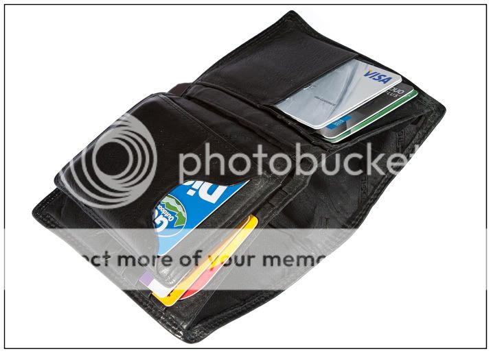
So I wanted to keep the shot empty of any clutter, and shadow, so three flashes and a bit of PS sorted that out
OK, more catching up, but I'm getting there LOL
Well here is Week 13 Empty.
And after moving house, my wallet is just that, as is my mind of ideas for these catch up shots.
So I wanted to keep the shot empty of any clutter, and shadow, so three flashes and a bit of PS sorted that out
OP
- Messages
- 298
- Name
- Adie
- Edit My Images
- Yes
Week 14 - OBJECT
I have submitted the photo for week 14 here as it is NSFW. Do not worry, it is not porn or in bad taste (well, IMHO it isn't) but I thought this was the best way to do it.
NSFW Week 14 - Object NSFW
Rgds
Adie
I have submitted the photo for week 14 here as it is NSFW. Do not worry, it is not porn or in bad taste (well, IMHO it isn't) but I thought this was the best way to do it.
NSFW Week 14 - Object NSFW
Rgds
Adie
- Messages
- 19,461
- Name
- Andy
- Edit My Images
- Yes
Nearly caught up at last
Here is my take on wrong.
A woman and her tools
No hate mail please LOL
I like it and I've done it many times...
Cheers.
OP
- Messages
- 298
- Name
- Adie
- Edit My Images
- Yes
This theme had me almost beat! :shake:
In the end, I went simple for the shot.
The paradox of Stone
Can God create a stone so heavy that it cannot lift it?
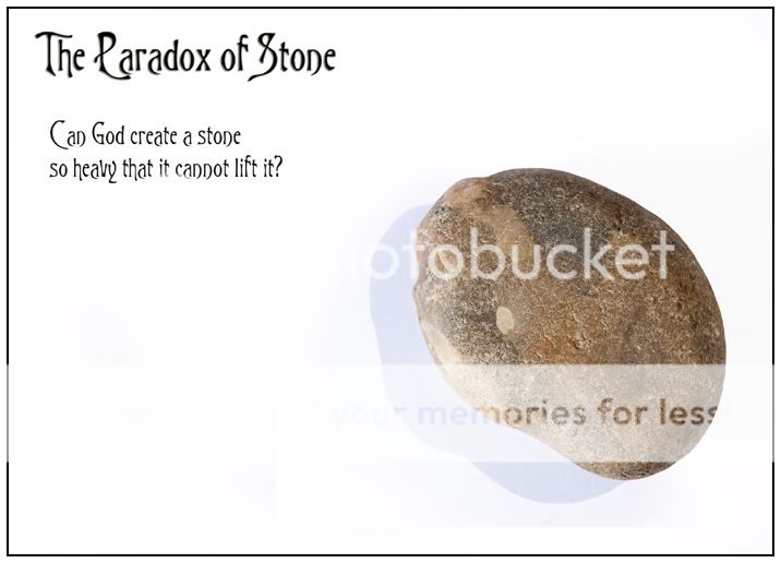
The paradox is as such:
The omnipotent being can either create a stone which it cannot lift, or it cannot create a stone which it cannot lift. If the being can create a stone that it cannot lift, then it cease to be omnipotent, as it is not all powerful. If the being cannot create a stone which it cannot lift, then it is already not omnipotent, as it is not all powerful.
The left the shadow under the stone, as without it, it looked displaced!
Rgds
Adie
In the end, I went simple for the shot.
The paradox of Stone
Can God create a stone so heavy that it cannot lift it?
The paradox is as such:
The omnipotent being can either create a stone which it cannot lift, or it cannot create a stone which it cannot lift. If the being can create a stone that it cannot lift, then it cease to be omnipotent, as it is not all powerful. If the being cannot create a stone which it cannot lift, then it is already not omnipotent, as it is not all powerful.
The left the shadow under the stone, as without it, it looked displaced!
Rgds
Adie
- Messages
- 19,461
- Name
- Andy
- Edit My Images
- Yes
Hi, Adie, well done for making it...
I like it, nice and simple and well composed.
I'm glad you left the shadow in as it adds some depth as well.
I'd like to see a bit more contrast in the rock.
I Googled the Paradox of Stone and now I'm off to bed to sleep it off...
Cheers and good luck with Power...
I like it, nice and simple and well composed.
I'm glad you left the shadow in as it adds some depth as well.
I'd like to see a bit more contrast in the rock.
I Googled the Paradox of Stone and now I'm off to bed to sleep it off...
Cheers and good luck with Power...
drodd
Also loves to mass debate
- Messages
- 5,519
- Name
- Dawn
- Edit My Images
- No
Hiya Adie,
WOW!!! what a fantastic catch up .... all the photos bang on theme and I like each one.
In particular I like how you paid so much attention to detail, even down to the framing.
Week 13: Spot on there (and pretty much how mine looks with having a 6 year old around always wanting everything he sees) Thank goodness for plastic
Week 14: Fantastic and I think you have done well with the b&w conversion. A very sensual image and I think you have capture the whole subject/object perspective very well. Just the right amount of dark space to accentuation the form and flow of the body.
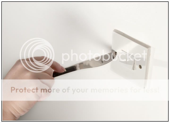
Week 15: and indeed wrong .... what would have been even better is if the switches were in the 'ON' position Fortunately I have a healthy supply of screw drivers so no need to use a knife (although I must confess having done this once or twice before ) As for the hammering a nail in the wall, that would have been good too and I something else I have had to resort to.
Week 16: Excellent and agree the shadow compliments the photos. Love the font you have used for the text (what font type is that?).
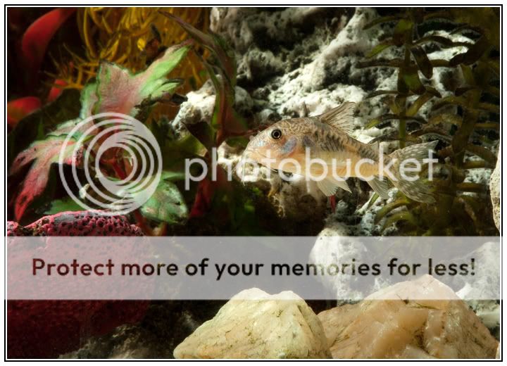
Week 17: Lucky for you to have tropical fish to assist you with this one. Great colours and detail.
Well done, you have really raised the bar with these last few and are making great progress with your project.
Cheers
Dawn
WOW!!! what a fantastic catch up .... all the photos bang on theme and I like each one.
In particular I like how you paid so much attention to detail, even down to the framing.
Week 13: Spot on there (and pretty much how mine looks with having a 6 year old around always wanting everything he sees
) Thank goodness for plastic Week 14: Fantastic and I think you have done well with the b&w conversion. A very sensual image and I think you have capture the whole subject/object perspective very well. Just the right amount of dark space to accentuation the form and flow of the body.
Week 15:
and indeed wrong .... what would have been even better is if the switches were in the 'ON' position Fortunately I have a healthy supply of screw drivers so no need to use a knife (although I must confess having done this once or twice before ) As for the hammering a nail in the wall, that would have been good too and I something else I have had to resort to.Week 16: Excellent and agree the shadow compliments the photos. Love the font you have used for the text (what font type is that?).
Week 17: Lucky for you to have tropical fish to assist you with this one. Great colours and detail.
Well done, you have really raised the bar with these last few and are making great progress with your project.
Cheers
Dawn
OP
- Messages
- 298
- Name
- Adie
- Edit My Images
- Yes
Thanks for your feedback Dawn.
I'm now back on track, and hoping to keep it that way.
Even under pressure of trying to catch up, I wanted to try and layer my shots with multiple meanings, and also keep the quality level at a place I was happy with.
Thanks once again.
Adie
PS, the font is Trinigan (A Victorian font)
I'm now back on track, and hoping to keep it that way.
Even under pressure of trying to catch up, I wanted to try and layer my shots with multiple meanings, and also keep the quality level at a place I was happy with.
Thanks once again.
Adie
PS, the font is Trinigan (A Victorian font)
Last edited:
drodd
Also loves to mass debate
- Messages
- 5,519
- Name
- Dawn
- Edit My Images
- No
Thanks for your feedback Dawn.
I'm now back on track, and hoping to keep it that way.
Even under pressure of trying to catch up, I wanted to try and layer my shots with multiple meanings, and also keep the quality level at a place I was happy with.
Thanks once again.
Adie
PS, the font is Trinigan (A Victorian font)
Hiya Adie,
You certainly have maintained the layer + multi meaning in each of the shots.
Thanks for the font type .... I'll see if I can find that .... I like it
Cheers
Dawn
- Messages
- 2,735
- Name
- Patrick
- Edit My Images
- Yes
Hi Adie, great thread you have going here. Some really imaginative images. I like that many of them are simple yet very effective.
Hard to choose among so many good images. The Paradox pic really appeals for being a simple but really well taken photograph - I love the textures and colours in the stone. And perfect for the theme.
The "tropical" image is also excellent - wonderful colours/textures and very nicely composed.
Great catch up
OP
- Messages
- 298
- Name
- Adie
- Edit My Images
- Yes
My offering for POWER. I have once again layered a few meanings to the theme, but you will probably need to know a bit about the army to get all the meanings.

But in case anyone wonders about the badge itself, here is a little story that sums it up......
A crusty old General died and found himself standing before Saint Peter at the pearly gates.
Peter welcomed him warmly, Come right in, General! "You've served your country well and you may enter Heaven!"
The General looked through the gates and stepped up to Saint Peter, "Just one thing, sonny. I hope there are no bloody Sergeant Major's here. They are the rudest, most obnoxious variety of human being ever. My time on Earth was made very unpleasant by the Sergeant Major. If there is one of them here, I'm not going in; I'd rather go to the other place."
"Don't worry, General," said Saint Peter. "No Sergeant Major has ever made it into Heaven. You'll find none of 'em here." With that the General enters into Heaven. Moments later, he comes upon an amazing sight. It is a swaggering figure in full uniform, slashed peak smartly on his head, a pace stick in one hand, and a beautiful woman on either arm. Incensed, the General rushed back to Saint Peter and bails him up "Hey! You said there were no Sergeant Majors in here! So what the hell is THAT?!?"
"Don't worry, General," says Saint Peter gently. "That's God. He just THINKS he's a Sergeant Major.
Rgds
Webby
SamuelSlade007
RENEGADE!!!!!!
- Messages
- 7,802
- Name
- Frank
- Edit My Images
- No
Adie...just popping in to say...love all of your photos..spot on theme wise..love the composition of moderation..
- Messages
- 6,704
- Name
- Colin
- Edit My Images
- No
Great catch-up. Some really good shots. At this rate I'm looking forward to yyyyyyour week 26 submission by the eeeeeend of this week.