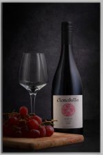
Wine bottle photography

wez130

Steak,wedges and a pint
Messages
2,248
Edit My Images
Yes
Following on from last weeks bollinger champagne attempt, I set this scene up with a nice bottle of red, I would have put some red in the glass to compliment it but I didn't have a cheap bottle handy, and this bottle is too expensive to open for the sake of a photo! I may revisit this with a cheap bottle of red to use in the glass again, however, C&C appreciated, thanks :)

53694223892_38e2bd13b6_b_d.jpg
 
Not cheap but has a screw top o_O
But I like the way you have it all lit and the Grapes just oof.
 
To my eyes, and with the little I know, this is beautifully lit.

:clap:
 
Not cheap but has a screw top o_O
But I like the way you have it all lit and the Grapes just oof.
Hi Graham - I, (we) only buy white these days if it has a screw top and generally, 90% of the time it's South African - still got good contacts in BDX for our time living there and we alway manage a few cases of red a year from our neighbours "across the valley"

That's a good shot Wez, but it's always great to experiment with indoor shots, for me they are usually in a restaurant, when you have to finish what you have bought,
 
The lighting is clever but I find the image a little too dark on a calibrated screen, and the top of the bottle almost disappears. Also the glass appears to have the still-life equivalent of horror lighting that doesn't *please* my eye, even though it stands out well.

I admire the care with which this has been set up and photographed, but I wanted to be more helpful than just 'nice photo'.
It's weird, this forum is making the image darker than it is, it looks brighter when I post it to facebook, and even on the Flickr page it's hosted at, but it's darker here!

Try having a look here....
(click on the image to open in flickr)


View: https://www.flickr.com/photos/194034601@N04/53694223892/in/dateposted-public/
 
It's weird, this forum is making the image darker than it is, it looks brighter when I post it to facebook, and even on the Flickr page it's hosted at, but it's darker here!

You're correct. This is something I've noticed with my own images occasionally, but didn't make the connection.
 
Hi, hope you don't mind an edit? (I'll delete if you wish, this just my personal taste), I felt it was a tad dark, I tweaked levels and lifted the BG. (Only used my phone hope it held up). Nice layout (y)


1000002874-04.jpeg
 
Last edited:
It's weird, this forum is making the image darker than it is, it looks brighter when I post it to facebook, and even on the Flickr page it's hosted at, but it's darker here!
It's actually not darker when posted here. It's an effect of contrast with the background... here it is on a white background which makes it seem darker, and on Flickr it is on a dark grey background which makes it seem lighter. That's why most editing programs provide the ability to change the interface background color (medium grey is a safe default).

You get the same kind of effect from editing in a lighter/darker ambient light conditions.
 
Overall it's very well done.

I think this would have been a little better as a two image composite to eliminate the reflection of the bottle in the glass (or reduce it significantly). I also would have used a spot on the label; or bring it up a bit in post.
 
A very good effort, but the lighting isn't really balanced.

Yes, it does need some "wine" in the glass, but for red wine we normally use dilute fruit drink for that, it saves opening the bottle and also doesn't photograph too dark.
 
Had another go, added an acrylic base for reflection, and a 3rd Godox AD200 with spot modifier pointing at the label. Better or worse?

Edit, i bought wine and forgot to add it grr!


53696215727_5fbbcb9147_b_d.jpg
 
Last edited:
How you go about it is of course entirely up to you, I tend to view this type of shot as a product shot, but everyone has their own way of doing things . . .

As a product shot, I would keep it as simple as possible,, so wouldn't have a reflective base (which adds psazz but which may be distractiing.

First, I would light the bottle, so that would be the only ingredient. I would use an identical strip softbox on each side of the bottle, as close as possible, to light the edges of the bottle and to provide a graduated lighting effect. This effect is usually achieved by having each softbox dead square to the bottle, at least with a dark bottle, i.e. not pointing either towards or away from the camera. The softbox needs to be only just out of shot, so with your composition I would set up the left-hand one first, as space needs to be allowed for the glass and grapes, and then position the right-hand one to match it. This would produce even, matched lighting.

Next, I would add the glass. It's pretty much a tradition to have two glasses rather than one, two indicates company, romance etc., one glass can hint at loneliness, alcoholism, The glass(es) normally have be to slightly forward of the bottle, to avoid getting in the way of the bottle lighting.

And the grapes can then be added.

Just my views, based on how I would go about it.
 
Had another go, added an acrylic base for reflection, and a 3rd Godox AD200 with spot modifier pointing at the label. Better or worse?

Edit, i bought wine and forgot to add it grr!
The label looks better; the glass looks worse. You have added some hot spots and you still have the bottle showing in the glass; moving the glass forward as Garry suggested would fix that if you don't want to composite; but then I don't know how the board/grapes would fit in the composition. If you want the base reflection I would de-emphasize it some (gradient darker/blur).
 
for red wine we normally use dilute fruit drink for that
Was going to say just this - Ribena / Vimto and adjust by dilution to get the desired depth of colour. White Wine (non sparkling), usually apple juice again diluted for tone - though i've even been known to go with cider vinegar - Ontbijtjes 1
 
I've refrained from replying simply because of the experts that have chimed in on this. Between them, Garry, Steven and Mark know more about this sort of stuff than I've had beer in my entire life. And I've had a lot of beer... (more than hot dinners)

So this is coming from someone who knows pretty much nothing compared to them, but Garry's comment...

How you go about it is of course entirely up to you, I tend to view this type of shot as a product shot, but everyone has their own way of doing things . . .
prompted me to reply...

I really like the original shot. What some might call under-exposed is nice and moody to me. I like the fact that there is no wine in the glass because it gives a sense of anticipation. A nice clean glass and unopened bottle waiting to be enjoyed. I like how the reflection of the bottle mirrors the similar shape on the bottle neck. I'm not so keen on the grapes simply because it feels a little cheesy as a foreground choice, but I wouldn't know how to fix it so that the glass and bottle don't look like they're hanging in the air. Maybe a couple of crackers and some cheese to reduce the height and be less intrusive? The acrylic base doesn't work for me at all.

It's pretty much a tradition to have two glasses rather than one, two indicates company, romance etc
This, I agree with, although the one glass gave me an impression of slippers and relaxing at the end of a long day with a treat rather than alcoholism :)

I guess it goes back to Garry's original comment that everyone has their own way of doing things. What were you trying to achieve? Do you think you managed it? What criticism do you have of it?

(not an expert!!!)
 
I guess it goes back to Garry's original comment that everyone has their own way of doing things. What were you trying to achieve? Do you think you managed it? What criticism do you have of it?
One of the hardest things in photography i've found, is making the message my shot conveys, carry through to the image, and be the message that the viewer carries away... The key is often to consider ALL the messages that the image can convey, to anticipate the positive and negative spins that people will put on the shot - because, however much we may just say "oh, its just a picture of a nice bottle of wine, in a suitably atmospheric surrounding" (not dismissing the OP's original image as being just that BTW - its definitely more than that) - EVERYONE who looks at a photo makes their own assessments and writes their own mental story about what they see. They MAY not actually realise that they are doing, but they do. That's why visual media are powerful tools in the right (or, some may argue, even more so the wrong) hands. As a photographer, who did quite a bit of advertising / product shots - though nowhere near Garry's level or depth of experience - I worked with art directors, with marketing people, and lots of "arty-farty" types that weren't interested in the slightest in how I got the photo - all they wanted was that it "spoke" to the message of the job brief. I was there to take the picture they painted in words, and turn it into a 10"x8" transparency.

While I haven't done any of that stuff for a couple of decades or more, that kind of approach still stuck with me, and when I so very occasionally get the camera out these days, for anything of an indoor setup shot, I may have a "centerpiece" of the image that I'm wanting to portray - but - my first recourse is to decide what I want to say about it, and often I'll even write myself a little "back story" for the image, and sketch out the image as if it was a frame from a "storyboard" from that back story being filmed. The key being to try and tell that whole back story in a single frame. That way I've as good a chance as possible to actually get my "message" over. Not saying its right, or its the only way to work, but it certainly improved my outputs quality level (from IMO pretty poor, to half acceptable - i'm very often my own harshest critic)

It's pretty much a tradition to have two glasses rather than one, two indicates company, romance etc., one glass can hint at loneliness, alcoholism
Single glass very much speaks to loneliness, either from loss of partners/friends, or, for example going back to the old masters Vanitas artworks - the isolation that comes with wealth - look back into that school of art, and its very seldom that, even in the massively overloaded tables displaying ostentatious wealth, that the table would be "set" for more than one consumer... like most Vanitas works, there was an element of the artist "thumbing their nose" at the Rich family comissioning their work - saying "you may be rich in posessions, but poor in company and companionship". It's actually a very effective way of setting a mood - a single glass can definitely speak volumes...
 
One of the hardest things in photography i've found, is making the message my shot conveys, carry through to the image, and be the message that the viewer carries away... The key is often to consider ALL the messages that the image can convey, to anticipate the positive and negative spins that people will put on the shot - because, however much we may just say "oh, its just a picture of a nice bottle of wine, in a suitably atmospheric surrounding" (not dismissing the OP's original image as being just that BTW - its definitely more than that) - EVERYONE who looks at a photo makes their own assessments and writes their own mental story about what they see. They MAY not actually realise that they are doing, but they do. That's why visual media are powerful tools in the right (or, some may argue, even more so the wrong) hands. As a photographer, who did quite a bit of advertising / product shots - though nowhere near Garry's level or depth of experience - I worked with art directors, with marketing people, and lots of "arty-farty" types that weren't interested in the slightest in how I got the photo - all they wanted was that it "spoke" to the message of the job brief. I was there to take the picture they painted in words, and turn it into a 10"x8" transparency.

While I haven't done any of that stuff for a couple of decades or more, that kind of approach still stuck with me, and when I so very occasionally get the camera out these days, for anything of an indoor setup shot, I may have a "centerpiece" of the image that I'm wanting to portray - but - my first recourse is to decide what I want to say about it, and often I'll even write myself a little "back story" for the image, and sketch out the image as if it was a frame from a "storyboard" from that back story being filmed. The key being to try and tell that whole back story in a single frame. That way I've as good a chance as possible to actually get my "message" over. Not saying its right, or its the only way to work, but it certainly improved my outputs quality level (from IMO pretty poor, to half acceptable - i'm very often my own harshest critic)


Single glass very much speaks to loneliness, either from loss of partners/friends, or, for example going back to the old masters Vanitas artworks - the isolation that comes with wealth - look back into that school of art, and its very seldom that, even in the massively overloaded tables displaying ostentatious wealth, that the table would be "set" for more than one consumer... like most Vanitas works, there was an element of the artist "thumbing their nose" at the Rich family comissioning their work - saying "you may be rich in posessions, but poor in company and companionship". It's actually a very effective way of setting a mood - a single glass can definitely speak volumes...
I agree with all of this, except this bit
As a photographer, who did quite a bit of advertising / product shots - though nowhere near Garry's level or depth of experience -
I've only ever been a hack photographer who was lucky enough to get and keep the right clients, and I was also arrogant enough to charge good money. Any success has been down to hard work rather than ability, it's the same with my hobbies - shooting, playing pool and playing chess - learn the theory, do the research and concentrate. If I can do it, so can everyone else.
One of the hardest things in photography i've found, is making the message my shot conveys, carry through to the image, and be the message that the viewer carries away... The key is often to consider ALL the messages that the image can convey, to anticipate the positive and negative spins that people will put on the shot - because, however much we may just say "oh, its just a picture of a nice bottle of wine, in a suitably atmospheric surrounding" (not dismissing the OP's original image as being just that BTW - its definitely more than that) - EVERYONE who looks at a photo makes their own assessments and writes their own mental story about what they see. They MAY not actually realise that they are doing, but they do. That's why visual media are powerful tools in the right (or, some may argue, even more so the wrong) hands. As a photographer, who did quite a bit of advertising / product shots - though nowhere near Garry's level or depth of experience - I worked with art directors, with marketing people, and lots of "arty-farty" types that weren't interested in the slightest in how I got the photo - all they wanted was that it "spoke" to the message of the job brief. I was there to take the picture they painted in words, and turn it into a 10"x8" transparency.

While I haven't done any of that stuff for a couple of decades or more, that kind of approach still stuck with me, and when I so very occasionally get the camera out these days, for anything of an indoor setup shot, I may have a "centerpiece" of the image that I'm wanting to portray - but - my first recourse is to decide what I want to say about it, and often I'll even write myself a little "back story" for the image, and sketch out the image as if it was a frame from a "storyboard" from that back story being filmed. The key being to try and tell that whole back story in a single frame. That way I've as good a chance as possible to actually get my "message" over. Not saying its right, or its the only way to work, but it certainly improved my outputs quality level (from IMO pretty poor, to half acceptable - i'm very often my own harshest critic)


Single glass very much speaks to loneliness, either from loss of partners/friends, or, for example going back to the old masters Vanitas artworks - the isolation that comes with wealth - look back into that school of art, and its very seldom that, even in the massively overloaded tables displaying ostentatious wealth, that the table would be "set" for more than one consumer... like most Vanitas works, there was an element of the artist "thumbing their nose" at the Rich family comissioning their work - saying "you may be rich in posessions, but poor in company and companionship". It's actually a very effective way of setting a mood - a single glass can definitely speak volumes...
I really like this shot, it reminds me of Patrick OI'brian's fiddle-playing Captain Jack Aubrey, absolute commander of his ship, but suffering the loneliness of command.
 
FWIW, as an 'ordinary' punter it never occurred to me that one glass might suggest problems and 2 company. It's just a graphic that either appeals or doesn't, but it suggests no more than "this is a nice bottle of wine shot". Or perhaps I'm atypical.
 
reminds me of Patrick OI'brian's fiddle-playing Captain Jack Aubrey, absolute commander of his ship, but suffering the loneliness of command.
the moment you mentioned that, my mind jumped straight to "where can I source / scrounge one of those wide bottomed ships decanters..." :D
 
Thanks for the insight, some interesting thoughts, and it just bolsters the fact that art is perceived in very different ways. I'm very much new to this whole product photography thing and I have a lot to learn, I never really had a 'story'to tell with this just yet, it's more just experimenting with strobes and getting feedback so that I can learn the basics of it all, once I do that then i'll take 'stories'of my scenes into consideration, I just really liked my original edit, to me it looked pleasing to the eye, but then, i'm no professional and didn't know that I had to take harsh light into consideration as much as some of you have, but that said, I also agree and need to train my eyes to see that kind of thing. I've been watiching lots of tutorial videos on Youtube byt a few different authors, Visual education, Workphlo and Adorama to name a few, and they all have different methods of achieving their goals, it's a lot to take in, but i'm really enjoying it too!
 
Back
Top