Critique Attempt number 2....

Messages
1,024
Name
Tom
Edit My Images
Yes
I managed to get another guinea pig to pose for another studio-style shoot. I was going for more dramatic lighting aiming to highlight the textures in the skin rather than hide them. I hope I found a happy medium between this and cruelly editing to make him look 20 years older!! The cropping of 1 was intentional and slightly experimental, i.e tight crop, placing him far left with neg space to the right.

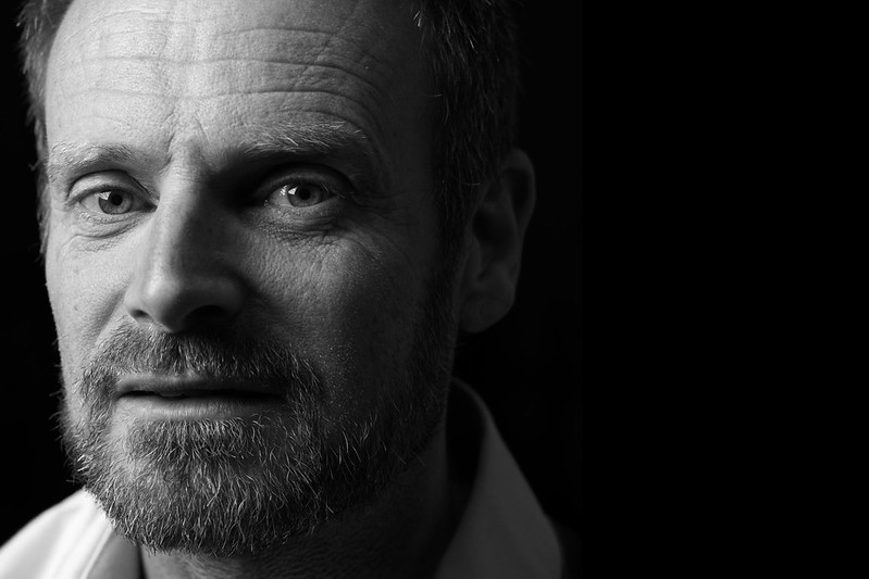
Martin 2 by Tom Pinches, on Flickr

Martin 1 by Tom Pinches, on Flickr
 
Lighting is better on 1 but I prefer the crop on 2.
 
I much prefer number 2 with the more central face. Number 1 seems to have the face too far to the left with no real interest to the right. But what do I know. They're both good pictures and the rest is just taste and preference :D

Well done Tom :D
 
I can't make my mind up! Have they been processed slightly differently? Number 1 seems to be more black and white. Number 2 has a slight brown/sepia hue to it. Whatever, both are great shots, good work I'd say.
 
What are you wanting critique on?

They're accurately exposed, focused, lit and processed. I'd have liked less dense shadows in his left eye socket but that's a small detail.

I don't understand - from the images - why you've framed them this way. By having his chin so close to the bottom edge you've made him look short - and the way you've cropped his head makes his forehead look huge. I'm confused by the vertical bar in the background of both. It'd be nice to have either some background detail or none but this is in between.

I suspect.. you're following the same path I did for ages, letting the lighting lead the imagery rather than the subject. I'd encourage you to avoid repeating my mistakes. Ask yourself why you're framing / lighting / processing in a particular way and what you're trying to convey.
I'm wanting critique on the kind of things you provided critique on! So thank you. As I said, these are first forays into this kind of photography so there are clearly many unknown unknowns.

Regarding your comment on the lighting leading the imagery rather than the subject, I think you're probably right, but I lack the skills and experience to do it that way. I imagine you need a fairly good foundation of the technical aspect before you can start using it creatively, to convey meaning and emotion. I have no idea what I'm trying to convey let alone how to do it o_O
 
I can't make my mind up! Have they been processed slightly differently? Number 1 seems to be more black and white. Number 2 has a slight brown/sepia hue to it. Whatever, both are great shots, good work I'd say.
You're right, I did play with the tones a bit. I created a gradient map for the first, saved it as a present and applied it to the second, hoping for continuity but then still ended up different! *shrug*
 
I'm wanting critique on the kind of things you provided critique on! So thank you. As I said, these are first forays into this kind of photography so there are clearly many unknown unknowns.

Regarding your comment on the lighting leading the imagery rather than the subject, I think you're probably right, but I lack the skills and experience to do it that way. I imagine you need a fairly good foundation of the technical aspect before you can start using it creatively, to convey meaning and emotion. I have no idea what I'm trying to convey let alone how to do it o_O

That was certainly my approach, yet there are plenty of hugely creative people who (by their own admission) have little technical skill.

My approach (these days!) is to experiment with one thing at a time. In this case I'd play with either lighting OR framing but not both. It's quite hard to see what effect your technical changes are having when lots of things are moving.

One last thing.. your early attempts at studio stuff are leagues better than mine were :)
Unfortunately I'm not hugely creative so I'd better get learning :p
 
Love the images, not a huge fan of the crops. IMO I would re-crop img 1 splitting the difference between the edge of his collar (right) and the start of the black - so you're splitting that thin line of grey background - essentially making the image more or less square. Would probably be inclined to do the same to the img 2 as well. Keep the main thing the main thing. But lovely tones and interesting and open subject.
 
Cropping is such a personal thing, there's not really a right/wrong answer but just ask yourself why you're cropping the image in the way that you are, how does it benefit your subject and your photograph, and also to keep aware of the lighting in the final crop. What works in camera can change drastically once that image is cropped - A strong light on the forehead, cropped as you have it here, draws the viewer away from the eyes and out of the image immediately.

You could use a flag to block some of the light on the left side of the image (the right side of the face) to better sculpt the light around his face. This would darken that side and draw the viewer's eye more into the centre, as well as creating depth in the image itself. You could also use a scrim to darken down his forehead, or do this in post if you have to.

Another way to add depth is to perhaps use a rim light to carve out his facial features on the right side of the photograph, but I personally wouldn't do this without having some sort of background present to add another layer of depth - a rim light on a plain black background can look quite flat and artificial.

I think the next step is to really work on sculpting your light with flags and scrims. An excellent tool to play around with this is set.a.light.3d
It's a lighting simulator that lets you add and remove lights / flags / reflectors etc to work out how your lighting is affected. Then when you do sit down with your model you'll know exactly where to place everything to achieve the look you're going for.
 
Back
Top