weekly blakesters 2014 52 - Retired Gracefully

Hi Iain
Number - like the comp. Strange about the coin tho - to me it should be more CCW so that the words are readily readable, but then the 'six' would be lost o_O. Lovely dof but that brown base really hurts my eyes.
Strong - no need for the crowbar - bang on theme. Lovely lighting and comp. (y) LH ring has less detail than the RH one to my eyes.
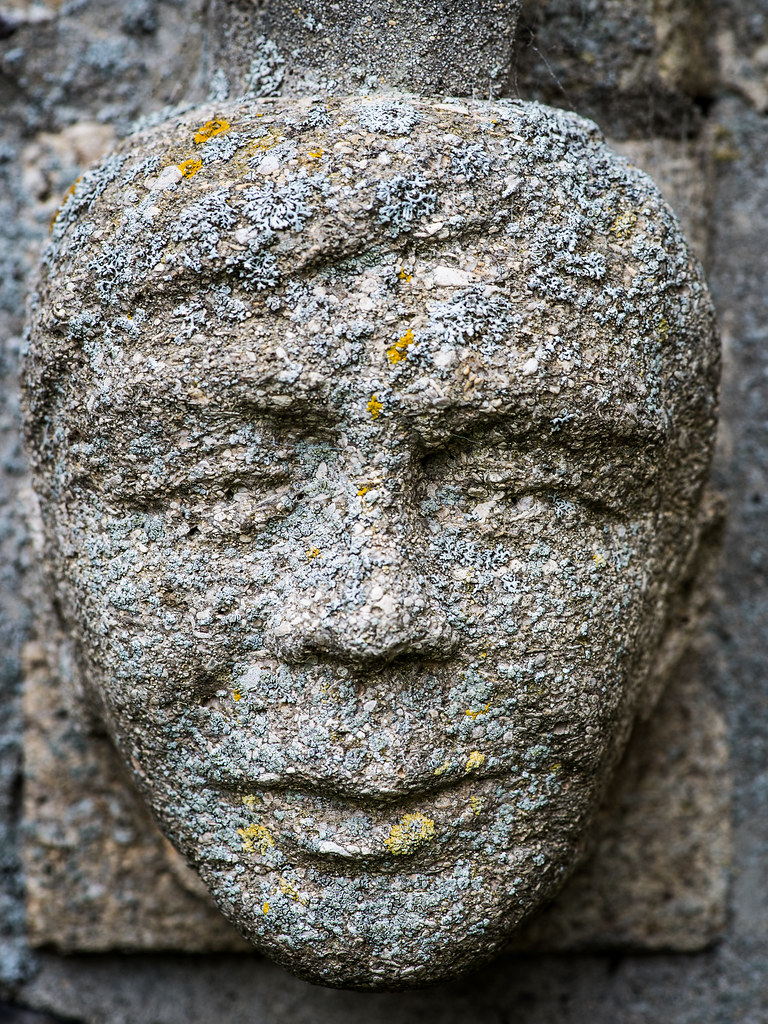
Texture - #1 - lots of detail and the lichen adds to the feel. suitable crop too. The dark bit top right is a bit distracting
#2 - not sure about this. I really like the idea/concept and the contrast between the hard nails, soft skin and gritty sand - but my eyes keep being drawn to the strange b/g or the dark mark on the LH wrist
 
Hi Iain, the heart in hands is great. Nice idea and another potential poster print for Athena!

Who would have though that YOU would shoot stones on the texture week eh? :LOL:

All the best mate.
 
Hi, #1 for me. #2 is a good take but I'd prefer the sand coloured.

#1, has great detail and the textures really work. Does look like it's popping out if the screen. Work's PC isn't the best but looks a little flat. I'll have another look tonight.

Cheers.
 
Definitely #1 for me. Lots of different colours, textures and shadows give it a real 3D feel. Not so keen on the heart, it's just a little too pale and lacking in contrast to bring out the texture.
 
Hi Iain, I like the both, both good for the theme, think I am wavering towards the face as its a little bit spooky
what lovely nails you have though :)
 
Hi Iain
Number - like the comp. Strange about the coin tho - to me it should be more CCW so that the words are readily readable, but then the 'six' would be lost o_O. Lovely dof but that brown base really hurts my eyes.
Strong - no need for the crowbar - bang on theme. Lovely lighting and comp. (y) LH ring has less detail than the RH one to my eyes.
Texture - #1 - lots of detail and the lichen adds to the feel. suitable crop too. The dark bit top right is a bit distracting
#2 - not sure about this. I really like the idea/concept and the contrast between the hard nails, soft skin and gritty sand - but my eyes keep being drawn to the strange b/g or the dark mark on the LH wrist

Thanks for commenting Alan (y)
Number - yes I wanted the words 'sixpence' visible but i get what you are saying about the rotation.
I don't really understand about the brown base hurting your eyes though, its not a bright vivid colour or such :thinking:

Texture - the dark mark on the LH wrist is a mole, it is there and I wasn't prepared to clone it out.

Cheers
 
Hi Iain, the heart in hands is great. Nice idea and another potential poster print for Athena!

Who would have though that YOU would shoot stones on the texture week eh? :LOL:

All the best mate.

Chests Brian (y)
Its not actually a stone, its sand moulded into the shape of a heart :D but I can see how it looks like a stone.

nice set of images, on theme. Prefer number 2 as it has vareity of textures

Thanks Richard (y)

Hi, #1 for me. #2 is a good take but I'd prefer the sand coloured.

#1, has great detail and the textures really work. Does look like it's popping out if the screen. Work's PC isn't the best but looks a little flat. I'll have another look tonight.

Cheers.

Cheers Andy (y)

I am a bit confused though between your comments that its popping out of the screen to looking a little flat, they seem to contradict one another :thinking:
 
Definitely #1 for me. Lots of different colours, textures and shadows give it a real 3D feel. Not so keen on the heart, it's just a little too pale and lacking in contrast to bring out the texture.

Thanks Elaine (y)
I found upping the contrast rendered the hands/skin a little harsh but I understand your point, I agree.

Hi Iain, I like the both, both good for the theme, think I am wavering towards the face as its a little bit spooky
what lovely nails you have though :)

:DThanks Allan (y)

Hi Iain, No 1 is slightly better for me. I think a tighter crop on 2 would help, but both great shots.

Thanks Richard(y)

Texture - two very good images but the second image has the edge for me. I prefer the composition works well and the choice of processing works as well. Great stuff Iain keep up the hard work :)

Thanks Mandy (y)
 
Hi Iain

Number...very original idea & well executed....DOF is incredibly small...really we ll done to get the main focus so pin sharp :clap:

Strong.....beautiful subject , really well lit & sharp.........not sure on the placement but that's just a personal thing

Texture....has to the Hands for me simply as it's such an original idea ,no crit from me at all....perfect as is :clap:

Thanks Lynne (y)

Looking forward to our catch up soon :D
 
Action - Not on theme as you say but I do like all the expressions in the faces image

Mono - Nice mono conversion and good use of using a crop that suits the image rather than the standard dimensions

Twisted - Great idea. My eye keeps being drawn to the middle prong which looks PP'd on or is it just the lighting

Fresh - Super shot. Well executed. I do like how close the whiteness of the shells are to the background. They almost blend in without disappearing. This probably says something about the good use of lighting

Shape - I've seen plenty of pencil shots but the card suits link for the shape was well thought out. Plenty of patience I guess as well.

Number – Gosh I haven't seen one of those for a while. Nice use of the very shallow DoF. Breaking the rule of thirds works on this one

Strong – Super clean whites. Big thumbs up to the lighting again

Texture - Both good on their own but I think I prefer #2. It has a bit more of a story to it which makes me want to know more.
 
Thought it was a heart shapoed stone at first, which lead me to think that the sand on the fingers and hands shouldn;t really be there....

Then I twigged it was moulded sand, and the grains around the fingers and nails.... (nice work getting this with the added complication of the self-timer!! :naughty: ) all makes sense.

Great shot.
 
HI Iain, 2nd image for me I quite like the different textures in the pic kinda agree with a comment above where a bit of colour may ad to this

Thanks Craig (y), I initially processed this as a colour image but wasn't sure about it. I preferred the mono conversion.

Action - Not on theme as you say but I do like all the expressions in the faces image

Mono - Nice mono conversion and good use of using a crop that suits the image rather than the standard dimensions

Twisted - Great idea. My eye keeps being drawn to the middle prong which looks PP'd on or is it just the lighting

Fresh - Super shot. Well executed. I do like how close the whiteness of the shells are to the background. They almost blend in without disappearing. This probably says something about the good use of lighting

Shape - I've seen plenty of pencil shots but the card suits link for the shape was well thought out. Plenty of patience I guess as well.

Number – Gosh I haven't seen one of those for a while. Nice use of the very shallow DoF. Breaking the rule of thirds works on this one

Strong – Super clean whites. Big thumbs up to the lighting again

Texture - Both good on their own but I think I prefer #2. It has a bit more of a story to it which makes me want to know more.

Thanks Peter (y)
Twisted, its just the lighting, it hasn't been pp'd.

Thought it was a heart shapoed stone at first, which lead me to think that the sand on the fingers and hands shouldn;t really be there....

Then I twigged it was moulded sand, and the grains around the fingers and nails.... (nice work getting this with the added complication of the self-timer!! :naughty: ) all makes sense.

Great shot.

Thanks Graham (y)
Yes it was tricky shooting my own hands ;)
 
Week 23 - Wild
A little late and again a bit of a departure away from my usual subject/style.
Post and be damned, onward and upward.

C&C welcome as always but not expected/required.

Week 23 - Wild by iain blake, on Flickr
 
Better late than never Iain, and nothing wrong with a post and be damned. I like this the composition works well, and with the focusing on the Lilly pads makes the image. My only niggle is in the bottom of the frame in the middle of the image you have the top off the flower bud. I would off been tempted to clone it out, that said still a pleasing image.
 
Hi Iain, the most interesting part of the picture are the dragonflies but they are a little lost the OoF water lily seems to dominate, my eye is constantly drawn to it,
of course that may well have been your intension but I am not sure why
 
Better late than never Iain, and nothing wrong with a post and be damned. I like this the composition works well, and with the focusing on the Lilly pads makes the image. My only niggle is in the bottom of the frame in the middle of the image you have the top off the flower bud. I would off been tempted to clone it out, that said still a pleasing image.

Thanks Mandy (y)
I tried cropping the bud as opposed to cloning it but that brought the damsel fly too close to the bottom of the frame. Cloning out the bud would have been the preferred option, I agree but laziness kicked in I'm afraid :D

Hi Iain, the most interesting part of the picture are the dragonflies but they are a little lost the OoF water lily seems to dominate, my eye is constantly drawn to it,
of course that may well have been your intension but I am not sure why

Cheers Allan (y)
The damsel fly are really the subject of the frame but it was my intention to have the wider shot.
I hear what you are saying about the water lily though, choices, choices eh?
This was another repeat theme, and it's all I can do to muster the enthusiasm for the 52 at the moment. That's not an excuse tbh just thinking out loud :D

Just spotted this on Flickr.....the dragonflies look like they're dancing......well spotted & framed (y) Nice to see something a little different from you :) I must admit I'd also have attempted to clone out the flower bud.....:exit:

Thanks Lynne (y)
I hear you too on the subject of the bud, please see my lame excuse reasoning above :D

Hi Iain,
Texture...It's the hands for me too, clever idea, nicely shot :)
Wild...love the reflection of the lge lily,the flower bud is a bit of a distraction not easy to clone i guess, the mating damsel flies finish it off nicely(y)(y)

Thanks judi(y)
Much appreciated your commenting.
Excuse my laziness in processing said bud from the frame :D
 
Hi Iain, the most interesting part of the picture are the dragonflies but they are a little lost the OoF water lily seems to dominate, my eye is constantly drawn to it,
of course that may well have been your intension but I am not sure why

I kind of agree here. My eye was first drawn to the OOF lilly, but then I looked around and saw the subtle little creatures hovering there. I think it's cleverly done if that's the intention, but as has been said, it takes a moment to see them and that's each time it's viewed too.
 
I kind of agree here. My eye was first drawn to the OOF lilly, but then I looked around and saw the subtle little creatures hovering there. I think it's cleverly done if that's the intention, but as has been said, it takes a moment to see them and that's each time it's viewed too.

Thanks Simon (y)
I wanted to present the 'scene' rather than a crop of the damsel fly.
Having the viewer look around the image was my intention.
 
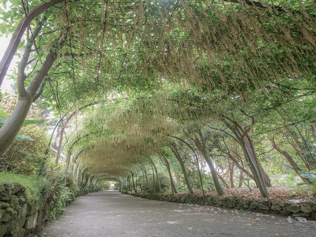
Week 24 - Dream/Dreamy a little late again but this was taken in the week of the theme.
Its more the processing on this which I hope conveys a dreamy look, I lowered the clarity and contrast plus desaturated it a little too.
This was taken at Bodnant Gardens in Wales, its a laburnum arch, I think its not at its best as the flowers are dying off a little, still wonderful to walk through it though.

C&C welcome as always but not expected.

Week 24 - Dreamy by iain blake, on Flickr
 
Texture - I won't mention the bud. Whoops too late LOL. What a great find. I've never seen damsel flies behave like that

Dreamy - I can see where you are going with this. I'm thinking it's maybe missing something/somebody at the end of the arch. Having been there in full blossom I think you'd have struggled to mute the colours enough to get the dreamy feel
 
Hi Iain
Wild - I get the point that the theme is concentrated on the flies but with a dreamy (Next week!) feel to the lily b/g. It would work better I feel if the whole scene could be shifted left so that the lily was less in the centre and thus less dominant. Lovely colours and quite serene
Dreamy - the oof lily has a lovely dreamy quality and .... oops. :)
The archway has got the theme I think. I like the pov and the curvature of the path and the wide angle lens. The desat seems a good idea for the theme and yet it has made it all a touch grey on my screen, partic the light area of sky top left which draws my eye. Having said that I am on a little netbook and i am not sure of its colour reproduction generally
 
'Ello, Iain, wild the detail in the dragonflies is great. Nice low angle and well composed. Pity you didn't move your toe....bottom centre :)

Dreamy, I saw your crafting this one. Works for me. Maybe a little warmer. Not sure how you are with processing but I'd be tempted to merge a blurred one just to add a little to the dreamy effect.

Cheers.
 
Texture - I won't mention the bud. Whoops too late LOL. What a great find. I've never seen damsel flies behave like that

Dreamy - I can see where you are going with this. I'm thinking it's maybe missing something/somebody at the end of the arch. Having been there in full blossom I think you'd have struggled to mute the colours enough to get the dreamy feel

Thanks Peter(y)
The damsel fly were mating, you can see the second of each pair at the bottom on the lily.
You could be right about someone being at the end of the arch, good point.

Hi Iain
Wild - I get the point that the theme is concentrated on the flies but with a dreamy (Next week!) feel to the lily b/g. It would work better I feel if the whole scene could be shifted left so that the lily was less in the centre and thus less dominant. Lovely colours and quite serene
Dreamy - the oof lily has a lovely dreamy quality and .... oops. :)
The archway has got the theme I think. I like the pov and the curvature of the path and the wide angle lens. The desat seems a good idea for the theme and yet it has made it all a touch grey on my screen, partic the light area of sky top left which draws my eye. Having said that I am on a little netbook and i am not sure of its colour reproduction generally

Thanks Alan (y)

'Ello, Iain, wild the detail in the dragonflies is great. Nice low angle and well composed. Pity you didn't move your toe....bottom centre :)

Dreamy, I saw your crafting this one. Works for me. Maybe a little warmer. Not sure how you are with processing but I'd be tempted to merge a blurred one just to add a little to the dreamy effect.

Cheers.

Cheers Andy (y)
I hear what you are saying about another layer on dreamy, never thought of that :)
 
Hi Iain

Think I need to view this on the pc ( currently on the netbook and not sure how good the color repro is ), on theme for me with the processing you've done though I agree with Andy in that a bit more blur might add to the effect along with a touch more warmth ?

Vertical should be more up your street so expecting great things from you this week (y)

I wouldn't bother Lynne :D
I shall put this week down as a miss and concentrate on the coming weeks theme vertical.

I am out in London tomorrow today with the camera club I am a member of so should get a few opportunities for this week.
 
Hi Iain .... A catch up from me ....
Texture....it has to be the heart in hands, I find the long fingernails at the top a bit jarring against the softness of the image, but I think the b&w suits it well and I really like the idea for the theme.
Wild....is a nice image, it would be good to have some more clarity on the damsels but then it may spoil the overall image with the lovely white lily.
Dream ...that looks like a mega long tunnel, I think it would take a little more softening for the theme, but I like the idea and the hanging remains of the flowers do give it a dreamy feel.
 
Catch-up time...

Texture - I like both and for different reasons. Top one is so obviously textural, you can almost feel it. The second is a much more interesting composition/photo, even if the texture element is slightly weaker. I really like both!

Wild - I like everything you have in shot and the DOF, lighting etc... but I'm struggling with the composition a bit. Not sure why, but it feels as if the insects are being overcrowded by the lilies etc. Had there been more space between them and the flowers (some negative space around them) it might work better for me?

Dream - great subject and choice for the theme (which is a difficult one). I like it. A more washed out look (see Blondie606's) might suit this? More haziness at the end of the tunnel, perhaps? Great spot though...
 
Back
Top