You are using an out of date browser. It may not display this or other websites correctly.
You should upgrade or use an alternative browser.
You should upgrade or use an alternative browser.
But Is It Art?
- Thread starter Catdaddy
- Start date
- Messages
- 29,408
- Name
- Marcel
- Edit My Images
- Yes
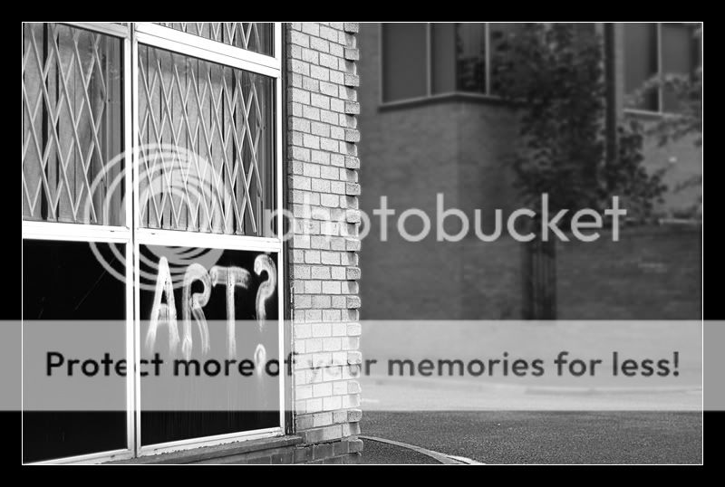
Hmm I can see what you're trying to achieve....I think.
The split down the middle of the edge of the brickwork, to separate the shot.
However, (I hope this doesnt sound horrible), I think the right hand side of the image is wasted. There's nothing in it to interest me at all. Nor to offset the left and the graffiti.
What I think may have worked, from what I can see of the scene, is a portrait of the graffiti and the window above it, half and half, black and white, so to speak.
I hope this doesn't put you off sticking with it, because it's only my opinion, and I really hope it doesn't sound too harsh.
- Messages
- 2,548
- Name
- Steve
- Edit My Images
- Yes
It states that it is art, but questions itself. When does art become vandalism?.
I guess if it is my window it's vandalism. Gotta love subjectivity.
I guess if it is my window it's vandalism. Gotta love subjectivity.
- Messages
- 3,125
- Edit My Images
- Yes
I think the image works as a whole, it shows that this is the work of a little s*d who was just trying out his daredevil skills, the space is needed to show that this is a quiet neighbourhood, with people minding their own business and then this happens...gggrrrr....I like graffitti, but this is vandalism. Nice artistic shot though 

- Messages
- 2,553
- Name
- Chris
- Edit My Images
- Yes
Thanks for the comments, everyone! Looking at the pic again it does seem to be unbalanced - and no, it's not intentional, unfortunately! 
I think I need to kidnap someone from Camden and have them walking away down the far pavement to keep a bit of (human) interest in the shot. I might have another go at this one...
(Note to self - must think more about shots before taking them!)
I think I need to kidnap someone from Camden and have them walking away down the far pavement to keep a bit of (human) interest in the shot. I might have another go at this one...
(Note to self - must think more about shots before taking them!)
CT
TPer Emeritus
- Messages
- 26,617
- Edit My Images
- Yes
I like it a lot, and the space on the right serves to throw the subject matter into sharp focus by contrast if nothing else. You should do it again Chris probably with a figure or figures oof on that far pavement going about their business in apparent indifference to the question. 
H
Hoodi
Guest
I'm liking it, but is the DoF real?
The toning is rather good, too..
Compositionally it's awkward - I like the dead space, but it's still too busy to feel truly "dead" - and I end up thinking I should see more in it.
The toning is rather good, too..
Compositionally it's awkward - I like the dead space, but it's still too busy to feel truly "dead" - and I end up thinking I should see more in it.

