You are using an out of date browser. It may not display this or other websites correctly.
You should upgrade or use an alternative browser.
You should upgrade or use an alternative browser.
Critique Chinatown New York
- Thread starter Oakneck
- Start date
D
Deleted member 34016
Guest
Ok feed back it is 
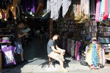
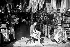
1. China town has such a vast array of colours- why shoot or convert to mono?
2, Eye contact would have been nice with the subject sat down
3. He is far to central in the image for me
Just a few initial thoughts
Les
1. China town has such a vast array of colours- why shoot or convert to mono?
2, Eye contact would have been nice with the subject sat down
3. He is far to central in the image for me
Just a few initial thoughts
Les
woof woof
I like a nice Chianti
- Messages
- 39,685
- Name
- Alan
- Edit My Images
- No
I'm ok with the balance with the ladies in the middle and blokes on either side and I'm ok with no eye contact so all in all I do like it but Les does make a point which could be valid but as you took the picture Raymond colour or B&W is down to you 
I don't mind the mono, there is nice contrast in the scene
the side of the guys head is very bright, perhaps burnt out? because he's bright relative to the rest of the scene, he's the subject.. but he's just sat there, side-on doing nothing.. so personally, I dont find it very interesting.
there are nice layers in the scene though, with the guy on the left and lady in the background.
Hi Les,Ok feed back it is
1. China town has such a vast array of colours- why shoot or convert to mono?
2, Eye contact would have been nice with the subject sat down
3. He is far to central in the image for me
Just a few initial thoughts
Les
Thank you for taking the time to give me some feedback; I appreciate it. At the time, I was nervous about going up and asking for a photograph. I like to edit in black & white sometimes when it comes to street photography. I don't feel confident that much doing regular edits. You're right about the colors in Chinatown standing out.
Last edited:
Hi Alan,I'm ok with the balance with the ladies in the middle and blokes on either side and I'm ok with no eye contact so all in all I do like it but Les does make a point which could be valid but as you took the picture Raymond colour or B&W is down to you
Thank you for taking the time to give me some feedback; I appreciate it. I like to edit with black & white it's my taste, and I find it hard sometimes to do regular edits. I find myself overthinking during the editing process, and I still need more practice.
Hi Gramps,I'm guessing that colour would have been manic with this type of setting.
Thank you, I took this photo due to the sunlight shining down on the person in the middle.
Hi Alan,I don't mind the mono, there is nice contrast in the scene
the side of the guys head is very bright, perhaps burnt out? because he's bright relative to the rest of the scene, he's the subject.. but he's just sat there, side-on doing nothing.. so personally, I dont find it very interesting.
there are nice layers in the scene though, with the guy on the left and lady in the background.
Thank you for taking the time to give me some feedback; I appreciate it. I'm glad you said that because the picture felt off, even though I like it. The guy on the left is reading the newspaper, and the lady in the middle should be the focus point.
- Messages
- 291
- Name
- Peter
- Edit My Images
- Yes
So what if it is ''Manic'' all those colours would be spectacular.
Sorry, for the late reply was busy. Thank you, for giving me feedback.So what if it is ''Manic'' all those colours would be spectacular.
I would like to see the colour version, yes it would be manic but it’s a manic city. It’s great that on the far left you have New York City on the T-shirt to identify the city.

Sorry for the late reply, and thank you for the feedback. Here is the color edit for some reason it's not showing the one I edited.
Last edited:
Thank you, I wish the actual one would be able to upload.And that is very nice too Raymond
- Messages
- 41,880
- Name
- 'Gramps'
- Edit My Images
- No
Though this is in colour (and generally I like colour) this example is duller than the B&W version.View attachment 353884
Sorry for the late reply, and thank you for the feedback. Here is the color edit for some reason it's not showing the one I edited.
- Messages
- 4,907
- Name
- Simon
- Edit My Images
- No
He's in interesting light but it hasn't caught his face and ultimately the main feature is a bored bloke on a phone.
I like the guy with the paper and the woman at the very back though. Maybe.. if you cropped the right and top & did some dodging to bring out the 4 people in the back it would make a stronger image?
I like the guy with the paper and the woman at the very back though. Maybe.. if you cropped the right and top & did some dodging to bring out the 4 people in the back it would make a stronger image?
Thank you for the feedback for some reason the one I edited won't show up.Though this is in colour (and generally I like colour) this example is duller than the B&W version.
Thank you for the feedback; I must be doing something wrong when I try to upload it. It will only show the unedited one for some reason, and I don't know why that keeps happening. Do you have that issue when you try to upload photos?He's in interesting light but it hasn't caught his face and ultimately the main feature is a bored bloke on a phone.
I like the guy with the paper and the woman at the very back though. Maybe.. if you cropped the right and top & did some dodging to bring out the 4 people in the back it would make a stronger image?
- Messages
- 4,907
- Name
- Simon
- Edit My Images
- No
haven't heard of that before, sorryThank you for the feedback; I must be doing something wrong when I try to upload it. It will only show the unedited one for some reason, and I don't know why that keeps happening. Do you have that issue when you try to upload photos?
Thanks.haven't heard of that before, sorry


