Critique Close-up baby photo

Messages
34
Edit My Images
Yes
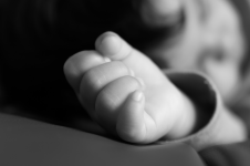
I don't do black and white that often but I thought this would work well. I do a lot of close-up and detailed photos of babies and children but I like keeping them realistic.

Please let me know what you think of this, any critique is welcome. Thank you!
 

Attachments

  • baby-hand-3000.png
    baby-hand-3000.png
    227.5 KB · Views: 36
Last edited:
Its very difficult to offer advice to new comers without knowing their level of experience and people are reluctant to be too critical.

I don't know if you were going for a soft look but for me I'd like a little more sharpness in the skin, also the OOF background is a bit too busy and distracting.

Well done for posting though and please show us more.
Appreciate your response!
I'll keep that in mind next time. I thought it would be nice to show some context in the background instead of just the hand.

Would it be better with a focused background or just a clear one?
 
Appreciate your response!
I'll keep that in mind next time. I thought it would be nice to show some context in the background instead of just the hand.

Would it be better with a focused background or just a clear one?
This is not my genre of interest but I note that you said you wished the background to give some context.

So purely my view as I see it:-
There is nothing of context that I can discern. However, the parents might see more than i do because it is their child and the oof BG has meaning to them!

Having said that I think it would be strange if the hand was isolated & disembodied.

In summary, I don't have your vision of what you are trying to achieve based on this image.........but I am not your potential client, they may see such an image differently :thinking:
 
Would it be better with a focused background or just a clear one?
For me, and I'm no expert, a more focussed but soft background might work but I think the bigger issue is the amount of contrast in the background, there is quite a hard transition in the middle of the frame and I feel it would be better if there was a smoother transition and if the shadows were lighter. What does the colour version look like? Are you using software like lightroom or photoshop where you could convert colours to lighter tones in the mono version
 
Back
Top