Captive Colour/Mono or bin?

Messages
5,635
Name
Shaheed
Edit My Images
No
So as I've not had the opportunity to shoot with the camera, I've been looking through the hard drive for neglected images. I am looking forward to being able to shoot some new material at the weekend!

In the meantime, I found an image which I thought was usable but again had earlier neglected!

I think I prefer the black and white but not sure about the image!

Anyhoo

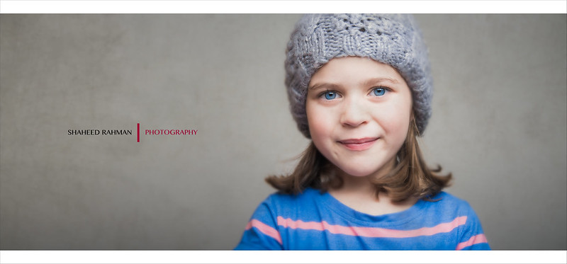
Stare by Sir SR, on Flickr

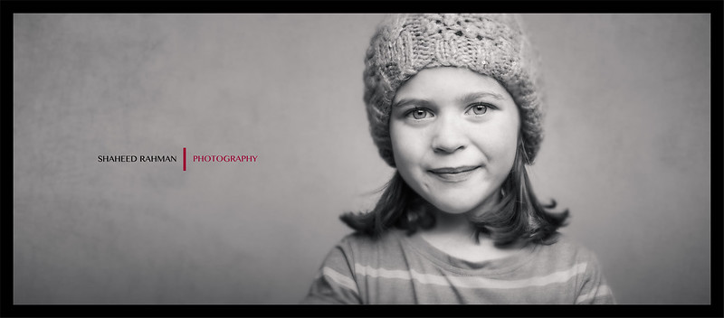
Stare B&W by Sir SR, on Flickr

Thanks for looking

Shaheed
 
With eyes like she has got seems a shame to make them b&w
 
Wow! I was expecting a closer call.....it seems most people like the colour!

I think as Bruce mentioned it might be the distracting top that puts me off as it draws attention away from her face. Maybe I'm being too picky again!

S
 
There's always one... :rolleyes:

;)

Nice shot of the missus too. Still reckon it's yours though. :p

It's a really old shot of the Mrs and technically all over the shop......but it's a rare capture of her on camera!!

Actually I have a horrible feeling that there is a pic of me wearing that hat in the depths of Flickr
 
Black and white for me... i do love her eyes in the colour but black and white always seems to grab me more:)

I also love black and white. Her eyes look blue to me in the mono (I can tell they're piercing rather than actually seeing blue) if that makes sense!

Thanks for looking/commenting!

Shaheed
 
I like the black and white to be honest. Think of she had a more neutral coloured top on id say colour.

Very nice.


Yeah i totally agree, the more i look at it the more the top is the issue, not sure why because it's not really an in your face top, it just bugged me lol
 
Serious question and probably noob questions, I only shot portraits of the mutt and not very often.

Why are your portrait shots done in landscape mode, with a wide empty space for your watermark and finally the last two you have posted have had the top of there heads chopped off ?? I like your photos and I'm curious why you do the above mentioned, is it just your style and being different??

PS , I prefer the colour version.
 
Last edited:
Very nice dude! I'm going to be different and say to drop the saturation down a tad... Not colour, not black and white. It will match up to your texture better I think.

Serious question and probably noob questions, I only shot portraits of the mutt and not very often.

Why are your portrait shots done in landscape mode, with a wide empty space for your watermark and finally the last two you have posted have had the top of there heads chopped off ?? I like your photos and I'm curious why you do the above mentioned, is it just your style and being different??

PS , I prefer the colour version.

Not to answer on behalf on Shaheed, but for me personally, I tend to shoot in landscape rather than portrait. If it's a full length shot hen I will go portrait or if it's a corporate headshot type thing. Kids I always leave lots of negative space or I'll do a square crop, and I love a good head chop. It really helps to draw the viewer into the models eyes.

You're really getting the hang of the texture thing. I love it!
 
I like the B&W one too, she has beautiful eyes :)

My older son has piercing blue eyes too and I think his really show up in B&W!
 
For me it has to be colour also..

I'm not sure why but the B&W image looks like the proportions are off slightly..

Maybe its the grey T Shirt blending into the grey background seems to make her head look bigger..
 
Bin. another one with a strained mouth.
 
For me personal choice the mono is stunning truly captures the serenity in her eyes and a depth the colour seems to detract from love it great shot !
 
you could always convert to mono and colour pop the eyes


popcorn at the ready :exit:
 
Last edited:
I like both versions. She's a cutie with beautiful eyes. On the black and white version, in Lightroom, you could play with the B&W adjustment to make the blue lighter a bit so they would stand out even more in B&W.
 
Yeah i totally agree, the more i look at it the more the top is the issue, not sure why because it's not really an in your face top, it just bugged me lol

I agree, prefer the colour but it's the top that spoils it a bit.
 
I like both versions. She's a cutie with beautiful eyes. On the black and white version, in Lightroom, you could play with the B&W adjustment to make the blue lighter a bit so they would stand out even more in B&W.

Hi

I've done that before with this particular subject in LR but didn't here.

There is a reason I didn't do that - can you guess what it was?

S
 
You were losing the shirt in the background I guess.
 
Back
Top