- Messages
- 1,564
- Name
- Graham
- Edit My Images
- No
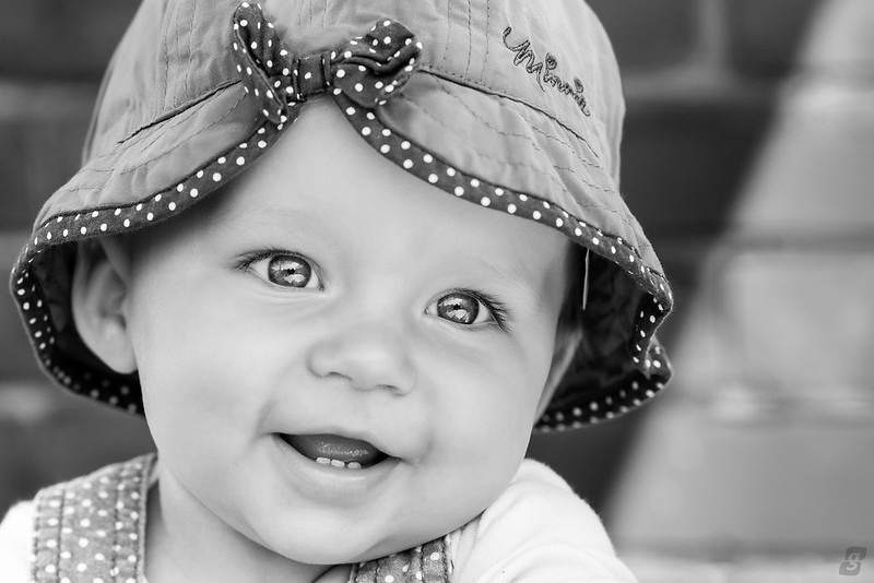
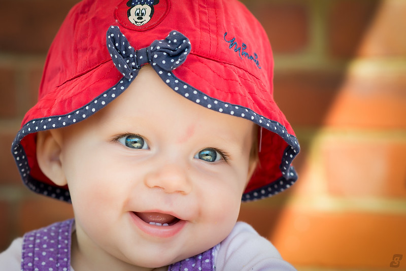
I can't choose which one I like more... They are different images, but one converted and one not.
 Cassidy #1
 Cassidy #2
Cassidy #1Cassidy #2 Cassidy #1Cassidy #2
I prefer the black and white. Gorgeous eyes and a nice moment.....I would prefer a little more room below, the crop is to tight and you have the floating head syndrome.
") The crop is tight, but with a hat on, it's acceptable in my opinion.
The crop is tight, but with a hat on, it's acceptable in my opinion.Now I'm undecided.
You've captured the eyes and skin tones beautifully so because of that I'm going to now say colour!
 I would of said b&w until you did the re-edit with the colour, so colour with the re-edit for me.
I think the eyes are over popped.
A nice shot but a wee bit overcooked in PP for me - skin looks too smoothed and the eyes are a bit too "popped".
Might be my screen as i am viewing on an old monitor at work.
Thanks guys, are you referring to the Take II?
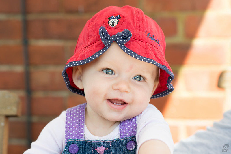
In that case I take it all back!
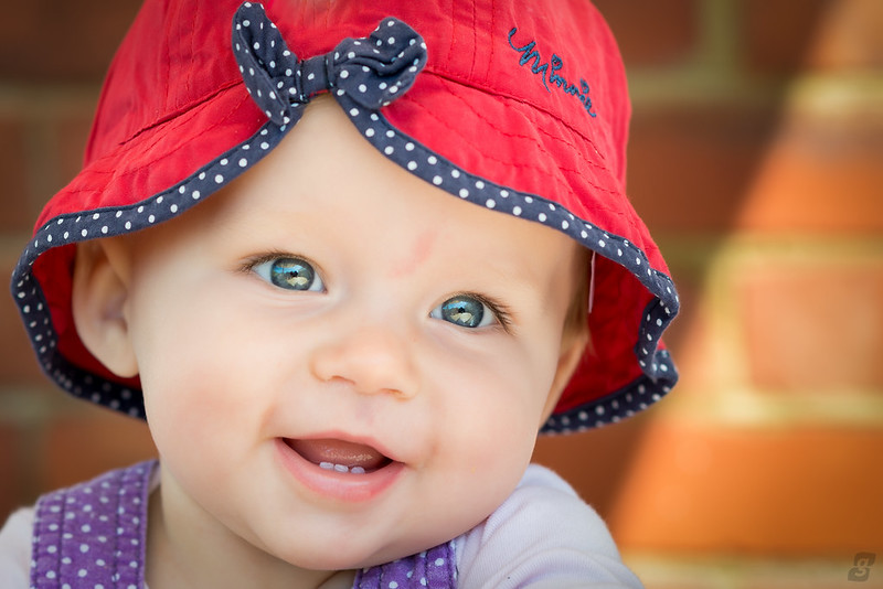 Cassidy #3