You are using an out of date browser. It may not display this or other websites correctly.
You should upgrade or use an alternative browser.
You should upgrade or use an alternative browser.
weekly d00d's 52 in 2014 ... Week 51 : Extravagant
- Thread starter d00d
- Start date
- Messages
- 9,095
- Name
- Mandy
- Edit My Images
- Yes
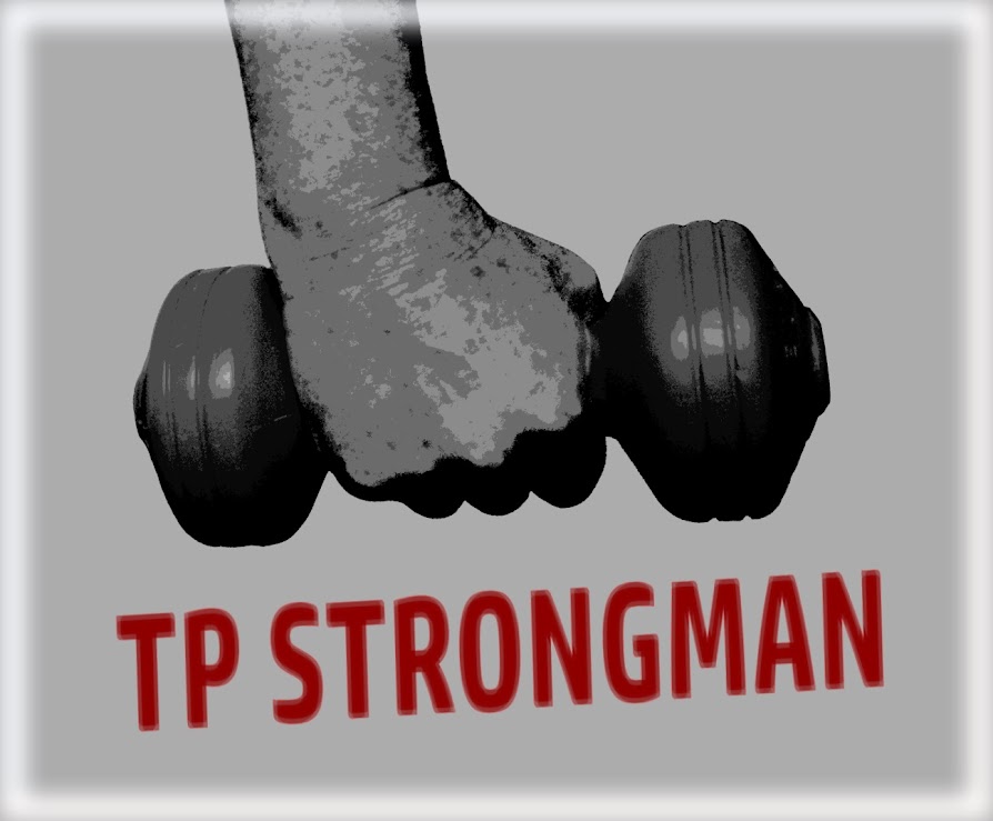
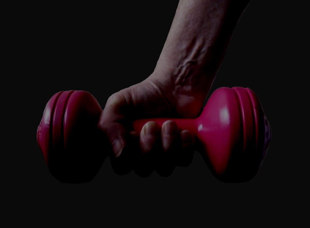
Strong - fits the theme the first image works for me I like the processing.
- Messages
- 9,078
- Name
- David
- Edit My Images
- Yes
Strong - fits the theme the first image works for me I like the processing.
Thanks
- Messages
- 7,548
- Name
- susie
- Edit My Images
- Yes
Hi d00d .... Glad you liked the sky .... I did look at a red one but I thought the blue complemented the tulips ..... did you notice that I blotted out the tulip at the bottom  I did it all with layers, I haven't mastered selecting a whole area....yet !!
Strong ....I really like the second image, the dark tone and composition give it a real sense of strength, and you are actually managing to make it look heavy to lift.....a good choice for the theme there
The first one, I like the editing of the hand but not the writing ... I would prefer a gritty looking grey/black and a more edgy looking font.
Last edited:
- Messages
- 6,502
- Name
- Peter
- Edit My Images
- Yes
Action - The word Action is in there but I'm afraid it doesn't do anything for me. Not keen on the false looking zoom effect either. Sorry.
Mono - #1 works though. Nicely converted with a balance of blacks through to whites
Twisted - I prefer #2 out of these. I'd be tempted to clone a bit of the bottom though
Fresh - #2 for me although a lovely blue sky would really make the tulips jump out more
Shape - I recognise the webpage LOL but not shouting shape I'm afraid
Number - Nicely lit
Strong - #1 looks like a poster of some sort.
- Messages
- 8,398
- Name
- Lynne
- Edit My Images
- Yes
Hi David
I quite like the poster effect , the pp match's the image ( if that makes sense ?) The straight shot needs some work on the lighting to make it pop a little more
I quite like the poster effect
- Messages
- 9,078
- Name
- David
- Edit My Images
- Yes
Hi d00d .... Glad you liked the sky .... I did look at a red one but I thought the blue complemented the tulips ..... did you notice that I blotted out the tulip at the bottomI did it all with layers, I haven't mastered selecting a whole area....yet !!
OMG No!
- Messages
- 1,084
- Name
- Craig
- Edit My Images
- Yes
Strong, #1 for me. As said the poster effect works well. I'd like a lighter BG sad it's a bit too similar to the hand.
Cheers.
must agree with this
- Messages
- 9,078
- Name
- David
- Edit My Images
- Yes
All my hard work for nothing
Nah ... what you've done with my tulip pic is just great ... and there's certainly been enough call for a blue sky.
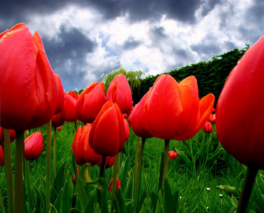
And you've inspired me to have a go at doing the kind of sky I'd like to see ... more appropriate than blue, as it was raining at the time, hence the wet FRESH green shadowless undergrowth. My layers have not blended as well as yours susie (I need to find a way of smoothing the edges, getting rid of the white outline) but I'll keep working on that.
- Messages
- 822
- Name
- Richard
- Edit My Images
- Yes
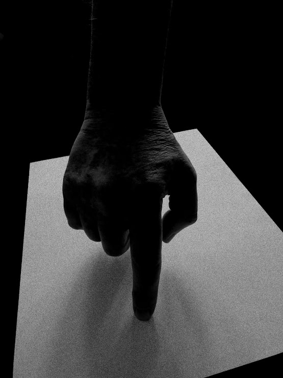
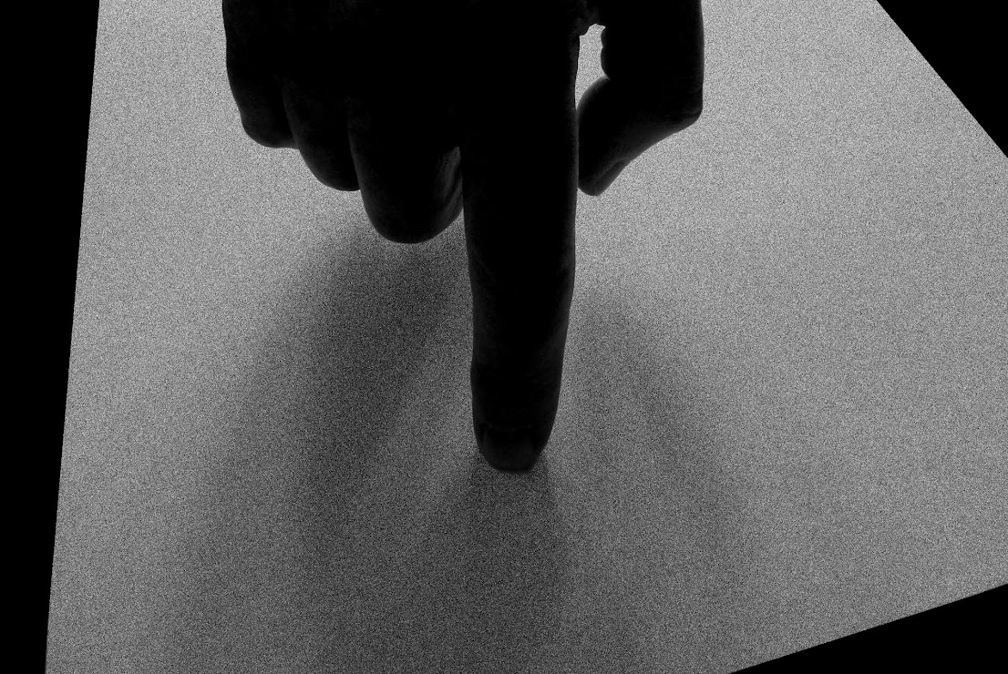
really liked the cropped version of texture, nice strong image. What is the finger on, looks like some sort of metallic paper??
- Messages
- 7,548
- Name
- susie
- Edit My Images
- Yes
It's good to see that I have inspired someone d00d  definitely a more moody looking sky there, I get the gist now of what you were looking for, much nicer than that original blank white.
That's a very original take on this weeks theme...I like the textured grainy look of the paper (I assume it's paper) against the dark hand, especially in the cropped version.
That's a very original take on this weeks theme...I like the textured grainy look of the paper (I assume it's paper) against the dark hand, especially in the cropped version.
- Messages
- 9,095
- Name
- Mandy
- Edit My Images
- Yes
Texture - I agree with Andy's comment it does have a slight forensic feel to it. The cropped version works best for me.
- Messages
- 1,409
- Name
- Elaine
- Edit My Images
- Yes
Cropped image for me. If you hadn't said you'd added the texture in pp I would have just thought it was a piece of sandpaper - very realistic! Hope you're having a great holiday.
- Messages
- 6,502
- Name
- Peter
- Edit My Images
- Yes
Yep the cropped version is the stronger of the two. I must admit I thought it was sandpaper.
- Messages
- 9,078
- Name
- David
- Edit My Images
- Yes
Hi guys ... here's a few holiday snaps ... Lisbon/Tavira ...
https://plus.google.com/photos/1123...ums/6027549143649804705?hl=en&partnerid=gplp0
https://plus.google.com/photos/1123...ums/6027549143649804705?hl=en&partnerid=gplp0
- Messages
- 19,461
- Name
- Andy
- Edit My Images
- Yes
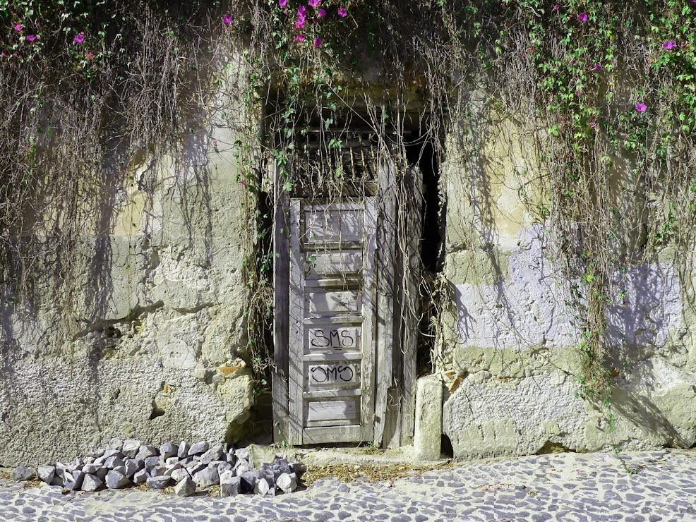
Hi, wild I like. Light is very harsh and a bit of warm light would improve for me. I'd also like to see a square crop. I do like it, though. some nice detail fits the theme.
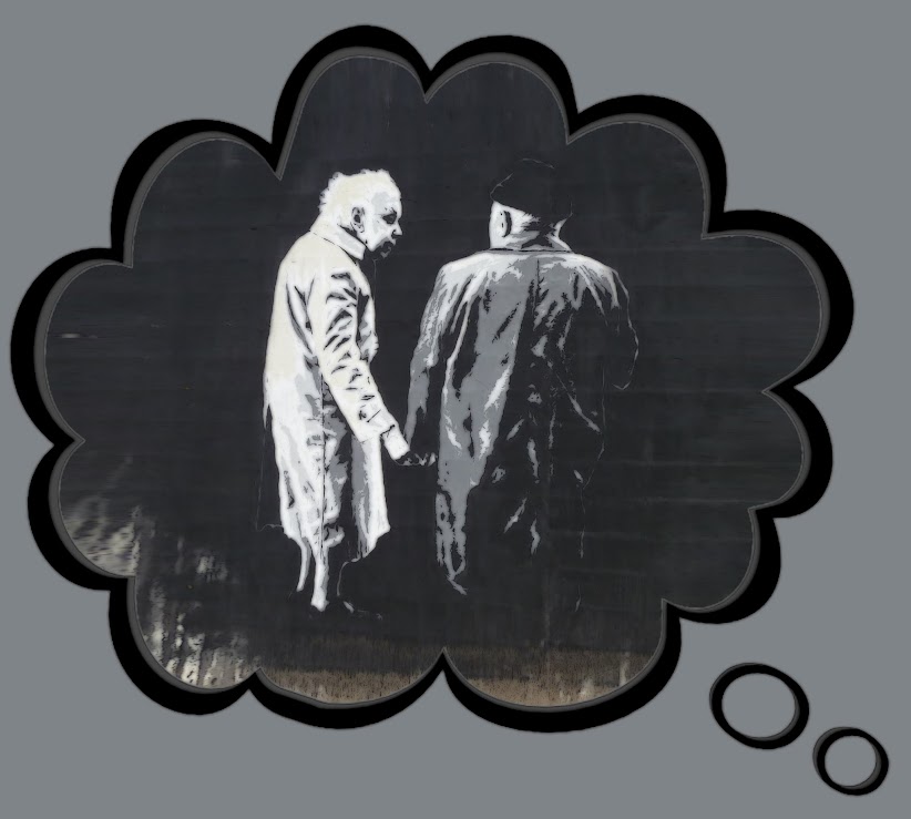
Dreamy, not sure, really. Obviously it fits the theme but I'd like to heard why you did it, IYSWIM.
Cheers.
Dreamy, not sure, really. Obviously it fits the theme but I'd like to heard why you did it, IYSWIM.
Cheers.
- Messages
- 9,095
- Name
- Mandy
- Edit My Images
- Yes
- Messages
- 9,078
- Name
- David
- Edit My Images
- Yes
Like it! I was planning on something on the same idea but with a person doing the dreaming. So I am glad to see you have done this. I like the stunted colour too in the dream image.
Yes I thought about "a person doing the dreaming" but never got it together.
"stunted colour" ... I like that term, must remember it.
Hi, wild I like. Light is very harsh and a bit of warm light would improve for me. I'd also like to see a square crop. I do like it, though. some nice detail fits the theme.
Dreamy, not sure, really. Obviously it fits the theme but I'd like to heard why you did it, IYSWIM.
Cheers.
Both shots were taken on the week of the theme, both whilst on hols in Lisbon ... I didn't want to fall behind. I was going to give an explanation for the Dreamy shot and call it something like "dreaming of eternal love" or some such, but didn't. It is a snap of some graffiti/street-art/mural I saw on a Lisbon wall, I liked it, didn't know what it was or why it was there but thought it somehow fits the theme. When I got home I didn't edit the original artwork, just put it in a dream bubble.
Last edited:
- Messages
- 4,088
- Name
- Graham
- Edit My Images
- Yes
Like it, great job.
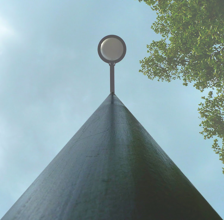
Perfect equilateral triangle formed there right into the corners... Sky and the tree making it clear we're looking straight up.
Is it a street light of some sort?
Nice color and texture and light on the pole part of whateveritis too.
Perfect equilateral triangle formed there right into the corners... Sky and the tree making it clear we're looking straight up.
Is it a street light of some sort?
Nice color and texture and light on the pole part of whateveritis too.
- Messages
- 7,548
- Name
- susie
- Edit My Images
- Yes
Hi d00d...I really like wild...the softness of the colours , the composition, the texture ...it's almost dreamy ...if only someone hadn't written sms on that door!!
Dream...it fits the theme and they look like a very contented old couple, it's very good street art.
Vertical...couldn't be better for the theme ... spot on with that one
Dream...it fits the theme and they look like a very contented old couple, it's very good street art.
Vertical...couldn't be better for the theme ... spot on with that one
- Messages
- 14,766
- Name
- Michael
- Edit My Images
- No
Hi David, sorry for not taking a look before now at your thread.
strong, quite like the poster effect, a slightly different bg colour maybe, but I prefer it to the 2nd, I would prefer just a little bit more lighting on the lhs.
texture, the uncropped version for me, like the dark b+w
wild, looks good overall but seems over exposed on my laptop screen
dream, I like it,
vertical, nice and straight and on theme
Keep up the good work





 they both work