
You are using an out of date browser. It may not display this or other websites correctly.
You should upgrade or use an alternative browser.
You should upgrade or use an alternative browser.
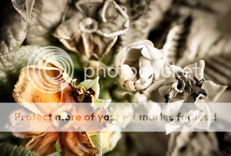
Decaying flowers - C+C welcome
- Thread starter grum
- Start date
- Messages
- 1,767
- Name
- Rooban
- Edit My Images
- No
Good one mate.
Thanks for the comments ")
Cheers - what's PT magazine though? Also how do you mean you would have preferred it to have less in it? Less colour? Sorry if I'm being thick - fairly new to this.
I really like the concept, saw it in PT magazine this month. would have prefered it to have less in it though. Well done
Cheers - what's PT magazine though? Also how do you mean you would have preferred it to have less in it? Less colour? Sorry if I'm being thick - fairly new to this.
- Messages
- 1,726
- Name
- Wendy
- Edit My Images
- Yes
Pratical Photography has an item on 'rotting flowers' good idea I think and want to try. I mean the photo for me is to 'busy', I am drawn to the colour picture then to the right to the black and white (both great) then try to take in the upper part of photo .. does that make sense? I think I would prefer nothing in the top of the image. But, that's just me
D
donrev
Guest
nice one i like it
Pratical Photography has an item on 'rotting flowers' good idea I think and want to try. I mean the photo for me is to 'busy', I am drawn to the colour picture then to the right to the black and white (both great) then try to take in the upper part of photo .. does that make sense? I think I would prefer nothing in the top of the image. But, that's just me
Ah I see, thanks. Will have a play with some different crops.
And thanks Nick and Joe. I know what you mean about the blur on the flower on the bottom left, might try cropping that out a bit more too.
Cheers