
You are using an out of date browser. It may not display this or other websites correctly.
You should upgrade or use an alternative browser.
You should upgrade or use an alternative browser.
Donington BSB
- Thread starter wull
- Start date
Matt Sayle
2017MSA Young Photographer of the Year(Motorsport)
- Messages
- 18,976
- Name
- Matt Sayle
- Edit My Images
- Yes
I shal try and c and c all of them:
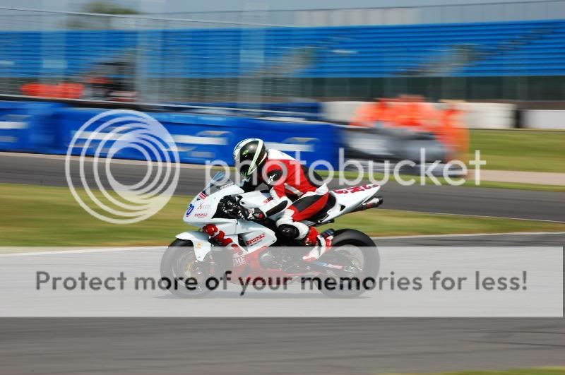
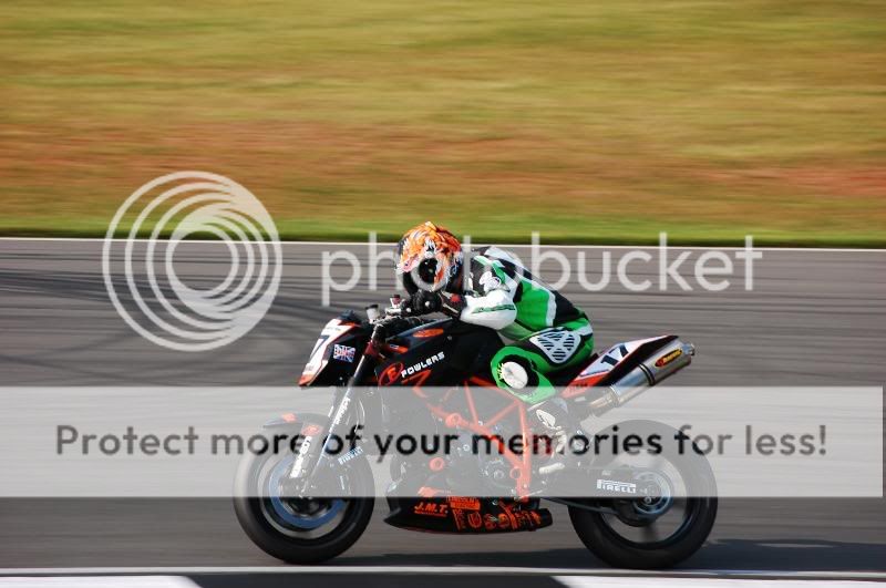
1.
The bike doesnt look very sharp, could be the resizing
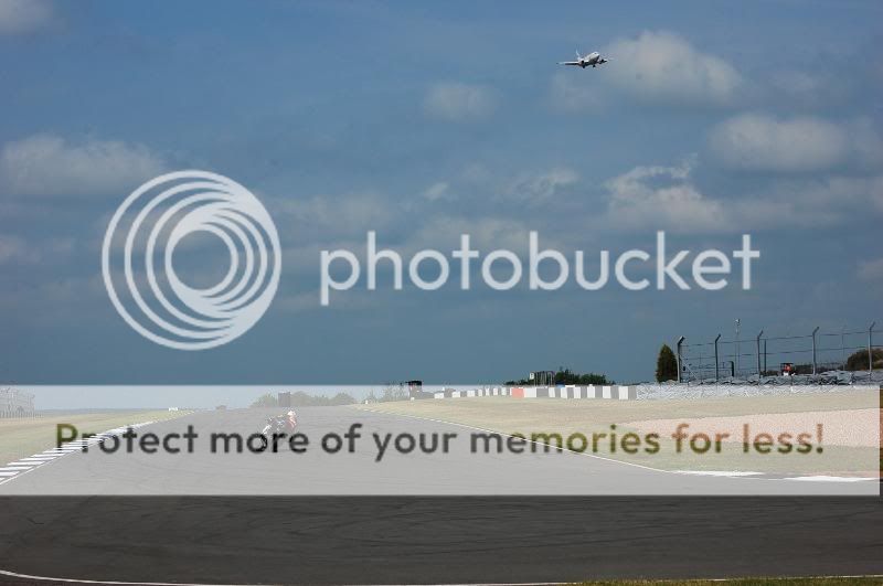
2.
Nice idea but doesnt work for me sorry.
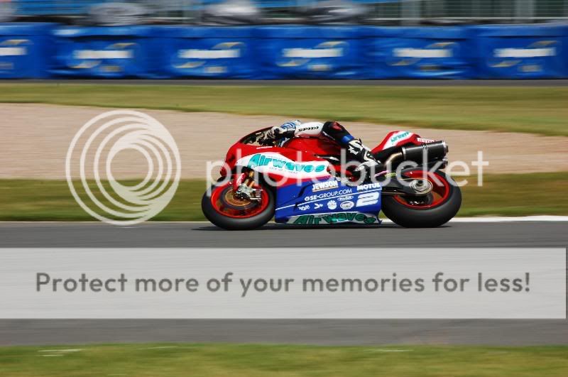
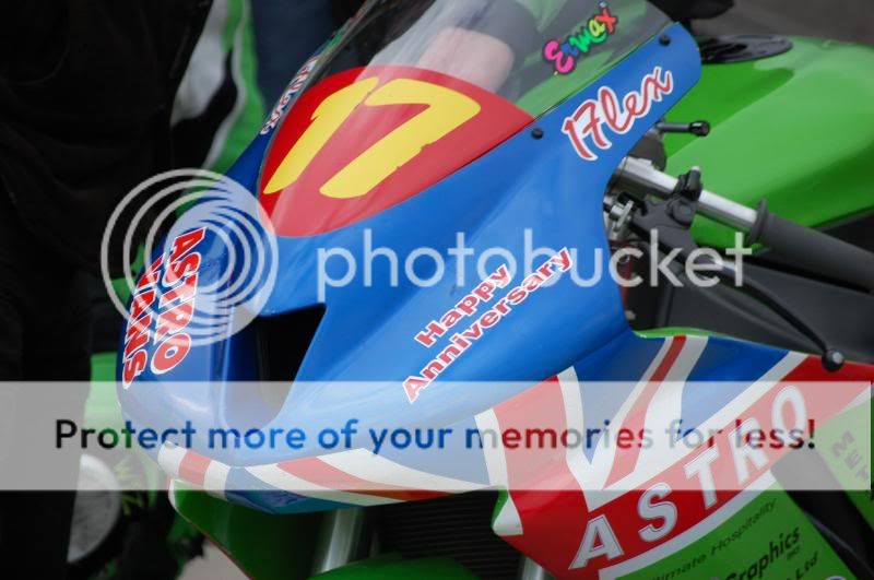
3.
Nice, sharp bike but I think the resizing has played havoc with it.
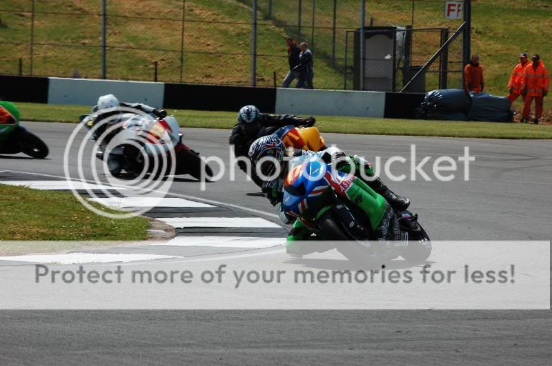
4.
Nice shot, shame about the marshalls in the background
5.
Nice shots, good panning
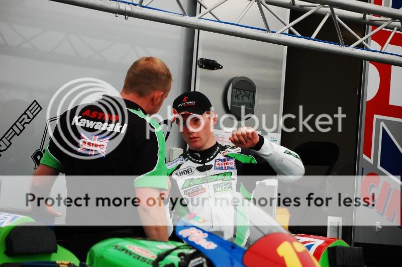
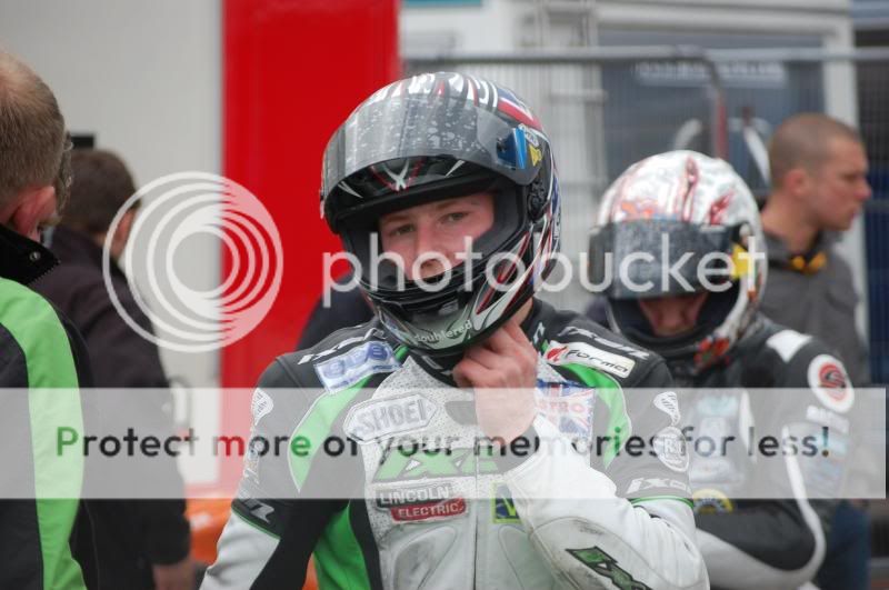
6 and 7.
I am a big fan of paddock shots so i like theses two
All in all good shots, just a shame about the resizing!
1.
The bike doesnt look very sharp, could be the resizing
2.
Nice idea but doesnt work for me sorry.
3.
Nice, sharp bike but I think the resizing has played havoc with it.
4.
Nice shot, shame about the marshalls in the background
5.
Nice shots, good panning
6 and 7.
I am a big fan of paddock shots so i like theses two
All in all good shots, just a shame about the resizing!
- Messages
- 285
- Edit My Images
- Yes
Some good panning in these shots and a different take on some of the action. Some of the shots (all in fact), look like there is too much contrast in each of the images. This has led to some loss of detail from what I can see.
My only other point would be in number 3, I prefer images where the rider is visible, tricky on this corner at Donington but just my personal preference")
My only other point would be in number 3, I prefer images where the rider is visible, tricky on this corner at Donington but just my personal preference
OP
- Messages
- 893
- Edit My Images
- Yes
Thanks for the comments Everydays a school day
How would i go about getting the contrast right. When i preview them on the screen they look not bad. It isnt until i see them on the monitor i realize how bad they are
I like the paddock shots myself matt im just not very good at them
Everydays a school dayHow would i go about getting the contrast right. When i preview them on the screen they look not bad. It isnt until i see them on the monitor i realize how bad they are
I like the paddock shots myself matt im just not very good at them
Matt Sayle
2017MSA Young Photographer of the Year(Motorsport)
- Messages
- 18,976
- Name
- Matt Sayle
- Edit My Images
- Yes
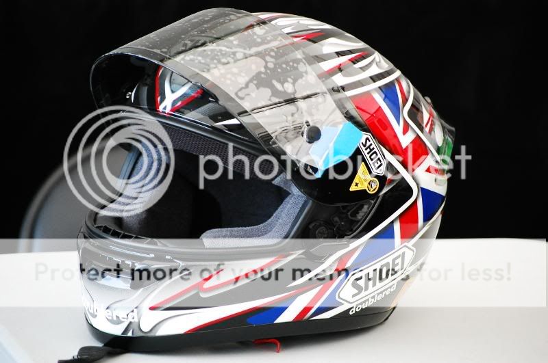
That last one doesnt look like a paddock shot, looks like a helmet shot out of a brochure
Matt Sayle
2017MSA Young Photographer of the Year(Motorsport)
- Messages
- 18,976
- Name
- Matt Sayle
- Edit My Images
- Yes


