

You are using an out of date browser. It may not display this or other websites correctly.
You should upgrade or use an alternative browser.
You should upgrade or use an alternative browser.
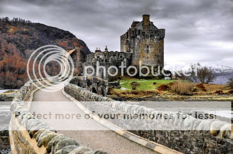
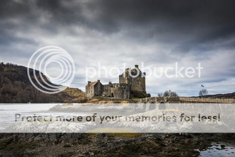
Eilean Donan Castle
- Thread starter Portybear
- Start date
- Messages
- 1,137
- Name
- Chris
- Edit My Images
- No
Eilean Donan really is a great location. think i prefer number 2 the best and the moody clouds give great atmosphere. Number 1 does a great job of leading your eyes down to the castle but think it may be a little over processed for my liking.
")
- Messages
- 5,311
- Name
- Kevin
- Edit My Images
- No
#1 also looks out of focus especially within foreground ? looking at the compostion propably hand held too ?
- Messages
- 20,926
- Name
- Steve
- Edit My Images
- Yes
I don't mind any of the compositions. The OOF front of one I can live with.
The drab light and heavy processing to compensate for the drabness I cannot live with.
The drab light and heavy processing to compensate for the drabness I cannot live with.
- Messages
- 1,907
- Name
- paul rogers
- Edit My Images
- Yes
If no one crits as you say how will he come through in the end....keep at it Len
you will come through in the end...these crits overlook your sense of adventure and no fear of making mistakes to learn
cheers
geof
- Messages
- 6,230
- Name
- Charles
- Edit My Images
- No
Like both, Len. √√√
- Messages
- 1,056
- Edit My Images
- Yes
FWIW my feeling from the images. In the first I find the processing very distracting - it's more than enough for me to react to (quite overdone for my taste), but not enough that I'd think "it's intentional HDR" or something like that. Regardless of composition the brightened shadows and the colour tone that gives to the image I find a bit distracting. For the composition the thing that seems to bother me is the bottom bit of path/wall, which sort of cuts off "my" path to the castle? It feels like blocking my view rather than leading me in? Same with the bit of land on the left of the wall, it feels isolated from the rest of the image.
Second image is the one I prefer - the development is a bit lighter touch. I'd (personally) be tempted to take a bit of the dark islands off the bottom, and a bit of the very dark sky off the top, make it more panoramic with less of the very dark areas, but others will disagree. That may also remove the little bit of bright water in the bottom right that drags the eye there.
The second image is the one for me. The above is not "criticism", just "critique" and all based only on my opinion and what I like. There's no (or very little) right and wrong in photography, it's just experimenting and finding the style you personally love