I have to say, none of them are working for me, sorry.
Will try and explain why.
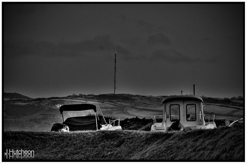
#1 - difficult to tell what its meant to be anyway and too many halos, overall a bit on the dark side
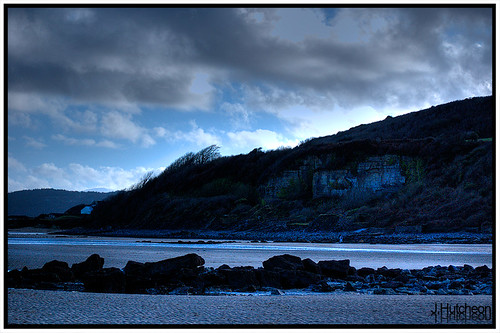
#2 - dark areas too dark, not enough detail [though admitedly, seeing a bigger version might help], but overall too dark and sky odd looking.
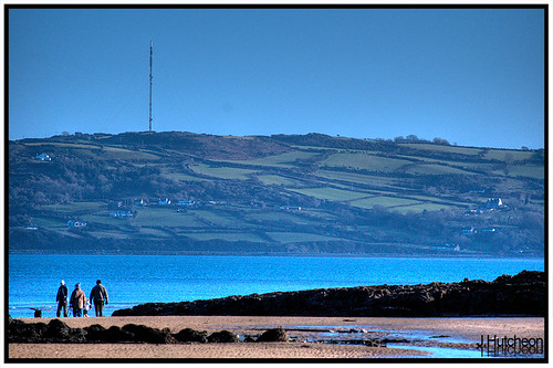
#3 - this is actually quite nice, but as mentioned, maybe a tad too blue, needs a little bit of warming up
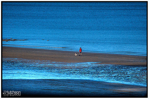
4 - as above ref blueness, but also, if you can crop it so that the dog walker is on the thirds line, I think you might find it improves significanlty, just a bit too central atm imo.
Please don't be offended, just giving an opinion, you don't have agree with it, if they are what you were aiming for then thats what matters