Forest Walk (3 Photo Collection)

Messages
490
Name
James
Edit My Images
Yes
Today I went for another walk through a different forestry. As it was a drizzly / rainy day, I thought I'd try and learn how to get good photos when the wonderful golden light is nowhere to be seen. Here they are:

1: I wasn't sure about posting this one up as I'm not really convinced I like it, I think the composition is a little messy:

Red Leaf
by James, on Flickr

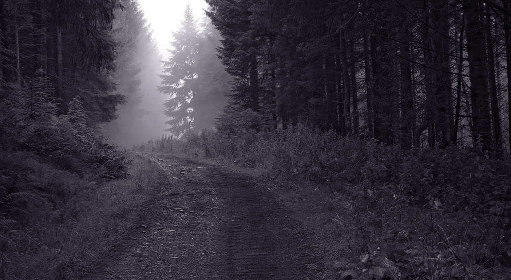
2: Compositionally, I'm happy with this one. I purposely didn't saturate the colours too much as I think it would detract from the misty feel. I tried getting rid of the blow highlight in Photoshop but failed miserably.

Into The Mist
by James, on Flickr

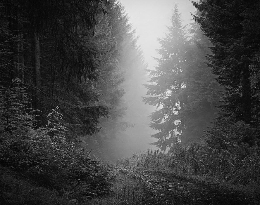
3: This is my favourite of the set. I wanted to show the height of the trees and use the stream / mini waterfall as a lead-in-line for the viewer.

Forest Waterfall
by James Carne, on Flickr

Any feedback would be hugely appreciated! :)

James
 
I agree with your statements. No1 doesn't do it as it is a messy backdrop. Number 2 may have benefited from shooting down the slope but I still like it. Number 3 is a really nice shot that would be better if the foreground foliage wasn't there. That's something I'm guilty of myself only seeing it when I get home and upload :(
 
I think #2 could do with a tighter crop. Converting to B&W and a little vignette
 
I like no3, maybe sort out the converging trees though (y)
 
Theres not much to commend the first one, its messy and the red is too saturated. I like the 2nd one, how the path disappears down the hill and the mist gives it some atmosphere, it does look a little flat though and it would probably benefit from some contrast, and ironically enough after my comment on the first one, a little colour boost :) The last one is good but agree with Ian regarding the foreground foliage.
 
I think No2 has great potential. Agree with Matt - would be better in B/W with some additional processing and cropping. No 3 does nothing for me - its just another one of a thousand milky waterfall shots
 
I agree with your statements. No1 doesn't do it as it is a messy backdrop. Number 2 may have benefited from shooting down the slope but I still like it. Number 3 is a really nice shot that would be better if the foreground foliage wasn't there. That's something I'm guilty of myself only seeing it when I get home and upload :(
Yep, same here. Will get to work in Photoshop and tidy it up.

I think #2 could do with a tighter crop. Converting to B&W and a little vignette
I did recompose the shot a number of times, one of which was quite a tight shot but I didn't feel it had the same effect, again, I'll have a play in Photoshop.

I like no3, maybe sort out the converging trees though (y)
How would I do that? I still don't fully understand Photoshop.

Seniorshot, that's fine, the next time I'm there, I'll try a different shot. :)

James
 
Here's the attempt at black and white. I think it looks pretty rubbish especially with the blown highlight. This is the first time I've tried processing something as black and white so any pointers will be hugely appreciated.

Into The Mist BW
by James, on Flickr

James
 
I was thinking more like.
TP Misty forest square


It's the mist that draws you into the shot so making it a focal point I think makes for a stronger image.


However I have no issues with being wrong
 
I like that! That hadn't even crossed my mind. I tend to see a photo but I'm still guilty of not filling the frame if that makes sense. I'll get there one day, hopefully lol.

James
 
I like that! That hadn't even crossed my mind. I tend to see a photo but I'm still guilty of not filling the frame if that makes sense. I'll get there one day, hopefully lol.

James

I'm a beginner too. All the gear no idea kinda thing.

However I've recently decided to put myself out there ab it more with providing critique. Hey if I critique someone and get shot down by the more experienced guys I'll still learn something right.
Plus I'll get to learn about a shot I didn't even take.

I think it will help your own shots by looking at other peoples and saying "How would I have taken that shot?". If the more knowledgeable folk inform me I'm wrong then again I've learnt something.

This is a fantastic forum. Full of characters. And experienced photographers. Some of which are even the same people..lol
 
Hi, #2 for me, all the way. Very mysterious and well composed. B&W is where it's at with this one. I did a conversion with Analogue Efex and now have it as my sreensaver. If we ever meet, I owe you a pint (y)

Cheers.
 
The mono conversions are very instructive as a way of condensing an overload of visual information and distilling greater meaning. No1 is indeed oversaturated. Saturation's something I rarely meddle with, and if I ever do it's to reduce it slightly. Increasing it's a quick route to artificiality. Matt's effort is satisfying but that's not to diminish your own framing - apart from the odd tint you've given it - why?

Blown highlights aren't sensibly to be cured in photoshop. The trick's to avoid them when you set the exposure in the camera. However apart from small specular highlights which can be often let go with impunity, maybe the least offensive form is an limited area of sky as you've got here. If it comes to that many famous and admired historical photographs have blown highlights! But they are normally a key failing and something to be ultra-aware of at the time of exposure.
 
The mono conversions are very instructive as a way of condensing an overload of visual information and distilling greater meaning. No1 is indeed oversaturated. Saturation's something I rarely meddle with, and if I ever do it's to reduce it slightly. Increasing it's a quick route to artificiality. Matt's effort is satisfying but that's not to diminish your own framing - apart from the odd tint you've given it - why?

Hi Roj,

I've only just noticed the tint, it must have been when I was using the channel mixer in Photoshop. It didn't look that bad on my other monitor but it's quite noticeable on my laptop screen.

James
 
Back
Top