Hi Chris,
First up I’ve gotta say I’ve been following your blog for the past few months, some well written articles on there, good stuff. The reason I bring it up, your
latest post gives some context to these images which I think helps us to offer some critique.
I believe I pretty much fit the archetypal photographer that you deride in the article, so what I have to say might be of no use to you at all hahaha. I think It’s important to note however, as with all creative pursuits, beauty is in the eye of the beholder. So while some might agree with me, just as many won’t and that’s cool… that’s what’s great about photography, everyone has their own taste and style.
With that in mind, these are just my opinions and I’m no professional so feel free to disregard anything I say as pure waffle
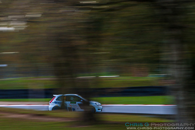
1.
You’ve nailed the panning technique here, lots of movement and the subject is suitably sharp. Looking at the image as a whole, it’s quite dark and there’s not a lot going on in the mass of green, which really does draw your eye to the subject. However, I find the tree obscuring the car quite distracting, if it wasn’t there the dark background and bright subject would be a much more successful image as it stands it looks a bit like a mis-timed snap shot.
2.
I’ve never been a massive fan of partial car shots in my own stuff as it’s so difficult to compose without it looking accidental. For the most part close crops are best used to highlight details and to focus the eye on a particular section. Because of the aggressive shutter speed you have used there’s nothing in focus, while this shows movement in the wheels and track, the tight crop has me looking for details that just aren’t there. I’d suggest a faster shutter would be a better choice for this kind of shot, whilst retaining movement in the wheels it would give your eye somewhere to settle instead of getting a totally blurred background that is not really intrinsic to the image. The composition doesn’t work for me either, it just looks like you were too close with too long a focal length. I tend to use the angled composition (sacrilege) in this situation to reduce the dead space at the top on 3:2 crops. I'm looking at these larger on Flickr as an 800px wide image is virtually useless for any kind of critical review.
3.
I like this, you’ve captured a good sense of speed and everything's sharp where necessary. I might be tempted to lighten the shadows a touch, leave at little more space at the edge of frame and maybe a widescreen crop to lose some of the space at the top. The problem with shooting the inside of Druids like this is you invariably end up looking down on the car and suffer a plain grey backdrop which isn’t the most photogenic, but that’s my personal opinion.
4.
I like the hint of autumn colours in this, there does seem to be a bit of a cool colour cast that is suppressing it though. As before, good movement… maybe could be a smidge sharper but that’s minor. My main issue with this is it looks like you’re in no-mans land in terms of focal length…personally I’d prefer a wider FOV to get more of the foliage in or get in tighter to really highlight the cars. As it stands its quite busy, with the foliage, cars and barriers competing with each other for attention. The two cars off to the right makes it feel unbalanced and a bit awkward to me.
5.
Good shot, great movement. Not sure about the tilt, either needs to be aggressive or horizontal for me. Big issue is the colour and shadow/highlight process which looks very flat and dull, need some post treatment to bring the colours up.
6.
Better than #2 as you've captured the detail well in the driver. Same problem with composition though, hacking the front right at the tip is a big no no and also cropping the Union Jack and BRSCC badge at the focal point looks very awkward to my eye. Same issue with dead space at the top.
7.
Good flame shot, just such a pity the trailing edge has been cropped again. Otherwise a decent image, I'd tilt again and recompose to get the flame on the lower left third junction and less of the car..but again just a personal opinion.
8.
Looks ok, my previous comments about partials still apply here though. Although you've hit focus on the side of the car, it's the driver that needs to be in focus for me and they are too blured for my liking
In the context of your article, I applaud your drive to experiment, I think whether people like what you have to say or not, its something many of us could benefit from. I would be cautious about promoting a singular 'approved' style of photography as at the end of the day that's just down to your taste. You see it all the time in comments on this forum, everyone has their own particular likes and dislikes and to blanket statement everything as simply good, bad, tired or fresh doesn't work. Pro's often take shots from a set location because they know that's what their customers want or delivers an angle they like or a possible opportunity, equally spectators queue up at spots for exactly the same reason... Remember it's all well and good to appeal to photographers, but a lot of the publications you mention are not aimed at a creative audience but general motorsport enthusiasts that have a much more varied sense of taste. Most of my friends hate my low shutter speed stuff giving me the line 'it'd be good if bits weren't blurry' but the same image can go mental on 500px and Flickr.
When togs end up with a similar shot to one another that doesn't necessarily make it bad or boring, it depends what they each individually want from it... I have a friend that's spent thousands on camera gear and keeps all his images locked down in private galleries on Flickr, I can't understand why he doesn't want people to see them or do anything with them... the plain answer is he's just doing it for himself, its just a hobby.
In terms of being original, in this set you've stuck to the inside of druids using a slow shutter because you were after a specific look, its not particularly original, or indeed varied, in that regard. That's not to say there's anything wrong with that approach, its more difficult so of course less prevalent than high shutter work, but no more or less worthy of appreciation... it just depends who's looking. Without meaning to sound harsh, you make some very divisive points in your articles but, to me at least (I cant stress that enough, just my own feelings), your images aren't as successful as they could be.
Even Darren Heath takes boring shots sometimes

Hopefully I've been constructive with my comments and as I said before, you and I have markedly different styles so everything I say should be taken with a pinch of salt. If anyone disagrees with my opinions that's cool... it's what it's all about

 1410_FFordFest_763 by Chris Gouge, on Flickr
 1410_FFordFest_440 by Chris Gouge, on Flickr
 1410_FFordFest_445 by Chris Gouge, on Flickr
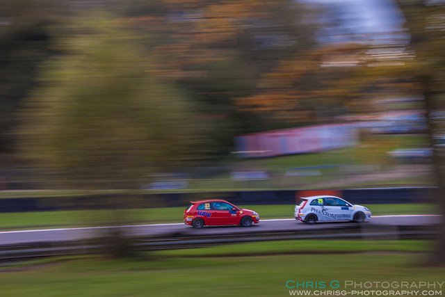 1410_FFordFest_749 by Chris Gouge, on Flickr
 1410_FFordFest_586 by Chris Gouge, on Flickr
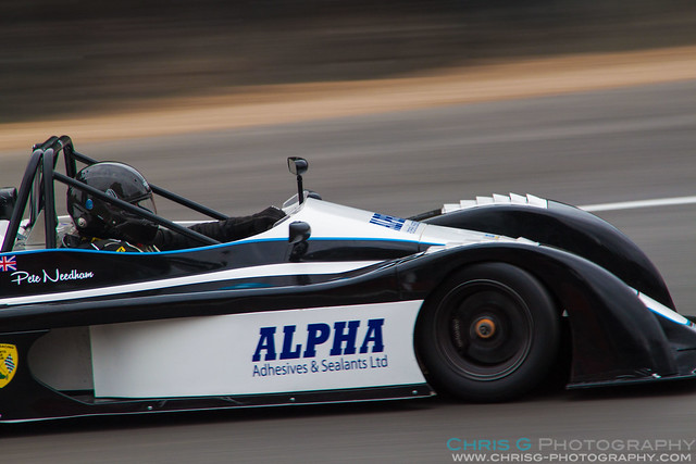 1410_FFordFest_677 by Chris Gouge, on Flickr
 1410_FFordFest_696 by Chris Gouge, on Flickr
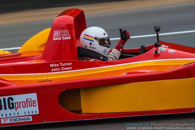 1410_FFordFest_710 by Chris Gouge, on Flickr