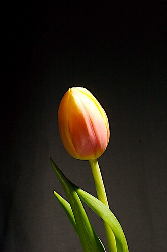
The first image is really, really nice ... ... it shows good thoughtful composition and almost spot on lighting except the highlights are just a tad blown ... :shrug:
Overall though a very good attempt ...
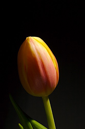
Not so sure about the second though ... I think it is the leaves being in shadow ... :shrug:
First one but with the light on the flower of the second one for me. Maybe diffuse the light source and add just a touch of reflected light from say a sheet of white paper to lighten the shadows. Oh and move the background further away so it is not lit and more OOF.
Many thanks for the comments and advise I now have something to work with. I was very strapped for space but I do agree the back ground needs to be further away and unlit.
This site uses cookies to help personalise content, tailor your experience and to keep you logged in if you register.
By continuing to use this site, you are consenting to our use of cookies.

")