Critique Looking for feedback and suggestions

Messages
27
Edit My Images
No
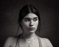
I'm fairly new to portraits, especially working with them in post, and I'm looking for suggestions and feedback for how to work with this image in post.

The setup is a large umbrella main high camera right, with a strip box fill at camera left. 3-4 stop difference between main and fill to try to bring some drama into the shadows. This was not a posed image (the subject was talking and moving her head) so the fall of the lighting and position of catchlights etc isn't as great as it could be, but in terms of where to go with this image in post I would appreciate any suggestions. This is not a beauty shot so I don't want to airbrush the skin, but I'm thinking it could use some more dodging on the face and perhaps some eye brightening?

Thanks for any advice
Georgia-2nd-Session-4175-part-edit.jpg
 
For me the only thing that stands out to me as 'wrong' with the image is ,
her eyes , too much sclera , but it is what it is , not a bad image at all.
 
If you’re looking for feedback, we’d have to know what you were aiming for.
The image is what it is, a beautiful girl with a frown. Lighting is ok, there’s no engagement because the frown is off to the side. Bluntly it looks more like she’s frustrated with the photographer than she’s unhappy with something else.

But what do you think might want fixing?
 
For me the only thing that stands out to me as 'wrong' with the image is ,
her eyes , too much sclera , but it is what it is , not a bad image at all.

Thanks wambam

If you’re looking for feedback, we’d have to know what you were aiming for.
The image is what it is, a beautiful girl with a frown. Lighting is ok, there’s no engagement because the frown is off to the side. Bluntly it looks more like she’s frustrated with the photographer than she’s unhappy with something else.

But what do you think might want fixing?

Thanks Phil, this portrait was taken as part of an emotions study, just expressions which were organic to the conversation at the time. It doesn't matter so much why she's frowning but if it were frustration with me that would probably make a good portrait in itself.
I think I messed up the lighting being too far off to one side to light her right eye, so the question is about where to take this image in post. Since I posted this I've had more of a play with the shadows and dodged the eyes slightly. But like wambam says - it is what it is given the expression.
I liked her look of sadness/frustration but wasn't sold on the look of image itself and was looking for ways to perhaps improve on it but I think it's as good as it's going to be, I'm not big on fixing things in post generally so I think it's probably best left there. I appreciate the overall feedback, always helpful to get someone else's take, thank you.
 
Thanks wambam


Thanks Phil, this portrait was taken as part of an emotions study, just expressions which were organic to the conversation at the time. It doesn't matter so much why she's frowning but if it were frustration with me that would probably make a good portrait in itself.
I think I messed up the lighting being too far off to one side to light her right eye, so the question is about where to take this image in post. Since I posted this I've had more of a play with the shadows and dodged the eyes slightly. But like wambam says - it is what it is given the expression.
I liked her look of sadness/frustration but wasn't sold on the look of image itself and was looking for ways to perhaps improve on it but I think it's as good as it's going to be, I'm not big on fixing things in post generally so I think it's probably best left there. I appreciate the overall feedback, always helpful to get someone else's take, thank you.

Tricky. I'd have said that for a portrait both eyes are a bit dark even after dodging.

For your project - I wonder whether it needs anything at all? Maybe it works better with the more candid look and 'missed' lighting?

Lastly - if I was going for moody & frowny I'd probably light to suit the mood. I'd try for something more contrasty & dramatic, but that depends on whether you need consistency with the rest of the project.
 
Back
Top